After years of expectation, Web Content Accessibility Guidelines (WCAG) 2.2 finally hit the scene in October 2023, introducing nine new success criteria that address the specific accessibility needs of individuals with visual, physical, and cognitive impairments. This major update is a game-changer for inclusivity, ensuring that the digital world is welcoming and usable for everyone.
In this article, our accessibility expert Glafira Zhur overviews the new criteria of WCAG 2.2 and finds out how it affects the accessibility landscape.
Let’s dive in!
While WCAG 2.2 builds upon the foundation of WCAG 2.1, it’s not a complete overhaul. It maintains the core principles of accessibility while introducing nine new success criteria and removing one, 4.1.1 Parsing, which was considered outdated.
Six of the nine new criteria fall under levels A and AA, focusing on the core accessibility guidelines that most web developers and content creators strive to meet.
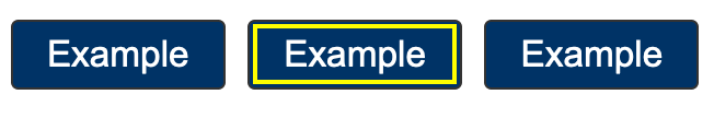
Focus Not Obscured criterion ensures that when you navigate a website using only your keyboard, the highlighted focus area stays visible even if other things are on the screen. This is crucial for visually impaired persons who rely on tools like screen readers to understand and use websites.
Imagine you’re tabbing through a webpage using just your keyboard – the rule ensures that the box or link you’re on remains clearly visible, even if there are other things like pop-ups or animations that may partially overlap the element in focus. This helps users with visual impairments understand what part of the webpage they’re interacting with.
The AA-level criterion is a bit flexible, allowing elements to be partially visible. In contrast, the following AAA-level criterion requires that focused elements be completely visible.
Building upon the AA-level, this criterion demands that focus indicators be clearly visible and distinct from the surrounding elements. This enhances accessibility for keyboard users, as well as for users with low vision or color blindness.
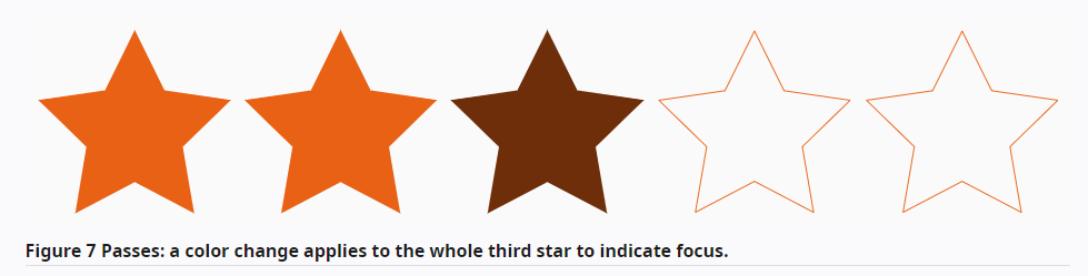
Focus Appearance criterion ensures that keyboard focus indicators are clearly visible and discernible. It requires that the focus indicator be at least as large as a 2 CSS pixel thick perimeter of the unfocused component and have a contrast ratio of at least 3:1 between the same pixels in the focused and unfocused states. This ensures that users can easily identify the focus indicator and understand which element is currently active.
Here are some examples of how to meet the requirements of Focus Appearance:
Before WCAG 2.2, web accessibility standards didn’t strictly define how focus indicators should look. WCAG 2.2 introduced stricter rules, requiring a clearer contrast between focused and unfocused elements. This could be challenging to achieve using traditional color schemes.
Luckily, modern browsers add more contrast to the focus indicator automatically.
There are two exceptions:
While new criteria add a challenge, the automatic contrast improvement is a positive step for web accessibility.
Some people find it hard to perform dragging movements in a specific way, or they might use special devices like a trackball, head pointer, eye-gaze system, or speech-controlled mouse emulator, which can make dragging tricky. The 2.5.7 Dragging Movements criterion ensures they can still use the functionality of the website.
For any action that involves dragging, you must provide a simple pointer alternative. For example, if you have a slider that can be dragged to adjust a value, you should also provide a text input field where the user can enter the value directly. Similarly, if a map allows users to drag the view of the map around, the map should also have up, down, left, and right buttons to move the view.
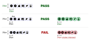
Target Size ensures that interactive elements on websites and apps are large enough to be easily clicked or tapped, even by people with limited dexterity or using assistive technologies. This means that all interactive targets, such as buttons, links, and form fields, should be at least 24 x 24 CSS pixels in size.
But there are five exceptions:
Consistent Help success criterion means that help mechanisms, such as contact information, self-help options, and FAQs, should be placed in the same order on every page. You also need to make sure the order of the help is the same. This makes it easier for users to find the help they need, regardless of which page they are on.
Here are some examples of how to make sure your website complies with this criterion:
Redundant Entry says you should avoid making users enter the same information multiple times. When a person fills out forms or goes through multi-step processes on websites, they shouldn’t have to enter the same information again and again. To meet this rule, you need to make sure that users only have to enter the same information once.
Think of an eCommerce store’s checkout: first, it asks for a shipping address. Then, in the billing part, it asks for a billing address. Since these addresses are often the same, users can just pick the same one as the shipping address option instead of typing it all again.
This helps people with cognitive disabilities and those with limited mobility complete tasks more easily.
3.3.8 Accessible Authentication success criterion requires that websites should not require users to perform cognitive function tests, such as remembering passwords, solving puzzles, or transcribing text, to log in. This standard is intended to make websites more accessible to people with cognitive disabilities, such as dyslexia, dyscalculia, and memory impairments.
Here are some of the key points of this criterion:
Accessible Authentication requires that websites do not require users to complete cognitive function tests as part of the login process. This includes tests such as remembering passwords, solving puzzles, or identifying objects or user-supplied images and media.
Instead, websites should provide alternative authentication methods, such as:
Previously, WCAG 2.2 required that HTML code be valid, following the technical specifications. However, with advancements in browsers and assistive technologies, these minor errors are now handled automatically, and the page can still load and function correctly. Therefore, WCAG 2.2 removed this rule, as it is no longer essential for accessibility.
Even though 4.1.1 Parsing is no longer a requirement, writing code that follows HTML specifications is still recommended. This will make debugging easier and help prevent unforeseen accessibility issues.
The release of WCAG 2.2 has set a new benchmark for making websites accessible to everyone. While it’s a significant step forward, it’s not essential to immediately adopt it. Focus on WCAG 2.1 AA compliance first, ensuring your website meets basic accessibility requirements. Then, gradually incorporate WCAG 2.2 guidelines as part of your ongoing efforts. Remember, accessibility is an ongoing process, not a one-time task.
The 2023 holiday shopping season broke records, with Forbes reporting $109.3 billion in online spending from November 1 to November 27. Cyber Monday hit $12.4 billion in sales, and 59% of Thanksgiving’s online sales were from smartphones. These numbers signify eCommerce’s remarkable growth, with 200.4 million shoppers in the four-day weekend, according to the NRF. Yet, 75% of US adults shopped over the five days from Thanksgiving to Cyber Monday, per the ICSC.
While these numbers picture eCommerce success, they also show a potential blind spot: the experiences of consumers with disabilities. For those with visual, auditory, or motor impairments, navigating websites and completing purchases can be a frustrating and challenging process.
Accessibility best practices are not just about ticking boxes for compliance; they are about creating an inclusive and welcoming shopping experience for all. By making your store accessible, you are not only doing the right thing morally but also expanding your reach to a broader customer base.
At SpurIT, we know that digital accessibility can be tough. Our accessibility experts are here to assist you in improving your website’s accessibility and ensuring it complies with both WCAG 2.1 and 2.2 guidelines. Feel free to reach out to discuss your project. Let us help you create a more inclusive online presence.
Considering migrating your Shopify store to OS 2.0? This article addresses frequently asked questions to…
In 2023, Shopify focused on delivering game-changing updates that empowered merchants of all sizes to…
On January 31, Shopify dropped the latest version of Shopify Editions, showcasing everything they've rolled…
Imagine online shopping that's as fun and engaging as a TikTok video, with the ability…
As an accessibility trendsetter, Glafira Zhur has been actively sharing her expertise with the international…
Over the years, Shopify Checkout has set the industry standard for speed, simplicity, and conversions.…
This website uses cookies.