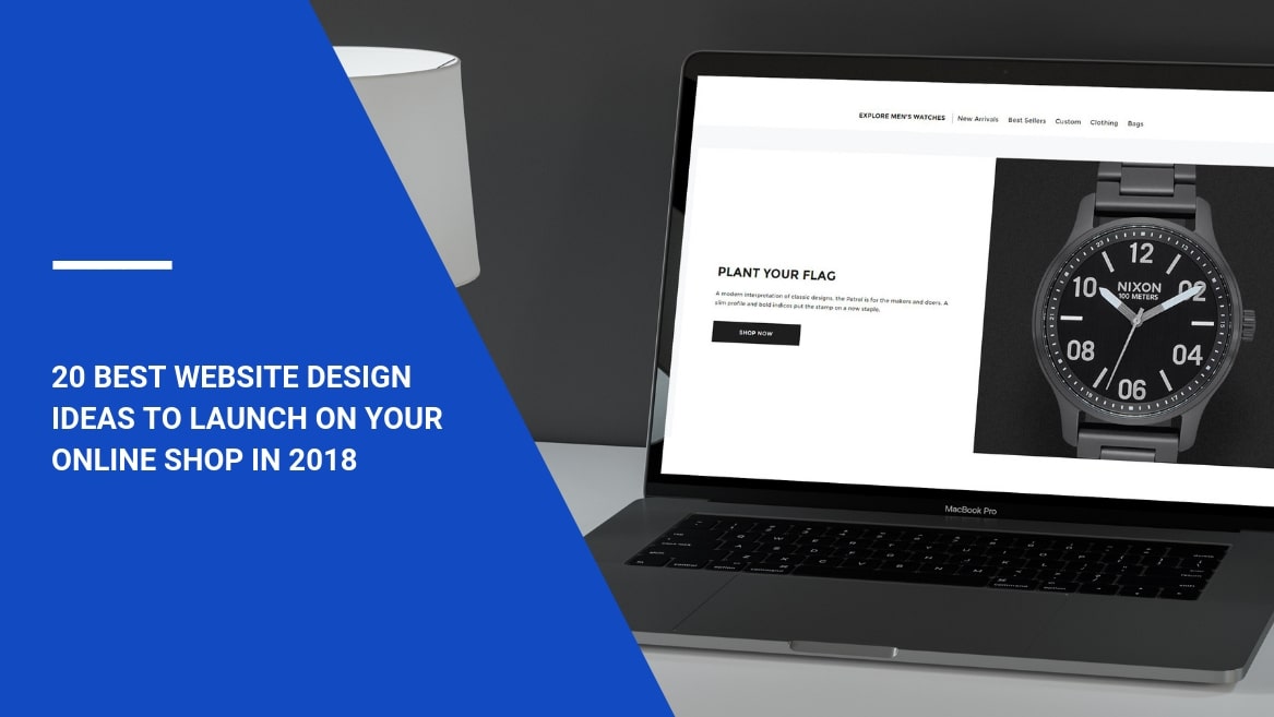
Why is the best website design decisive for being competitive? Digital presence is the only way for retai2lers to survive in the era of eCommerce. The design of your website has a significant impact on your clients who are only willing to find your products quickly and easily.
However, the majority of eCommerce website design examples fail to attract users and turn them into customers. This happens because it is not always easy to follow the latest trends in website design and implement them at the right time.
Years ago, it was hard to imagine that online sales would be impossible without mobile apps and different devices. The nature of shopping has changed, turning into an omnichannel experience for consumers and retailers. That is why it is important to optimize every channel of interaction with online users at all costs. Consumers try new things every day – make sure you keep your site updated according to the demand.
Turn to the best website design ideas that help to improve user retention rates and optimize conversions. If you don’t leave an impact on your customers and just let them scroll through pages without any interest, it will be hard to turn them into your fans.
Content:
- All roads lead to an excellent homepage
- Clean navigation helps to find everything
- Mobile-friendly design is a top priority
- Appeal to the senses
- Grab users’ attention with calls-to-action and popups
- Dynamic content
- Create an impactful design of your website
All roads lead to an excellent homepage
Cool website designs can’t survive without a well-rounded homepage. The way you organize your homepage can influence conversions and improve retention rates. The design of this very page is crucial as it is the first page your visitors encounter. Captivating the attention of your customers from this starting point and making the first amazing impression – you can achieve these goals using the right elements in your design. What are they?
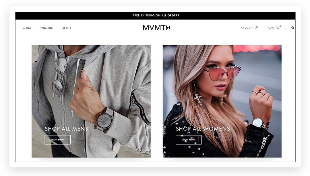
1. Use images that redirect to product pages
MVMT Watches offers a homepage that allows customers to shop the look by clicking on an image.
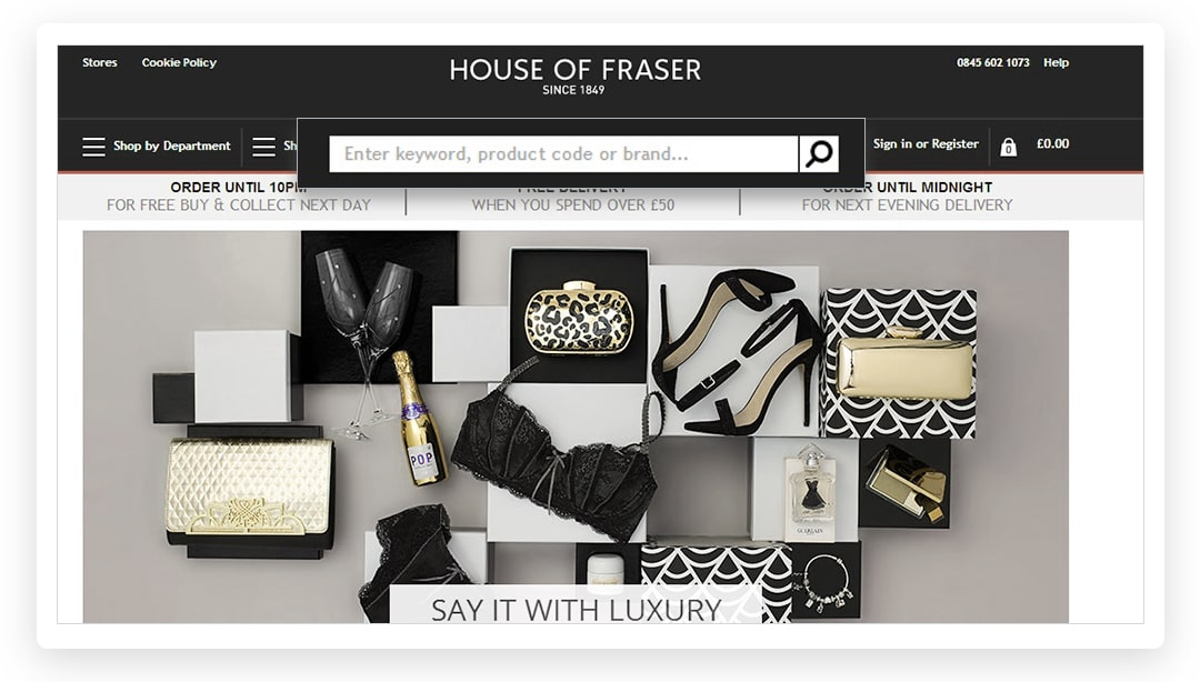
2. Add a search bar
House of Fraser makes their search bar easily findable to avoid friction among potential customers.
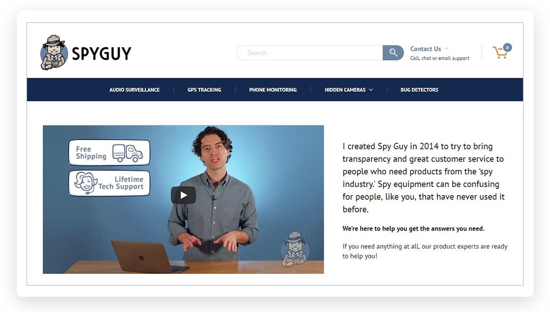
3. Add a video
Video content is a major engagement booster that adds trust and loyalty to your relationships with clients. Team SpyGuy added a video that tells a story about the creation of their brand. The results were amazing: nearly half of visitors click on the “play” button.
Clean navigation helps to find everything
In order to compete with amazing eCommerce websites, it is essential to adopt your design to meet user expectations. Your ability to simplify the website’s navigation is one of the major factors that influence conversions. If users, especially first-time visitors, have a clear path to the checkout, they are likely to repeat their journey on your website. It is important to create a roadmap that leads to the discovery of your brand. However, it is also essential to follow the design conventions that advocate user-friendly intuitive nature of every website’s element.
4. Clear categorization
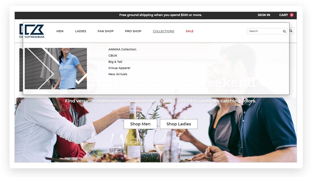
Cutter & Buck created an easy navigation that serves data-hungry visitors the best. Each section in the menu leads to the checkout in one or two clicks.
5. Divide the page into blocks
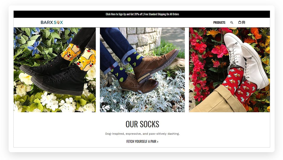
Barx Sox provides snippets of information that users can grab while scanning the page. All the crucial pieces of information are easy to find and understand.
6. Redirect users in a smart way
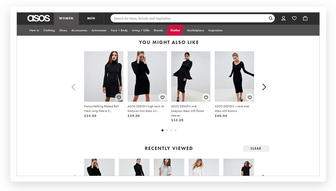
ASOS offers product recommendations that are personalized for each user based on their previous browsing experience.
7. Add sticky buttons
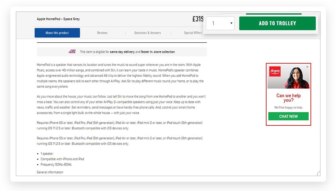
Elements of the menu (“Add to trolley”) follow a user when he or she scrolls a page.
Mobile-friendly design is a top priority
With the popularity of mobile shopping continuing to grow, it is unthinkable to overlook that area of customer acquisition. Online searchers use their smartphones to find information about your brand, your products and reward programs. That is why the content on your website should adjust to any screen size and load as quickly as possible. Mobile website design is a reflection of the new reality of modern retail. What common things does it share in 2018?
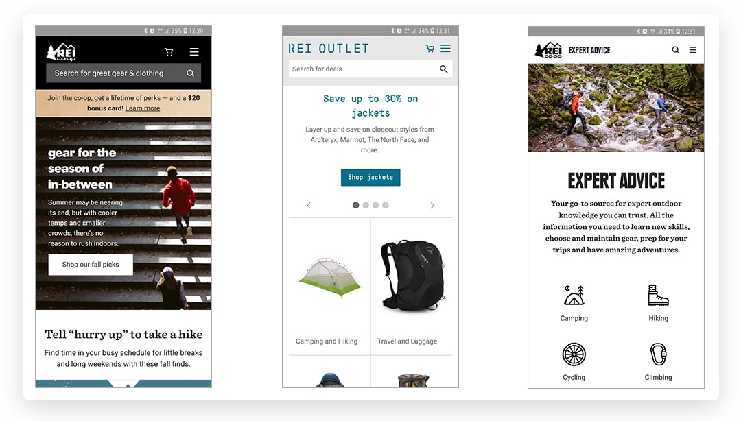
8. Hamburger menus
REI uses a navigation menu that is hidden behind a hamburger icon.
9. Include white space into the design
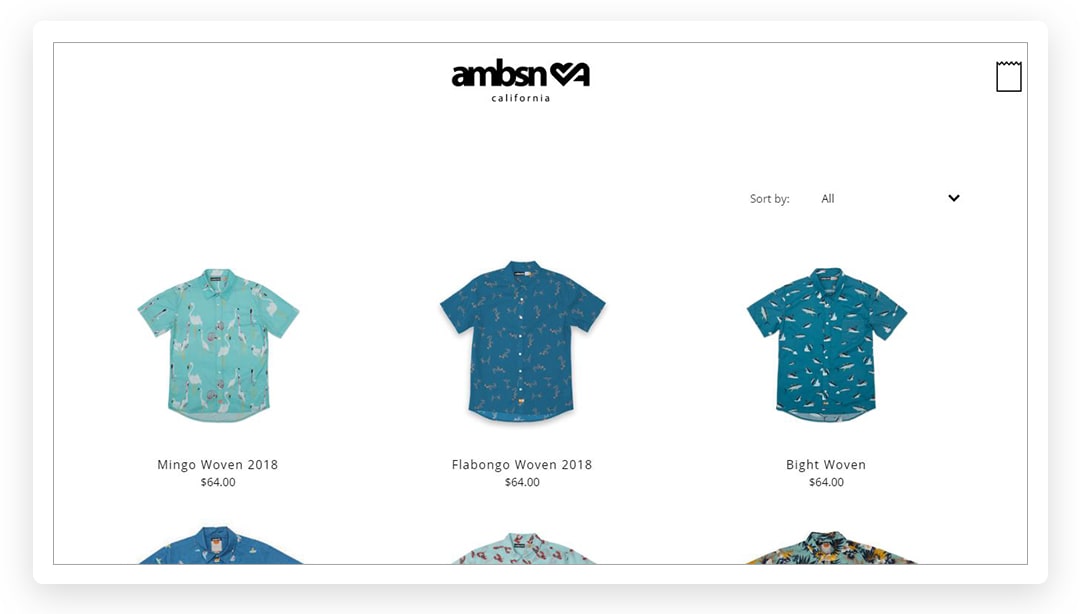
AMBSN uses white space, which significantly improves the loading speed of their website. Apart from that, it makes your products stand out and shine.
10. Long scrolling
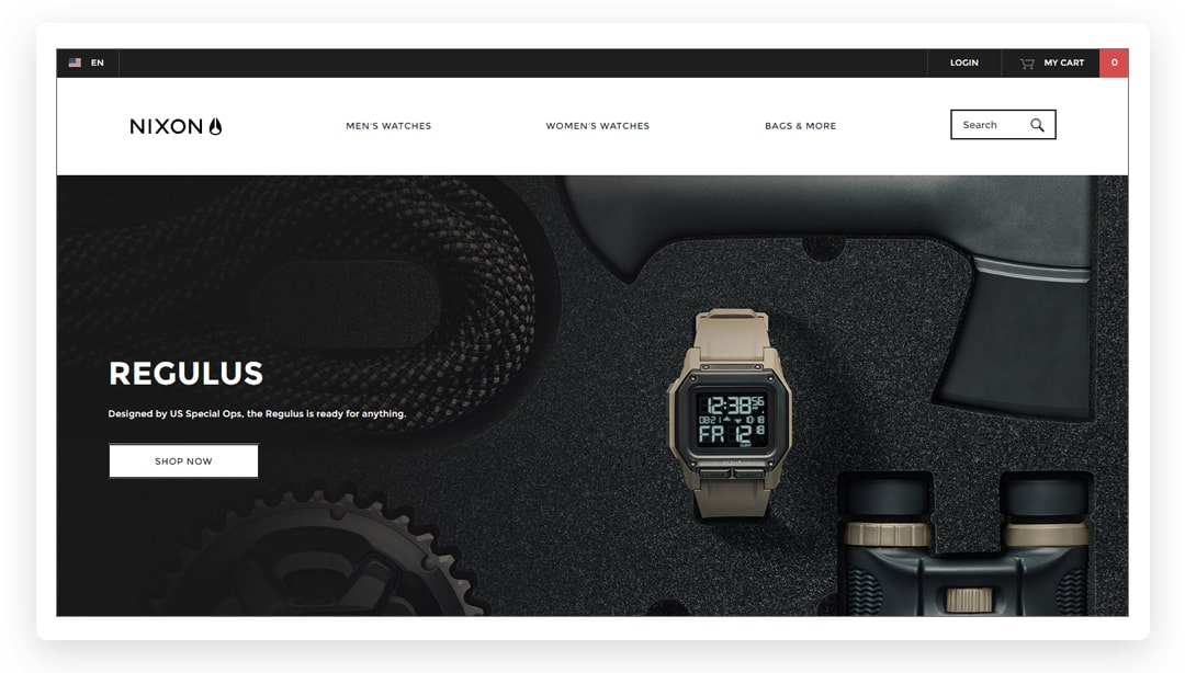
Scrolling is a way to replace clicking on buttons, which is an issue for a mobile interface. Nixon uses engaging images to supply long scroll to maintain the interest of users.
Appeal to the senses
Apart from its informational message, your website can be a place where you can tell a story about your company and express the values that you live by. With the help of certain eCommerce site design tricks, you can reinforce your message and appeal to the masses. What are they?
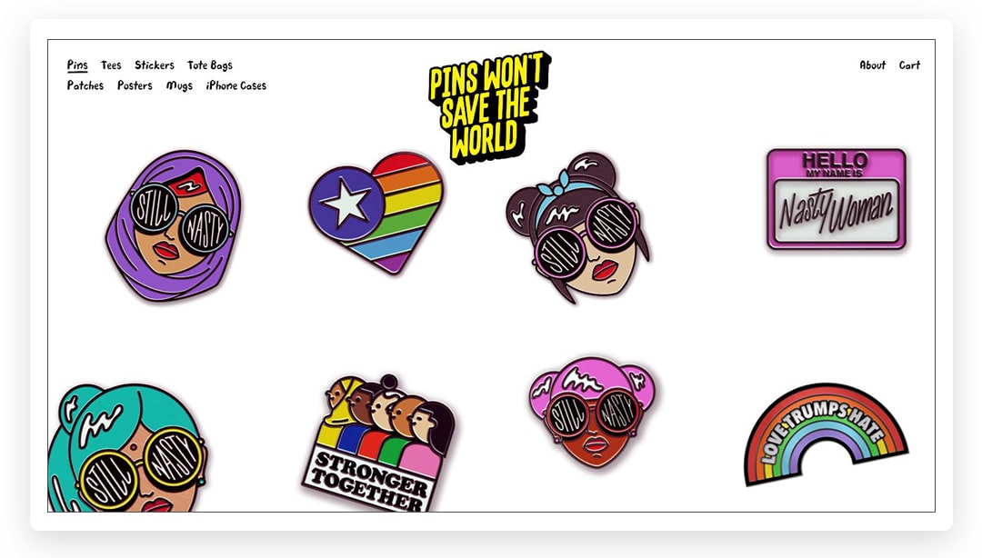
11. Use typography that speaks for your brand
Pins Won’t Save The World uses typography as a part of visual art.
12. Use pictures of real people
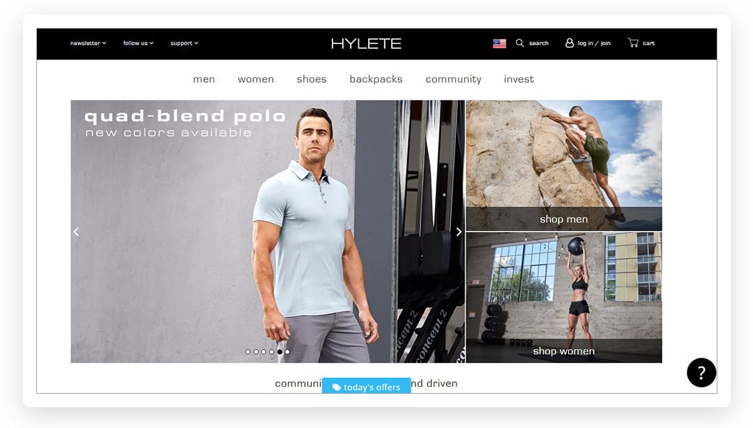
Hylete uses real customer photos with reviews to reinforce the credibility of the brand.
13. Show the team in the “About us” section
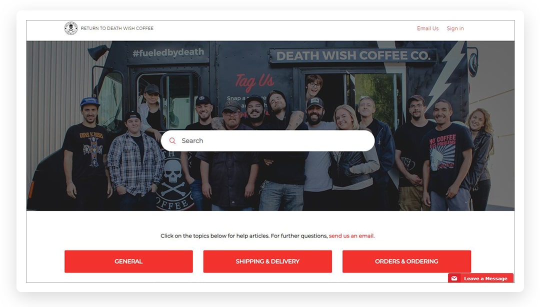
Death Wish Coffee Company reveals the people that stand behind their amazing brand.
Grab users’ attention with calls-to-action and popups
Calls-to-action and engagement boosters are the basic features of the best eshop design examples. The design of these elements matters a lot in a world of stiff competition. With the help of CTA (call-to-action) buttons, it is easy to collect email addresses and introduce new offers. They aim at interrupting the shopping experience and delivering the information that is crucial for online searchers.
14. Collect emails
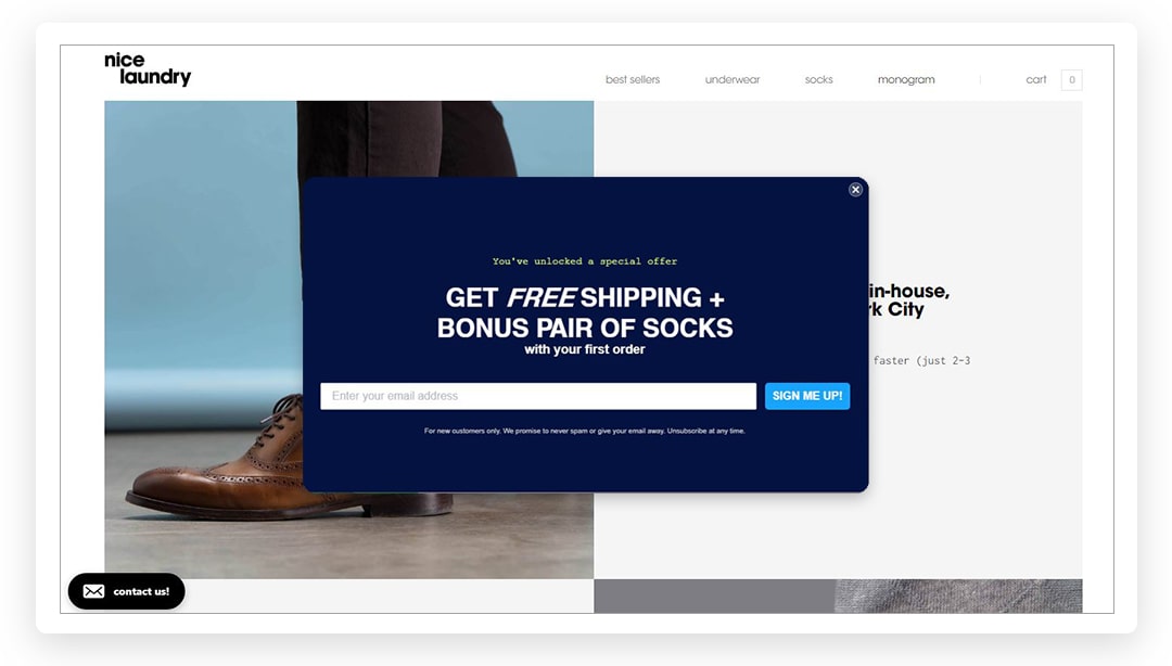
Nice laundry uses the perfect timing to collect emails by offering a bonus.
15. Improve the shopping experience
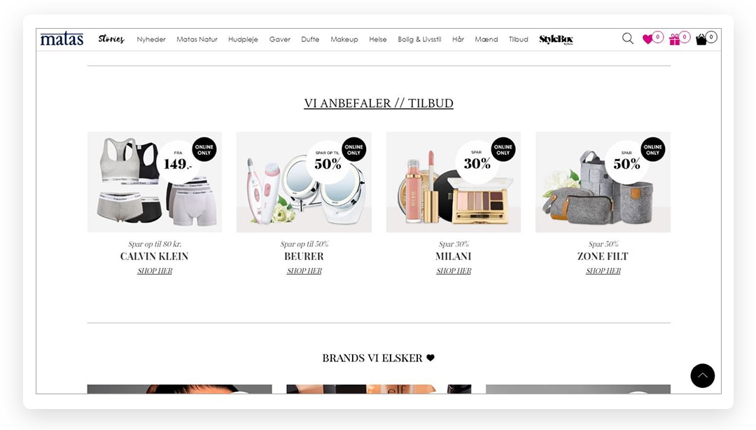
Matas offers an informative guide to its products.
16. Influence cart abandoners
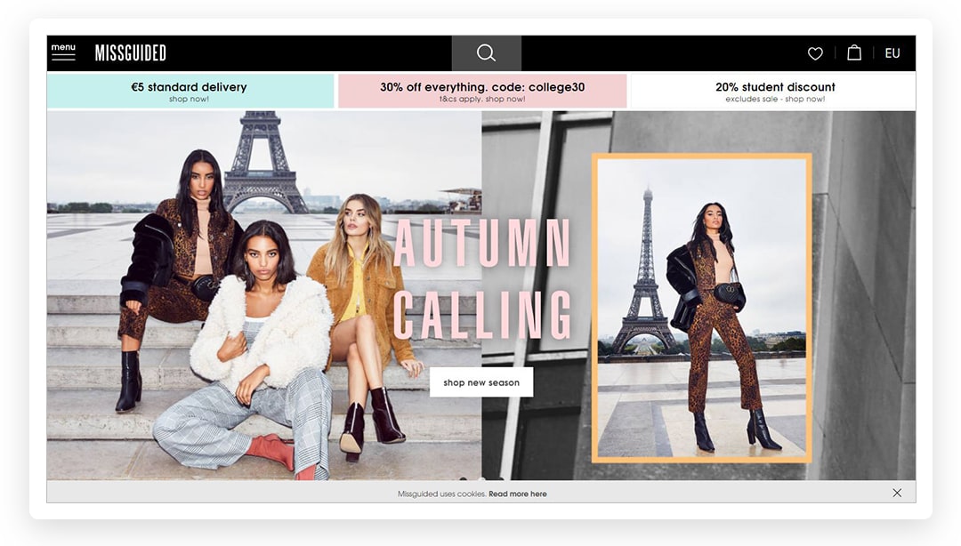
Team Misguided targets visitors who want to abandon their cart with a lower price for the entire order.
17. “Add to cart” on the homepage
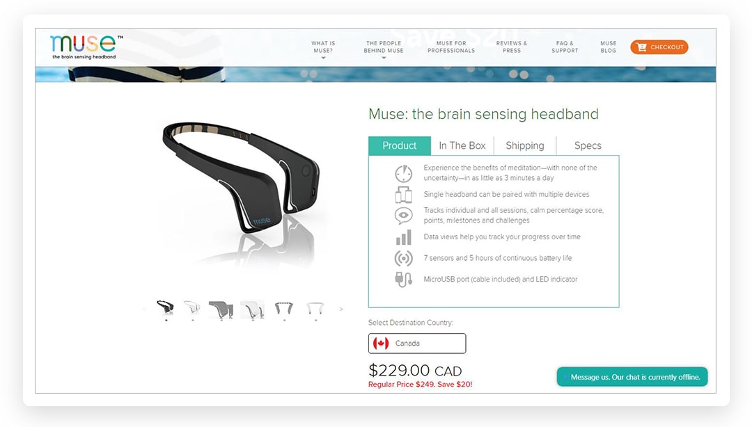
Muse made a push to target their visitors on the homepage.
Dynamic content
The popularity of motion advertising has changed the landscape of modern website design development. Numerous successful brands use mobile animations, cinemagraphs and GIFs to boost engagement, build trust, or tell a story. Mobile animation and GIFs do not affect the loading speed of a website, as they do not require tons of data to work properly. Let us see how you can use motion advertising based on the examples of the best eCommerce website templates.
18. Cinemagraphs
Widely used by recognizable brands (Netflix, Macy’s, Disney, and more), cinemagraphs add interest to product and landing pages, or an “About us” page.
19. Scrolling effects
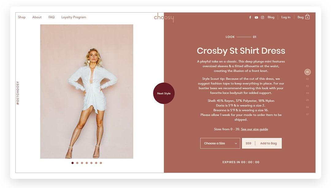
Choosy’s created a landing page that turns scrolling actions into an amusing game: you can scroll individual columns and whole pages.
20. Add page loading effects
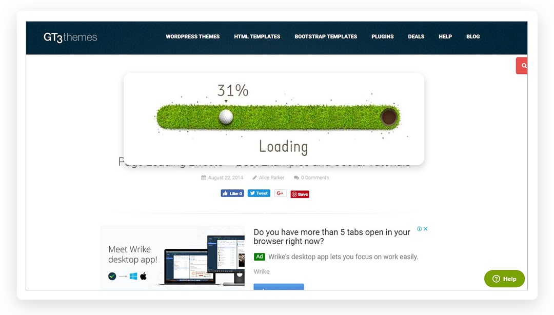
You can add any effect to a page that is loading. Add progress bats, parallelograms, spinning loaders or animation loops, for example:
Create an impactful design of your website
Stay ahead of the competition in your niche by examining the best-looking eCommerce sites. Numerous brands implement the trends mentioned above on their own e-stores. They create a consistent shopping and browsing experience that makes clients return to their stores and spend more.
Know your ideal customers and do everything possible to entertain and please them with the help of the right elements of your website. Test new ideas on the way to the best-selling website design – you never know what feature will appeal to clients until you try it.