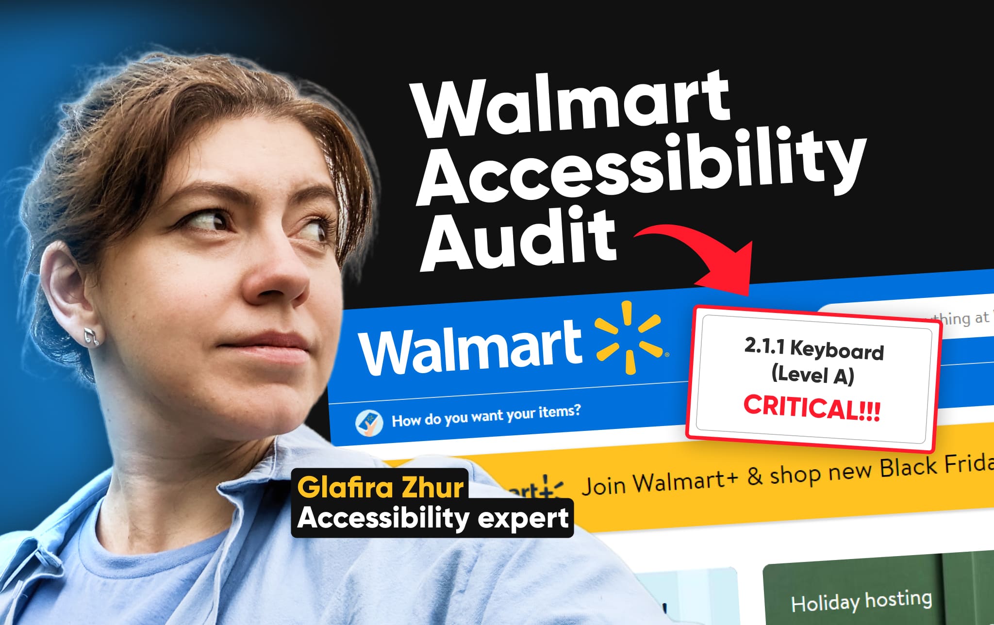
In this article, our accessibility expert Glafira Zhur is going to dive into Walmart Marketplace, a popular online shopping destination. She’ll put ourselves in the shoes of three different users: a user with no disabilities or special conditions, a keyboard user, and a screen reader user. We’ll see how easy or difficult it is for each user to navigate the website and complete a purchase.
Let’s dive in!
- Meet your accessibility audit guide
- Exploring Walmart Marketplace
- Accessibility audit scenario
- Target users
- Reviewing the scenario as an average user without disabilities
- Navigating the Walmart Marketplace as a keyboard user
- Explaining how the screen reader works
- Navigating the Walmart Marketplace as a blind person
- Conclusion
Meet your accessibility audit guide
Hi, my name is Glafira. I’m an Accessibility Team Lead at SpurIT, a Google Developer Expert for web technologies, and a Women Techmaker Ambassador. I’m thrilled to be your guide today as we delve into the realm of web accessibility.
Exploring Walmart Marketplace
Today, we embark on a mission to assess the accessibility of Walmart Marketplace, a popular online shopping destination. As an independent individual, I strive to navigate the digital realm with autonomy, making purchases without relying on assistance. The internet, in its very essence, should be a barrier-free environment, enabling me to fulfill my needs independently. However, does this promise align with reality? Let’s embark on a journey to uncover the truth.
Accessibility audit scenario
Imagine I’m setting out to buy a gift for my brother. We’ll walk through the following scenario:
- Navigating to the homepage: We’ll begin by accessing the Walmart Marketplace homepage.
- Finding the department menu: Our next step is to find the department menu, which will guide us through the various product categories.
- Browsing and filtering products: Once we’ve identified the suitable department, we’ll go to the specific category we seek. Here, we’ll apply filters to narrow down the product selection using filters to come up with a curated list of products.
- Choosing the ideal product: From the refined list, we’ll pick up the product that best suits our needs.
- Adding the product to the cart: With our selection made, we’ll proceed to add the product to our virtual shopping cart.
- Reviewing the cart: To ensure everything is in order, we will meticulously review the contents of our cart.
- Initiating checkout: Next, we’ll start the checkout process, preparing to finalize the transaction.
As we move through this seemingly straightforward scenario, we will see how this experience changes for people with different accessibility needs.
Target users
To get a real picture of how accessible Walmart Marketplace is, I’ll pretend to be three different types of users:
- Average user: We’ll begin by simulating the experience of an average user with no known disabilities or special conditions.
- Keyboard-only user: Next, we’ll pretend to be a user who relies solely on keyboard navigation. We’ll explore if it’s still easy to find and buy things without using a mouse.
- Screen reader user: Finally, we’ll delve into the perspective of a visually impaired user who uses a screen reader to navigate the digital realm. We’ll try to highlight any potential barriers for individuals who rely on assistive technologies.
By trying out Walmart Marketplace as these different users, we’ll get a good idea of how accessible it is for everyone. We’ll also see how the process takes longer for some users than others.
Reviewing the scenario as an average user without disabilities
As an average user without disabilities, I found the Walmart marketplace’s main page to be quite straightforward. Navigating to the desired category, selecting a product, and adding it to the cart was a breeze.
Navigating to the desired category
The first step involved accessing the department menu, which presented a drop-down list. I opted for the “gift finder” category, keeping in mind that my brother wasn’t exactly the easiest person to shop for. To avoid breaking the bank, I narrowed down my search to gifts under $25.
Refining the search options
There was a variety of filters and pre-selected items on the gift finder page. To refine my options further, I used the persona drop-down menu, choosing “for him” as it was intended for my brother. Also, I applied the “home gifts” filter to align with my brother’s love for homeware and his wife’s preferences.
Selecting and adding the product
Then, I scrolled down and discovered the perfect gift for my brother – a set of four Christmas mugs. The timing is perfect, as Christmas is just around the corner. Clicking on the product page revealed the mugs in all their glory.
I reviewed the product details, ensuring the image matched the description. Everything checked out, and the ever-present “add to cart” button remained within easy reach. With a simple click, the mugs were added to my cart.
Completing the purchase
A confirmation notification popped up, informing me of the successful addition. I proceeded to the cart, where I verified that the mugs were indeed there. A final click on the “continue to check out” button marked the end of my seamless shopping experience.
Navigating the Walmart Marketplace as a keyboard user
Navigational tools for keyboard users
Unlike average users who rely on a mouse, keyboard users interact with the interface using a combination of keys. The primary keys for navigation are the Tab and Shift-Tab keys, which allow for moving forward and backward through the interface, respectively.
Keyboards users navigate through interactive elements, excluding text fields. To interact with drop-down menus, search suggestions, and other interactive elements, users can utilize the up, down, right, and left arrow keys. The Enter and Space keys serve as activation keys, while the Escape key facilitates closing menus and modal windows.
Moreover, keyboard users rely on the arrow keys for scrolling. By pressing the up or down arrow keys, users can scroll vertically through the page.
In a nutshell, keyboard users navigate the Walmart Marketplace by employing a combination of Tab, Shift-Tab, arrow, Enter, Space, and Escape keys to interact with various elements and navigate through the interface seamlessly.
Let’s now explore how a keyboard user navigates the gift finder process.
Navigating the Departments menu as a keyboard-only user
As a keyboard-only user, I navigate to the Departments menu using the Tab key to identify the location of the focus. I noticed a “skip to the main content” link, which will be discussed later. Pressing the Tab key again displays a clear focus state with a distinct border that adapts to light and dark interfaces.
Focus not going to the menu once it’s opened
I activate the department menu using the Enter key. The menu opens, but the focus remains unclear. I press the top key to check and discover that the focus has shifted elsewhere. Pressing the Tab key brings the focus back to the Department button, indicating an issue with focus management.
Ineffective arrow keys for menu navigation
Within the menu, I attempted to use arrow keys to navigate through the items, but the arrows functioned as a scroll instead. I was forced to rely on the Tab key to progress through the menu items one by one.
Challenges accessing submenus
Upon pressing Enter to activate a menu item and open a submenu, I remained on the previous menu item instead of transitioning to the open submenu. With caution, I pressed the Tab key, hoping it would move the focus to the open submenu rather than continuing through the parent menu items. Fortunately, the Tab key successfully directed the focus to the submenu.
Limited accessibility within submenus
Similar to the parent menu, the arrow keys within the submenu were ineffective for navigation. I was once again restricted to using the Tab key to progress through the submenu items.
Reaching the filters section
To reach the filters section, I repeatedly pressed the Tab key to navigate through various interactive elements. Yet, I discovered a “skip link” that immediately transported the focus to the top of the page, providing a convenient shortcut.
Loss of visual focus after using Skip to the main link
I initiated the “skip to main content” link by pressing the top key. The link appeared with the prompt “Skip to main content,” allowing me to bypass the navigation, which remains consistent across all pages. While navigating through the website, I frequently open multiple pages. If I were forced to manually navigate through each page’s navigation, I would likely become frustrated and abandon the task. Fortunately, the “skip to main content” link provides a convenient solution.
Upon activating the link with the Enter key, I was swiftly transported to the main content area. The page even scrolled upwards slightly to highlight this action, leaving no doubt that something had happened. It appeared that I was directly accessing the filters section. Yet, upon pressing the Tab key to identify the focus, I discovered that no elements were visible on the screen.
Repeatedly pressing the Tab key yielded no results until the fourth press. This indicated that the focus was present, but it was hidden under the header due to the interface’s scrolling behavior. This misalignment between the visual target and the actual focus point created a disorienting experience.
To confirm this, I pressed the Shift+Up arrow keys to scroll upwards. Certainly, the focus had been reset to the very beginning of the main content. But, the scrolling interface hid these elements, rendering them invisible to the user.
It dawns on me; that perhaps the visual target of the link does not align with the actual focus. There’s an incongruence between the displayed target area and the actual focused zone.
With a determined effort, I finally navigated to the filters area.
Filtering reloads the page and resets the keyboard focus
As I press the Enter key on the Persona drop-down, it opens, and I navigate through the options using the up and down arrow keys. Selecting the “For Him” value, the page reloads, leaving me disoriented about the focus location. Pressing the Tab key shows that the focus has shifted to the top of the page, forcing me to retrace my steps to reach the filters. This process requires pressing the Tab key four times, highlighting the inconvenience for keyboard users.
For mouse users, the page reloads are barely noticeable. However, for keyboard users, they’re a constant source of frustration.
Moving on to the products list, I noticed the lack of skip links, making it necessary to tab through every product cart to reach the desired one. Once on the product list, I encounter individual product carts with three tab stops. While manageable, it’s still an unnecessary hurdle.
Finally reaching the desired product cart, I press Enter to proceed to the product page. The “Skip to main content” link is still present, which is positive. However, upon skipping to the main content, the page layout is still not fully optimized for keyboard users. The breadcrumbs navigation links remain the first items to focus on, requiring me to tab through them to reach the actual product description.
Tab through product content to reach the Add to Cart area
For a keyboard user navigating this product page is a frustrating experience. I see the “Add to Cart” button, eager to add the item to my shopping list, but there’s no clear path to get there using only my keyboard. This page is divided into two sections, and I have to meticulously tab through each element on the left side before I can even reach the carousel of products on the right.
As a keyboard user, I expect to be able to access all the content on the page without having to rely on a mouse or touch gestures. However, the carousel doesn’t behave as expected. While non-keyboard users can click the “Next” button to view more products, keyboard users have to press the Tab key repeatedly, as many times as there are products in the carousel. This is inefficient and slows the user experience.
I finally make it past the carousels, and I’m excited to see the “Add to Cart” button just a few steps away. But as I press the Tab key, I’m surprised to encounter another carousel with reviews, forcing me to repeat the process of tabbing through every product. Finally, after what felt like an eternity of tabbing, I reached the “Add to Cart” button.
Navigating back to the Cart link from the Add to Cart area
With a satisfying click, the product is added to my cart. But now I face another challenge – navigating to the cart link, which is at the top of the page. I have two options: either tab through the entire page to reach the header, or reload the page, hoping the focus lands on the cart link.
I opt for the latter. After the reload, the page reappears, but the focus remains unreachable. This behavior is controlled by browsers; the browser decides where the focus goes after a page reload.
To specify my location, I used the Tab or Shift+Tab keys. Finally, after 10 taps of the Tab key, I reach the navigation bar, where the cart link awaits. With everything set up, I hit Enter, and voila, the cart appeared.
Upon opening the cart, I noticed that its structure mirrors that of the product page: interactive elements on the left and essential content on the right, which is crucial for our needs. To proceed with the purchase, I navigate to the checkout button, satisfied with everything on this page. Our goal is simple: we just need to buy a mug.
I hit the Tab key, navigating through the interface that I’m quite familiar with. Utilizing the “skip to main content” link, I noticed a strange scroll. Pressing the Tab again, I reach the left section of the cart, where I find a “skip to checkout section” link. It would be really impressive to have a similar link on the product page, allowing me to skip the left part and jump straight to the “add to cart” button.
Pressing this skip link, my focus seamlessly shifts to the right part of the page, allowing me to effortlessly continue to the checkout button. It’s a convenient feature. I hope the absence of this skip link on the product page is just a glitch. I’m optimistic they’ll add it because it seems like they understand how it should work.
With a simple press of the “continue to checkout” button, I reach my destination, taking a bit longer for a keyboard user. Now, let’s see how it goes for the screen reader.
Explaining how the screen reader works
Before we delve into navigating with a screen reader, let’s break down the basics. A screen reader reads everything on the screen, meticulously narrating each element and its placement. The order of narration follows the structure of the code – the arrangement of elements in the code determines the order in which they’ll be read aloud.
Now, imagine you’re a visually impaired individual using a screen reader. You’re essentially navigating a website, relying on the screen reader to guide you. This can be a challenge, especially when it comes to understanding the page’s structure.
Header, content blocks, and clearly defined sections – all these visual elements might go unnoticed by a screen reader user. They’ll have to rely on the screen reader’s narration to build a mental map of the interface, its organization, and layout.
Here’s a key difference between screen reader users and sighted users. Sighted users rely on the Tab key to navigate, often skipping over non-interactive elements. However, the screen reader users often use arrow keys to move through the page, element by element, from top to bottom and left to right.
Now, let’s put this knowledge into practice!
Navigating the Walmart Marketplace as a blind person
Now, let’s put ourselves in the shoes of a blind user. I’ll reload the page, and the first thing I’ll hear is the title, which is the same as the tab name in your browser. This is how screen reader users orient themselves and get the page’s context.
The screen reader meticulously describes every element on the page, including the title. It’s like having a verbal tour guide. But you can pause the narration and move through the page at your own pace.
For screen reader users, there’s an accessible menu that outlines the page’s elements and their types. Let’s check it out. [screen reader: elements list dialogue]
The menu provides us with an overview of the page’s structure, including links, headings, form fields, buttons, and landmarks. These landmarks are crucial for understanding the page’s organization and navigating seamlessly through the visual areas.
Landmarks don’t capture the full visual structure
I switch to the landmarks tab to get an overview of the page’s structure. The screen reader identifies the banner area, its contents, and the main navigation. It also mentions the secondary navigation and the footer.
This provides a basic understanding of the page’s layout. However, the main content section contains numerous subsections, which can be challenging for a blind user to navigate effectively. To gain a clearer picture, let’s explore the headings tab.
A single heading for the screen reader, yet visually more
The screen reader announces only one heading, an H1 heading, on this page. However, visually, there are numerous headings, each marking a different section. This can be confusing for a blind user navigating the page solely through the screen reader’s narration. They’ll need to tab through every element, a tough and time-consuming process.
To make the navigation more efficient, let’s locate the Departments button. From the screen reader’s description, it seems to open a menu with a comprehensive list of departments. I’m pretty sure clicking this button will open up the menu, and then I can check out what’s inside. Let’s give it a try!
Menu navigation challenges for screen reader users
I hear a generic announcement saying that the menu has been expanded, but there’s no indication of where the focus is. It would be helpful if the screen reader would provide more context, such as which item on the list I’m on and whether it’s selected. Now, I need to press the Tab key or use the arrow keys to get the full picture.
I press the arrow key and find myself on a link called “All Departments.” I guess this is the right place to go. I notice a list of 26 buttons, and realize I need to find the one labeled “Gift Finder.”
But I’ll proceed at my own pace, not relying on the screen reader’s speed. So, I’m bending the rules a bit by repeatedly pressing the arrow key without listening to the content, given that I can visually capture it. But both approaches maintain the same pace due to the screen reader’s speed.
The screen reader announces that one of the buttons is collapsed, and I know that pressing it will expand the menu. However, I haven’t received any updates on the current menu state, which makes it difficult to navigate seamlessly. Ideally, the focus should shift to the expanded menu, and I should be able to use the down arrow key to navigate within it without going through the parent menu first. Unfortunately, in our scenario, I have to navigate through all the parent items before reaching the child menu.
It’s still a bit unclear about what’s happening on the screen. We’ve transitioned from one list to another one and reached a heading level 2. I continue using the arrow keys to explore the options. It seems like the list of four items has a submenu with nine items inside it.
Finally, I arrived at the link I needed, “Gifts Under $25.” I activate it using the Enter key. The screen reader doesn’t clearly catch the menu structure or semantics, making it challenging for visually impaired users to understand the website’s organization. This information can be provided by adopting HTML semantics.
Moving to the category filters page, I find myself at the top. I need to figure out the page structure based on the provided landmarks. There’s no obvious indication of the structure, so I’ll again check the landmarks for something useful.
The structure of the category page headings is not clear
Let’s start by examining the headings. I notice a heading that reads “Gift Finder 1,000+,” which doesn’t offer much significant information. Unfortunately, there are only two headings on this page, and neither provides the information I need.
Here, we can identify two additional landmarks within the main landmark, one of which is “sort and filter.” This seems like the right place to access the filtering functionality. Yet, upon entering this landmark, it becomes clear that it doesn’t contain all the available filters. There are still numerous filters hidden from us.
The only way to fully understand the page is to manually navigate through the page using arrow keys. This approach is incredibly inefficient and time-consuming. It would be much more user-friendly to have labeled regions or landmarks that indicate the location of different filtering options.
In this case, the right region or landmark isn’t suitable for me; I won’t find the needed filters here. Let’s take a shortcut for a different perspective. Just to understand how our filters and elements are experienced by a blind person. I’ll opt for “Home Gifts” from the filter by using the arrow key. This leads me to toggle buttons. Each button has a state, indicating whether it’s currently activated or not.
Let’s quickly navigate to the right one.
Filter applied, page reloads, screen reader resets to page top
As I press the toggle button, the page reloads, just like it would for someone using a keyboard. I find myself back at the top of the page, and I need to navigate to the section I’m interested in. Screen reader users have a variety of ways to explore a page. NVDA users, for instance, can use the “D” button to move through landmarks, which include headings, headers, footers, main content sections, and more. With a simple press of the “D” button, I can efficiently navigate through these landmarks.
Within the main landmark, I navigate using the arrow keys, delving deeper into its content. I encounter a combo box labeled “Who’s It For,” and I decide to select the suitable Persona from this dropdown menu.
With a determined press of the enter key, the dropdown menu gracefully opened, displaying a selection of four options. Using the arrow keys, I navigate through this dropdown, carefully considering each option before making my choice. “For Him” seems like the perfect fit for my current needs. Upon selecting this option, the page reloads once again. As the page loads, I remember encountering a landmark labeled “Sort and Filter,” positioned strategically near the product lists. This landmark promises to expedite my search for the perfect product.
With arrow keys, I navigate through the page’s elements to the product list. I’m familiar with the H1 heading that serves as the product list’s gateway. In the future, I can quickly access this area by pressing either the “1” or “H” keys on my keyboard. While I could continue scrolling through the product list indefinitely using the down arrow key, let’s employ a shortcut.
I’ll use the Tab key to navigate through the content, just like keyboard users. It allows me to explore the page’s elements one by one. However, in this current situation, the product list isn’t semantically structured, meaning I’ll need to repeatedly press the Tab key to hear each product description. Screen readers can handle this type of option. Additionally, adding headings to the product carts, such as H3 or H2 based on the previous level, would further enhance the navigation experience. However, in this particular scenario, we’re limited to using the arrow keys or Tab keys, which can be slightly less efficient.
Proceeding to the product page, as a blind user, understanding the page’s structure is challenging. For exploration, I rely on arrow keys or directly access the main content using the “D” key to navigate through landmarks. We’ve reached the main content, equivalent to using the skip link. Screen reader users like me can also employ skip links to access the page’s core content efficiently. Let’s find the “Add to Cart” button; my experience suggests it likely accompanies an H1 heading. A swift press of the “1” key on my keyboard instantly transports me to the H1 heading.
Unnecessary details for the screen reader user
As I navigate the product page, I’m presented with different information, some of which is strictly for screen reader users. A string of text emerges, informing me of the product’s reviews, a link to view those reviews, and a discount price. While this information about discounts is not visible to sighted users, it’s an excellent example of how developers sometimes overlook elements. Whether due to oversight, intentional exclusion, or simply a forgotten detail, these elements can provide screen reader users with more information than their sighted ones. In this case, the price tag discloses that I’ve saved an impressive zero dollars on this mug. I giggle at the irony, wondering if the developer intended to share this message to screen reader users specifically. With a satisfied sigh, I press the down arrow key, ready to explore more.
Upon adding the product to the cart, the user doesn’t receive the correct notification
With a satisfying click, I add the product to my cart, even faster than the keyboard user. Yet, confusion arises as the screen reader announces the “increase quantity button.” This unexpected notification leaves me momentarily disoriented, unsure of the focus’s direction or the reason behind the active button. A clear notification informing screen reader users of successful cart additions would be a welcome improvement.
Remembering the intuitive landmark structure, I swiftly navigate using the Shift + D shortcut, effectively guiding me toward the “cart items and accounts” section. I reach the region swiftly, without the need to reload the page. This efficiency is a definite advantage compared to the experience of a keyboard user. Next, I head to the cart link. It’s quite satisfying to hear that we now have one item in our cart, along with the total amount we need to spend. Let’s proceed to explore the cart.
Some invisible alert messages appeared while loading the cart page
As the page loads, an unexpected alert message suddenly appears, demanding immediate attention. This intrusive notification halts the flow of information, leaving me in a state of uncertainty. Why was this alert triggered? What message does it share?
Navigating to the main content, I found a heading named “Cart.” Yet, understanding the page’s structure proves challenging. Although I attempt to use the landmarks menu to identify page sections, it only reveals a banner, the header with search and navigation areas, an unidentified banner, and the footer, providing limited structural insight.
Opting to navigate by buttons, I press the ‘b’ key, luckily discovering the “Continue to Checkout” button. Interesting that it behaves more like a link, potentially leading to another page. Pressing it, I reach the final step – success! This experience hints that, for a blind person, navigating the page might be more accessible, leveraging screen reader functionality. However, it’s acknowledged that exploring content takes longer for screen reader users.
Looking back on this journey, I’ve gained valuable insights and interesting experiences while navigating the marketplace.
Conclusion
Let’s wrap things up. For keyboard users, Walmart’s focus is clearly visible, complemented by a convenient skip link – a convenient feature. Enhancing the add-to-cart flow on the product page and concealing invisible carousel items from the tab border would be beneficial improvements.
These improvements will significantly enhance user navigation efficiency. While screen reader users generally find it easier to find their way around, it’s critical to add semantic markup for interactive complex widgets, such as menus, to ensure comprehensive accessibility. Additionally, establishing a clear page structure with well-defined landmarks and employing a clear heading structure will further improve navigation for all users. Also, preventing page reloads upon filter changes would benefit all users, as it eliminates the disruption of navigation and maintains focus on the current page content.
We know that Walmart recognizes the importance of accessibility, and it’s a requirement they take seriously. So far, they’ve done a great job. And as we can see in this brief review, there are still areas where they can enhance their accessibility features. We understand that accessibility is not an easy thing, and we wish Walmart continued success in their commitment to providing an inclusive and accessible experience for all users.
And, of course, don’t hesitate to reach out. Let’s discuss your web accessibility project and improve the accessibility of your shop or marketplace. I’m always here to help.
Thanks for watching or reading our web accessibility audit of Walmart Marketplace. Let us know which website you’d like us to explore next. For more insightful content, please subscribe to our channel and hit the bell icon.