Without exaggeration, the Internet is replete with applications aimed to increase conversions on Shopify stores. However, a wide selection does not guarantee effectiveness. On the contrary, finding the best-working app suitable for the exact needs of your business can sometimes be very difficult.
Often, even the experience of colleagues from related business areas cannot be applied to your business with the same efficiency, and their success stories seem far-fetched and paid for.
Many shopkeepers know from personal experience how individual the approach to choosing widgets for a website could be. So, in this article, we share detailed instructions with real examples, which will help you find the most suitable option easily, while saving money on it.
Content:
- The App Choice Which Will Save Your Money
- The 3 Must-Have A/B Tests For You Store
- Unexpected Success
- A/B Testing as a Way to Increase Profits
- A/B Test Result Analysis Tricks
The App Choice Which Will Save Your Money
First of all, you should select an application that is supposed to increase the sales of your store. The main mistake that shopkeepers make at this stage is choosing widgets randomly without taking the specifics of the business into account. Let’s take a closer look at what is meant by this specificity:
- Average order value
- Store conversion
- Bounce rate
- Seasonal fluctuations in activity
- Delivery and packaging expenses, etc.
Based on the analysis of the main business metrics, its features, and analytics (for example, using Google Analytics), a hypothesis about what exactly should boost sales is made. Internet merchants often carry out meaningless experiments that have no influence on the business. That’s why they may have the impression that all such widgets are ineffective, although this is fundamentally wrong.

There are some widgets and applications that are inherently universal, but you need to keep in mind that in different stores they will work with different results. This is exactly the type of an application that we will use as a baseline: Quantity Discount & Tiered Pricing app for Shopify. The main task of this application is to increase the size of the average order value and thereby the overall profit of the store. It is easy to manage, does not require creating duplicates in inventory, and allows you to make bulk changes on the go. It’s perfect for those shops where:
- The cost of goods can be reduced without affecting the store
- Prices for goods are not too high
- The goods are in constant demand (there is no point in offering to buy two identical smartphones at a discount)
How does it work?
A widget, which offers users the opportunity to buy several units of goods simultaneously at a discount, is added to the product page. The discounts can be controlled through the settings of the application itself as it is easily and quickly configured.
As a result, the user sees the benefit and willingly buys a few items at once, even if they did not plan to buy more than one unit initially. In addition, the first 14 days of the application can be used for free, which is enough to conduct a small test.
However, if your research shows that some other application can potentially improve your business metrics, use it! The main thing is to determine a hypothesis as opposed to taking random actions.
The 3 Must-Have A/B Tests For You Store
In the Quantity Discount & Tiered Pricing app you can customize the widget that your customers will see. Although this is not obvious, sometimes even the color of the widget can affect the buyer’s decision, so it’s worth taking these tests seriously.

What to test?
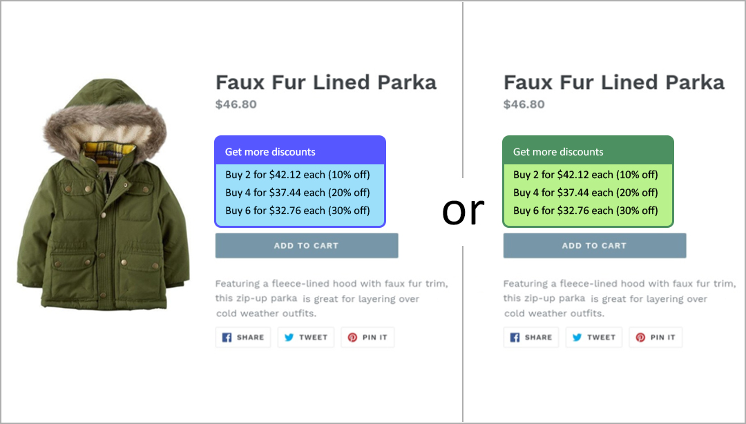
- The location of the widget (before and after the “Add to cart” button, an example is above)
- The widget’s design
- The call to action on the widget
How to test?
Unexpected Success
- Once again, I decided to experiment with business solutions to increase profits and better understand my customers. Sometimes the client is motivated not by what you bet on and your actions arise the reaction opposite to what you think they do. I found a way to learn about their preferences at no particular cost with an A/B test and I’ll talk about how I studied the influence of a Quantity Discount widget design on the store’s conversion. Well, let’s go!
A/B Testing as a Way to Increase Profits
- Why do we need A/B tests? Think of a situation where the project is launched and gains traffic while users actively use the resource. And one day you decide to change something, for example, a CTA phrase or add a tiered pricing widget.
- How will this affect sales? At first glance, the buyer comes to the store for the goods, that is, the widget’s design and font descriptions should be of little importance to customers. However, in practice, this is not the case. The visual appeal of your resource greatly affects sales, sometimes in a truly incomprehensible way. A/B testing was invented in order to experimentally determine the influence of these factors and provide a better design.
A/B Design Testing
I stumbled across the Internet to the description of this Quantity Discount application. The decision came suddenly. I have long wanted to try to sell goods in bulk, and at the same time decided to check out the ready-made design templates provided with the app. Frankly, the results puzzled me. Look at these samples to see why.
- Consider hourly & seasonal changes, holidays, etc. Usually, shopkeepers remember these apps and tricks on the eve of holidays and discounted sales. Thus, they deprive themselves of the opportunity to obtain objective test results. If you look at the analytics of your site, it becomes clear that the activity of users differs even on different days of the week. That is why there is no sense in conducting tests with a length of fewer than 7 days. You should also consider the length of the sales cycle while choosing the test period.
- Use parallel testing. Since it is difficult to choose the time for tests, there are ways to divide the audience of the website into segments and show them different versions of the design. This can be done, for example, by adding additional scripts to the page and sending cookies to users’ browsers, which contain information about what version of the website to download. Thanks to this, you can objectively compare the impact of test changes on user activity and avoid the negative consequences of failed tests.
However, interference in the page code may violate its integrity, which can lead to errors in previously working functionality. If you think that this method can harm your store, there is an easier way. Make changes one by one at regular intervals, and then compare the results. Still, in this case, you should avoid seasonal bursts of activity described in the previous point.
A/B Test Result Analysis Tricks
When the data meets our expectations, there is a temptation to make hasty conclusions about the results of testing. The effect of making a change is defined as the difference between the average values of the key indicators. To find out whether the results are worth applying, try this:
- Construct the distribution curves characterizing the frequency of a random variable occurrence in the test and control samples.
- Mark the average values on the curves.
- Estimate the intersection of these two graphs.
In this case, the error rate corresponds to the intersection area of these two distributions. As a rule, to make a positive decision about the effectiveness of changes, a significance level of 90%, 95% or 99% is chosen, which means the intersection area should be less than 10%, 5%, and 1% correspondingly (Wikipedia). If the significance level is low, there is a danger of making erroneous conclusions about the obtained effect.
P.S. We’ll be happy if the tips we gathered here help your business to grow! If you want to get more tips, stay tuned to read about 7 tips to boost an online store owner’s profit in the next 24 hours. Don’t miss out on the fun!