Our team has partnered with Tropicfeel, a Spanish travel gear brand, for years. Initially, we created a custom theme, developed a design system, and improved the website’s loading speed and performance. Following that, we assisted them in creating unique product pages and maintaining the website for an extended period.
But when Shopify Online Store 2.0 came along, our experts saw it as the perfect solution for their needs. In this article, we’ll open up about how we put our client’s needs first, even when it means sacrificing a steady stream of income.
Let’s dive in!
Why did we advocate for OS 2.0?
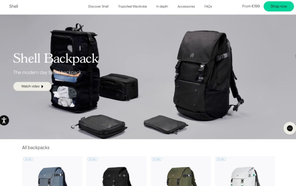
Tropicfeel pays great attention to the design of their website. This startup has a deep understanding of its products and customers, and it is important for them to provide detailed descriptions of each product. Unlike other companies, they create a separate page for each new product. These pages are not just standard product pages with a photo, price, and description; they are full-fledged landing pages with a lot of sections. Tropicfeel provides detailed descriptions of the product’s benefits, usage options, video reviews, and recommended accessories. They add a lot of informational sections before leading the user to the purchase. In fact, almost every page on their website, except for the accessory pages, is accompanied by such a number of blocks.

Although the page structure is roughly the same, the content is unique for each collection, making them non-identical. As Tropicfeel frequently updates their collections, they often reached out to us for landing page development. This was a costly process.
After the release of OS 2.0 with its Dynamic Sections, we carefully studied the capabilities of this upgrade and proposed Tropicfeel to leverage it to the fullest.
What changed when moving from Shopify OS 1.0 to OS 2.0?
The old way of creating new pages
Let’s take a look at how the process of creating a new page worked before the release of OS 2.0.
Even if Tropicfeel used sections that were similar in design, a developer was still required. This was because we had to copy the code, save it in a separate file, customize it, connect a snippet, and broadly replicate everything, including creating a separate set of settings to control the content of that landing page, and duplicate section on the website.
Whenever Tropicfeel launched new products and wanted to create new landing pages, even if they entirely matched the previous structure, they had to contact us for assistance. The only page where sections could be modified was the homepage.
Empowering Tropicfeel with OS 2.0
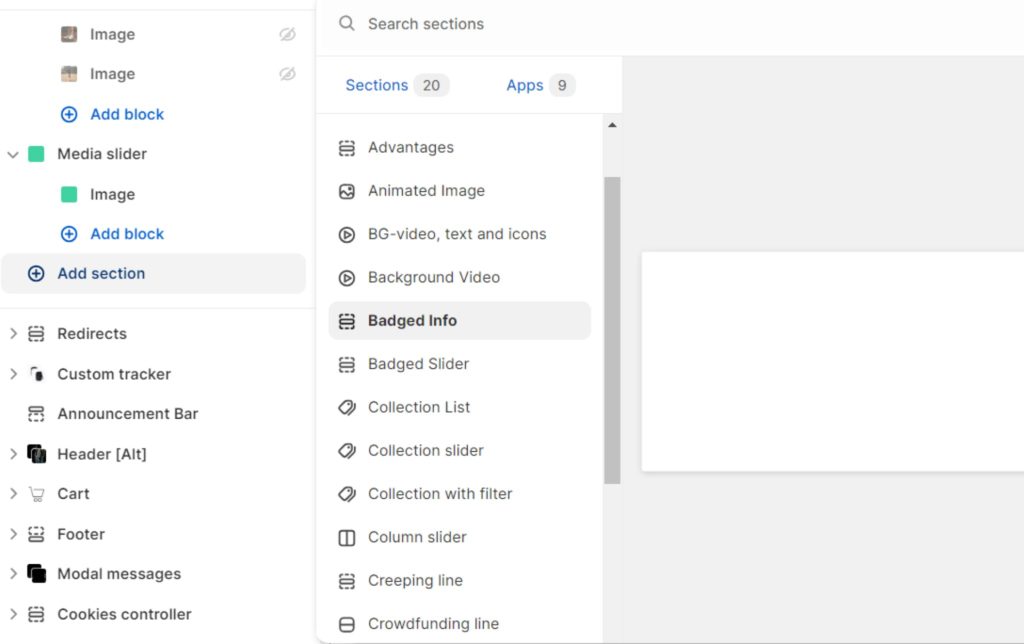
The new OS 2.0 functionality eliminated this limitation entirely. We updated Tropicfeel to OS 2.0, enabling reuse of each section on new landing pages. This means that Tropicfeel’s website administrator can now navigate to the website’s admin panel, choose to create a new page, and then fill it with sections as they prefer. Since the sections are already developed, they don’t require further development. Tropicfeel’s site administrator simply adds a new section and fills it with unique content tailored to that page, independent of the content in the same sections elsewhere on the website. Sections can be combined, rearranged, and manipulated in various ways.

By adopting OS 2.0’s features and eliminating the need for repeated development, they’ve cut their yearly development costs by more than $30,000. This has allowed them to redirect resources to other important strategic things.
To wrap up
By switching client to Shopify OS 2.0, we made a conscious decision to prioritize their long-term success over revenue generation for ourselves. We thought that giving them the tools to manage things independently, without relying on a development team, would let them focus on core business while maintaining high website standards.
If you also want to streamline your website management and empower and receive more control over your store, check out what Shopify Online Store 2.0 can do. Contact us to find out how it can benefit your business.