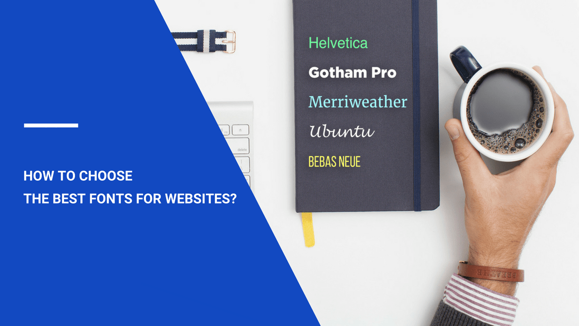
As the web community grows, online content is becoming more helpful and pleasant to consume at the same time. Modern graphic technologies allow creating high-quality images and videos, while advanced audio processors bring decent mp3 files to life. And what about text content?
The way text is perceived is defined mainly by its font. Each typeface creates unique letterforms. Its influence on the reader can hardly be overestimated, as the text appearance is crucial for information comprehension and user experience in general. You certainly don’t want to overlook the best font choice.
Picking the typefaces for your website can be tricky sometimes. It is a matter of aesthetic taste and profound experience rather than a decision made step-by-step. Countless numbers of new typefaces appear every day, and it’s up to you to choose the most suitable one for your project. Let’s start by covering the general rules of picking a font and then move on to some specific case recommendations.
Choose the Font Type Wisely
While every font design is exceptional, people divide all typefaces into 4 general font groups:
- Serif fonts;
- Sans-serif fonts;
- Handwriting or script fonts;
- Display fonts.
Each group has its strengths and weaknesses. Let’s find out how to implement fonts effectively.
Serif Fonts
Serifs are the lines on the edges of letters and symbols. Their mission is to make characters more distinctive. The human brain spends less time recognizing a serif character.
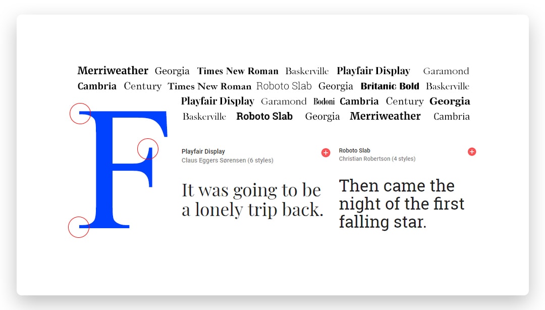
However, this advantage of serif fonts works only for high-resolution surfaces, such as paper pages. Modern displays have 3-10 times lower resolution than that. Web serif typefaces have some issues with low-quality shapes in small font sizes. Nevertheless, medium font sizes are still valid for serif typefaces. For instance, Times New Roman of the 14-16 pt size remains the most popular solution for printed documents. If some of your materials potentially need to be published, then serif fonts will be a good choice.
Serif typefaces are the most classical ones. They are associated with printed books and all published literature in general. Their subtle flavor of classics reveals the stable and slightly conservative nature of the serif typeface group.
Sans-Serif Fonts
Sans means “without” in French. Unlike the previous group, these typefaces lack the serifs on their characters. Sans-serif fonts offer simpler shapes. Their letters and symbols are insignificantly harder for our brains to identify, as sans-serif characters lose the contrast and retain the general shapes.
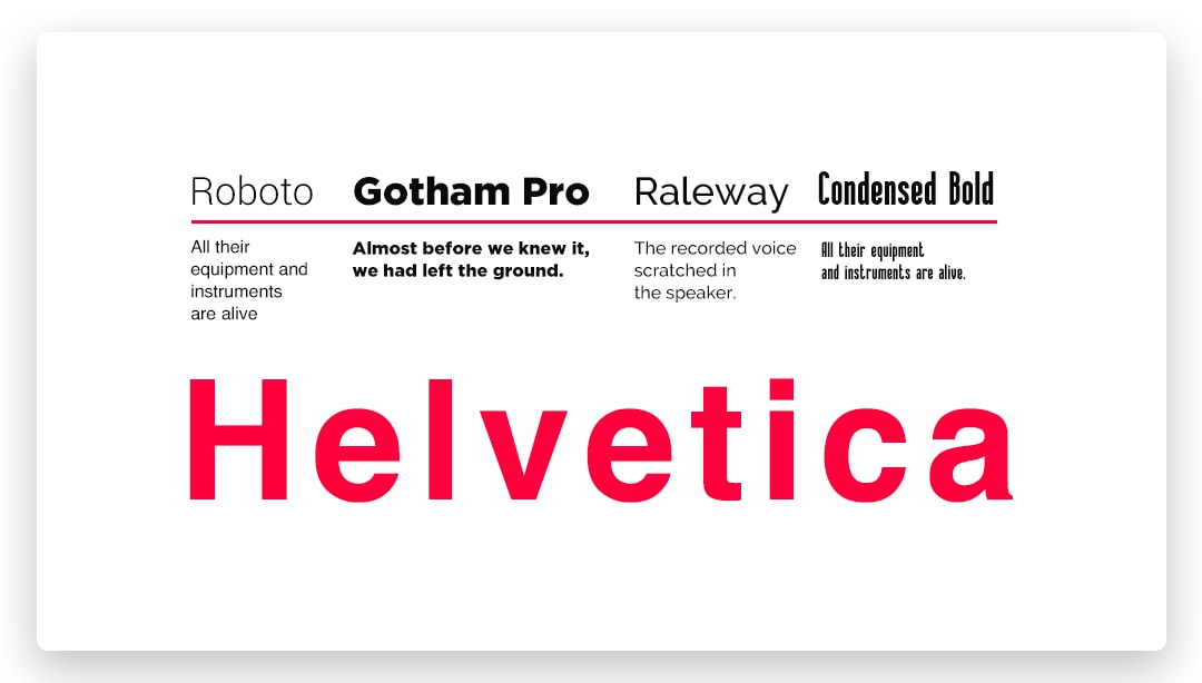
How does it influence readability? In fact, it takes a bit more time to read a sans-serif text. More importantly, solid paragraphs with no headings become challenging to comprehend. Characters blend into one piece and become unreadable.
However, sans-serif typefaces are the usual practice on the web. They are used for most online content. How do people manage to improve sans-serif text comprehension?
Mixed and structured content is the recipe for it. Continuous image-heading-text alternation provides our eyes with enough time to rest during these transitions. This trick makes up for the choice of clean, modern, progressive and trendy sans-serif fonts for websites.
Handwriting (Script) Fonts
Self-explanatory – this font group mimics manually written letters and symbols. Often ornamental, script typefaces don’t have exact character structure as they are based on physical handwriting.
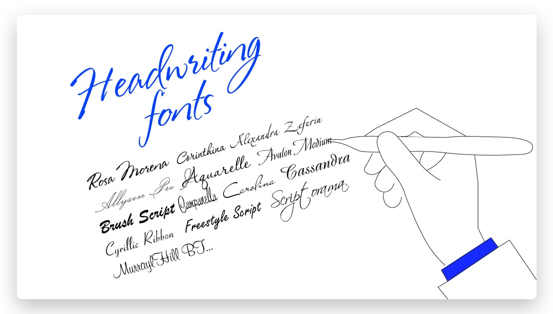
This font group is used for decorative purposes. Fashionable and unusual, script typefaces bring elegance and sophistication to headlines, titles, logos and other small text fragments. Handwriting fonts are perfect to make a quote stand out. Apply the script typeface to the cited text, and it’ll seem like you’ve literally snatched a piece of someone’s notebook.
However, there are always two sides to a coin. This is where the handwriting fonts’ restrictions stand in your way. As the decorative purpose of the text is fulfilled, readability goes down significantly. When we are talking about one line of text, that’s okay. On the other hand, applying the script font styles for a considerable part of the content is a bad idea. Use it as a tool for creating contrast, not as the style core.
Display and Decorative Fonts
These are the most engaging and the coolest fonts with the narrowest application domain. Display fonts are often customized to focus on delivering a specific emotion.
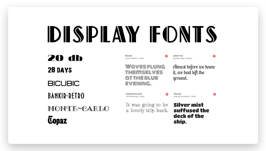
Attention-seeking display typefaces are considered the most dangerous ones to use. Proper display font application is super efficient, while its misuse will only scare off the visitors of your website. As with the handwritten typefaces, you mustn’t apply them to whole paragraphs to avoid readability losses.
Set the Leading and Tracking
Although almost every trusted font is well-balanced, sometimes it’s essential to change some parameters. Let’s talk about changing the text leading and tracking.
The leading is the space between lines, and the tracking is the horizontal distance between the characters. Luckily for you, these parameters are easy to manage with modern web technologies. Set the suitable parameter values if you feel like changing the default figures.
Font Websites: Keep the Licensing in Mind
Most free fonts for a website have an unlimited license. It means you can use them anywhere for any purposes. However, some font licenses have specific restrictions on where and how many times you can implement the chosen typeface. Make sure to double-check it to avoid licensing issues.
Opt for Needed Character Sets
Multi-language fonts offer various character sets for different keyboard layouts. It’s a tremendous opportunity if you post multi-language content on your website.
However, the font file size depends on its character sets. Its download time is crucial because of high demands for modern user experience. Ensure you opt out of all excess character sets to decrease the font file size.
Build an Elaborate Font Hierarchy
In most cases, content creators use 2-3 website typefaces to ensure the most appealing text appearance and high readability. Using a single typeface, you can’t reach the sufficient distinction of various text parts: the title, headings, description section, quotes, etc.
On the other hand, mixing too many text styles will be confusing to your visitors. You want to focus on a combination of several fonts to achieve visual diversity and to keep a consistent concept at the same time.
In other words, your fonts must be distinguishable from each other, yet have the same message idea. The web standard is to combine two sans-serif fonts. For example, an immortal classic is Roboto headings with Open Sans text paragraphs.
Use Your Aesthetic Taste for Font Design
Fortunately, there are lots of free “font mixers” online. You can use Google Fonts to find the most appropriate and successful typeface combinations for the web. If you wish to experiment and find your own unique style, the task of evaluating the font compatibility falls on your shoulders. Find some existing combinations, and get inspired by felicitous solutions. Develop your taste to create a successful typeface synergy. And don’t forget to play with the font weight and size parameters. They change the text appearance drastically.
Define Your Brand Tone
Your professional font is a master of subliminal messages. Like a refined dress on a woman, a proper web font speaks for you. This is why your typefaces must conform to the brand voice. Let’s take a look at successful solutions for the great synergy between a font and the brand tone:
Confident and Stable
Have a look at the LG website:

The thick sans-serif font for the logo and the old-school Arial as the main website font. Nothing exciting about this decision, right? That’s the point.
Classical font design shows your dedication to stability and profound experience. Your confident typeface decision speaks for your reliability.
Mild and Conservative
A library website is a great example of this script font usage:
Sans-serif Quicksand with an unusual combination of serif and handwritten fonts on the logo. It’s a perfect way to connect the website with the library concept.
Creative and Fresh
Attention-seeking and unusual ideas also have an appropriate typeface combination. Let’s take a closer look at Le Mugs:

A creative mix of handwritten Bernardo and a custom Le Mugs font delivers a fresh and engaging user experience.
The Bottom Line
The right way to pick the best font for your website is to concentrate on the typeface choice principles and develop an aesthetic taste to combine the web font with the brand tone. Share Tweet Share Share Pin