Teddy Blake: Theme customization
- Custom theme development
- Fashion and apparel

Project details
-
Team
Senior Full Stack Developer, 2 Mid-Level Full
Stack Developers, Team Lead, Project
Manager, Account Manager -
Technologies
JavaScript, Shopify Storefront API, HTML5, CSS,
Shopify Theme Liquid, Braintree payments API,
Avalara API, Klaviyo API -
Time
2,5 months
-
The task
To improve the user experience (UX) of a Shopify store through a redesign.
Results
-
+36%
conversion rate
-
+82%
usability
-
+74%
performance
About the business
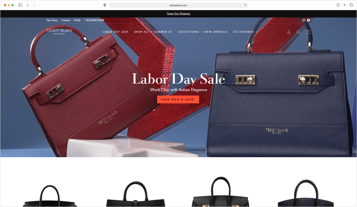
We assisted Teddy Blake in migrating their store from Magento to Shopify and integrating it with their warehouse. They have now approached us again for help in improving the website’s frontend. Our task was to update the website to meet modern UX standards, enhance loading speed, and incorporate custom features.
Custom theme vs. customizing a ready-made theme
Given the outdated Teddy Blake website, we faced two choices: creating a custom theme from scratch or customizing a pre-made one. After evaluating the advantages, disadvantages, and costs of each option tailored to the Teddy Blake store, the client ultimately chose to customize a ready-made theme.
How you can benefit
Choosing between building a theme from scratch or customizing a pre-existing Shopify theme can be challenging. It depends on individual needs—some require a bespoke theme, while others achieve goals with customizations to a pre-made theme. Opting for customization is cost-effective and saves time.
For a wise decision that optimizes both time and budget, seek professional help. Visit our Custom Development page for more information on how our expertise can assist you effortlessly.
Choosing the theme
When choosing a website theme, it’s important to prioritize functionality and code quality. Here’s a simple process we followed to assist Teddy Blake:
- Understand the required functionality and find a theme that already includes it. This minimizes development work and lowers costs.
- Carefully select several themes that match Teddy Blake’s business needs and have the necessary functionality.
- Evaluate the code quality of each theme and choose the best option. Clean code makes development easier and faster, allowing for quick changes.
- Present Teddy Blake with a range of suitable themes to choose from. Ultimately, they select the one that visually appeals to them.
By following this process, Teddy Blake significantly reduces development costs and the need for future technical maintenance and customizations, even before starting the actual development work.
Update of the updated design
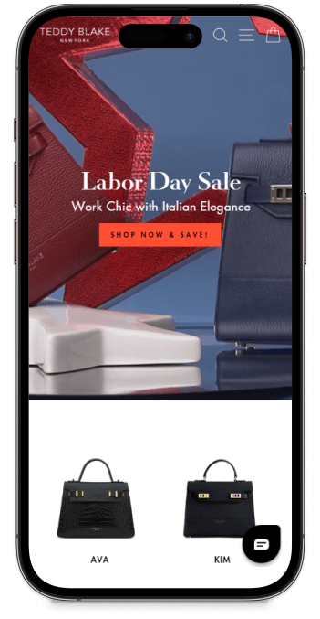
To meet our client’s specific needs, we undertook the challenge of customizing the chosen theme to align with their style while considering their product requirements. Our goal was to create a visually appealing website that not only looks great but also ensures a smooth user experience.
The redesign of our website focused on enhancing the overall user experience, with particular attention given to improving product pages, collections, etc. We implemented new functionalities to make product selection easier and adjusted the layout of secondary elements to increase conversion rates compared to the previous design.
How you can benefit
To make the layout design process easier, begin by selecting a theme. Even if a layout seems simple, it can become time-consuming if it lacks essential features. By choosing a theme from the start and designing around it, you can save time and streamline the development process.
If you need guidance for a redesign, visit our Store Design page for expert tips on cost-effective and efficient approaches.
Homepage customization
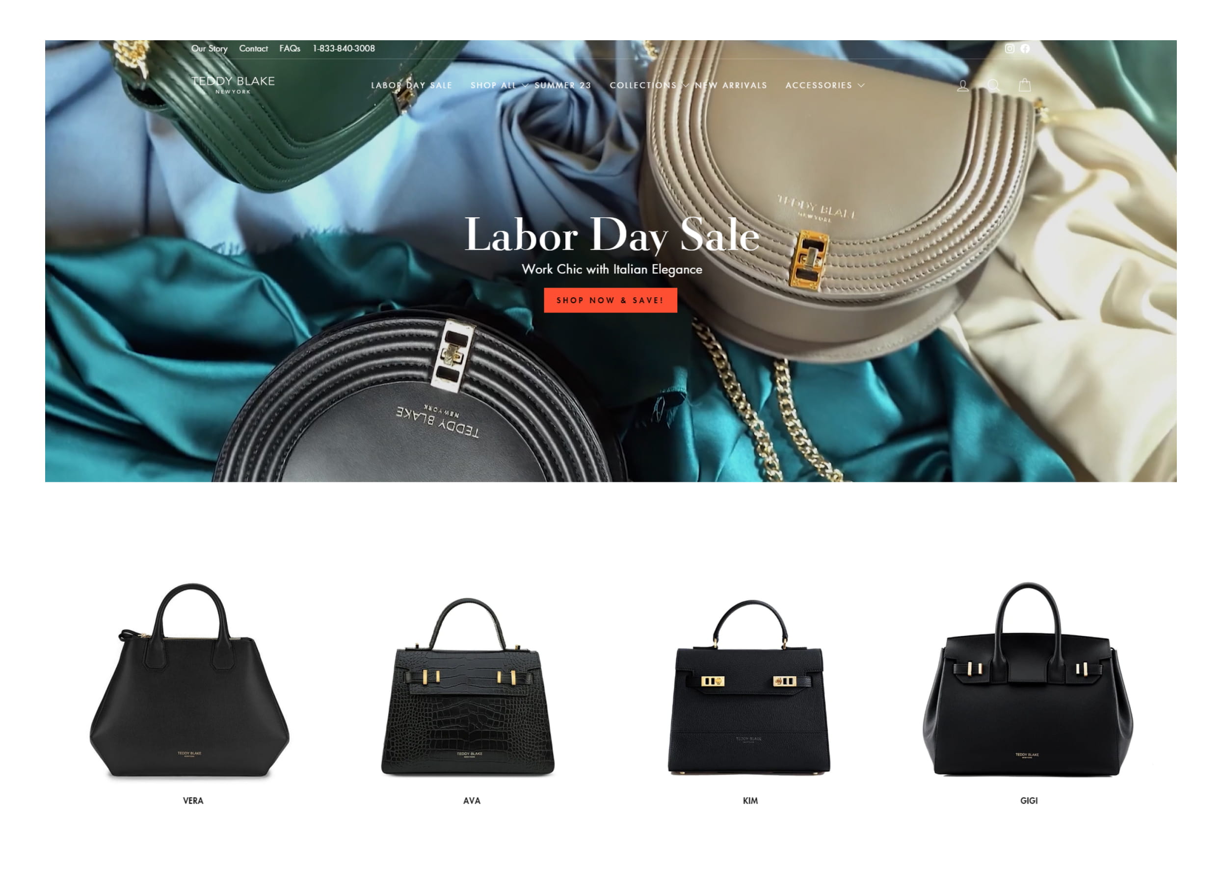
We implemented a fixed banner below the video banner to promote ongoing sales and special offers. Additionally, a user-friendly carousel with header filters was created, enabling easy navigation through product collections based on tags.
Collection pages
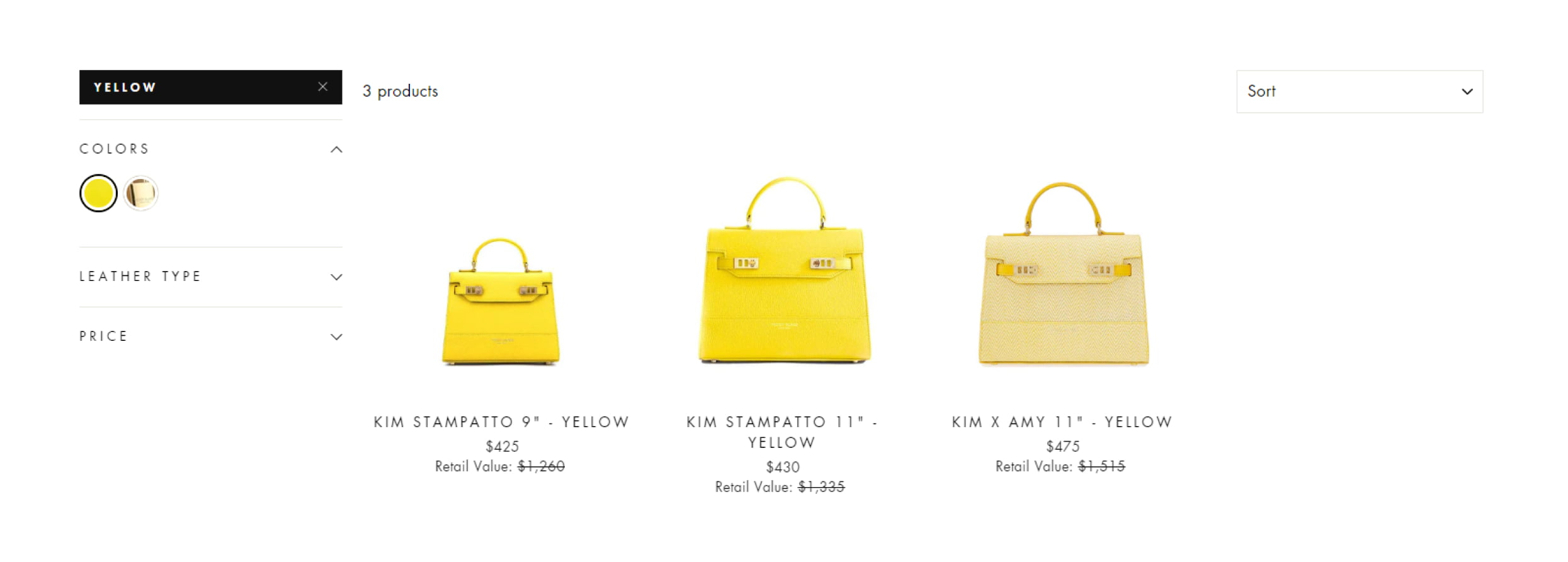
To enhance the collection pages, we strategically placed banners at regular intervals to highlight important content. Furthermore, the category page was improved by displaying all available product colors, allowing users to click on a color and instantly see the corresponding product image.

Product page
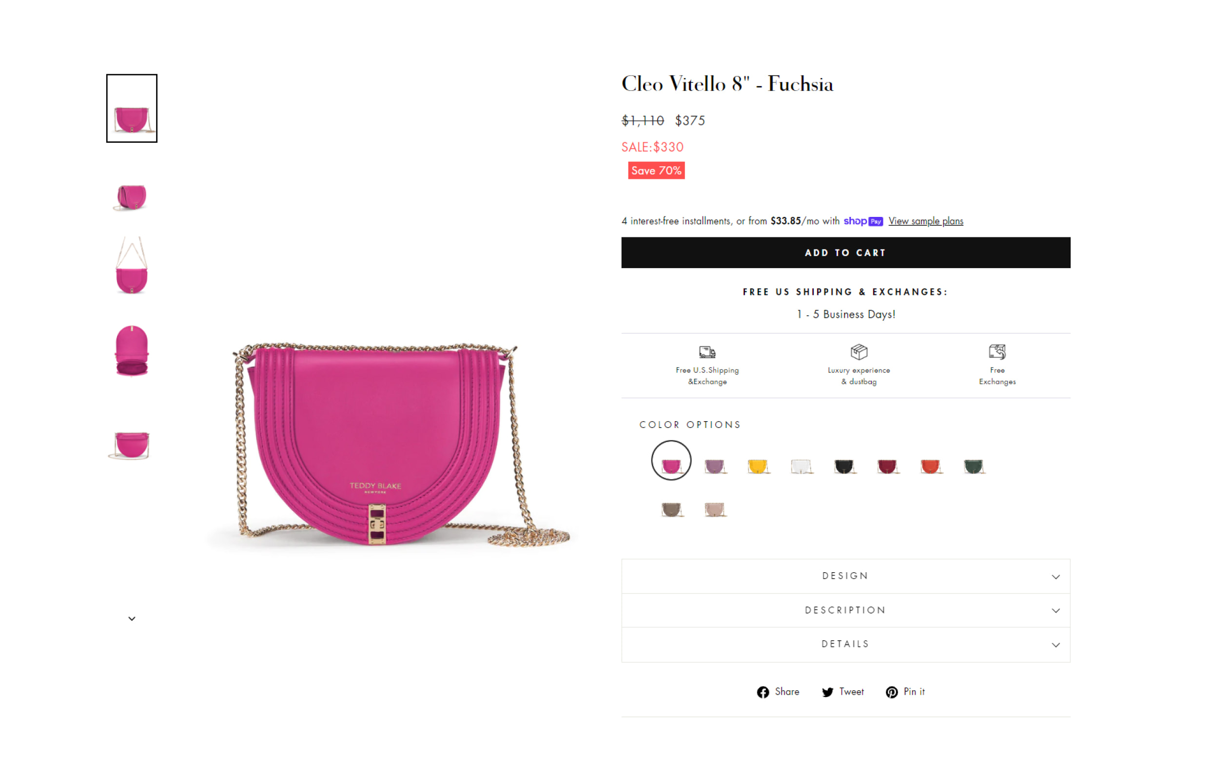
The product page now features enlarged, full-width product images, providing a captivating visual experience. We also optimized the color swatch functionality to fit neatly within two lines, ensuring a streamlined selection process, even with a wide range of choices.
Additional features
A comprehensive dashboard was developed, providing a clear overview of both past and current pre-orders. It includes order numbers, products, and order dates for easy tracking and management.
Summary
Teddy Blake trusted us to update their website, resulting in remarkable outcomes. We optimized speed, functionality, and conversions, saving costs and delivering a smooth user experience. Our efforts boosted conversions and provided industry-specific insights for long-term success. To see what our clients say about working with us, check out reviews in our Clutch profile.


