
Madam Glam: Magento 1 to Shopify migration
- Migration to Shopify
- Health, beauty, and cosmetics
Team
3 Senior Developers, 3 Mid-Level Developers, 2 Junior
Developers, Project Manager, Account Manager
Technologies
HTML5, SCSS, BEM, WAI-ARIA,
JavaScript, Shopify theme liquid
Time
9 weeks
The task
Create a custom theme that would meet strict client requirements for loading speed, accessibility, code quality and website functionality.
+67%
site speed
+46%
performance
+100%
accessibility
+92%
code quality
Deck of Scarlet is a US-made beauty brand that offers a makeup subscription service, shipping to Canada, UK/Europe, and the USA. The products are delivered every other month and include the colors needed to complete multiple full makeup looks, inspired by YouTube beauty vloggers.
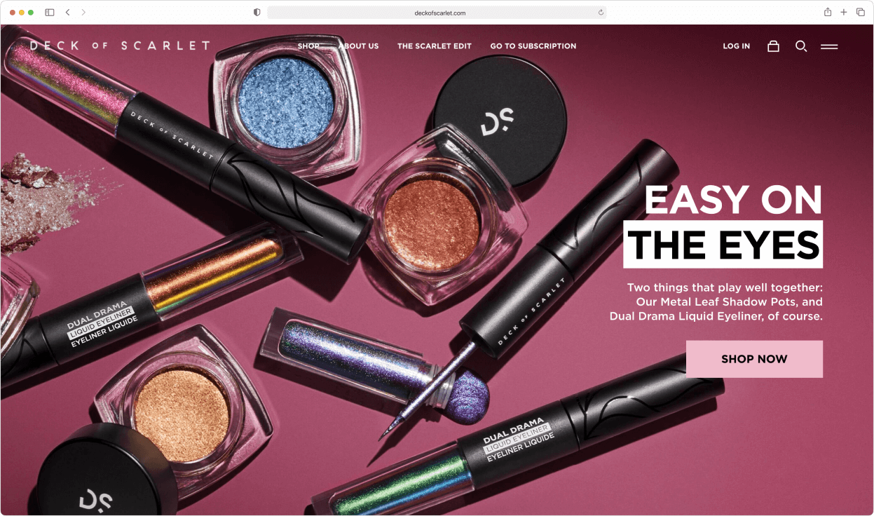
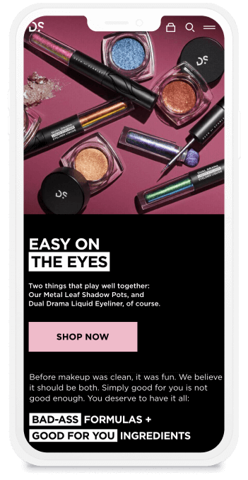
The client came to us with an already polished design for both desktop and mobile. In theme development, just implementing a layout is simple – one of the major parts of the work is thinking through the logic behind each element, and how theme design and functionality should work together. Here are some of the most interesting custom elements we implemented in the Deck of Scarlet theme.
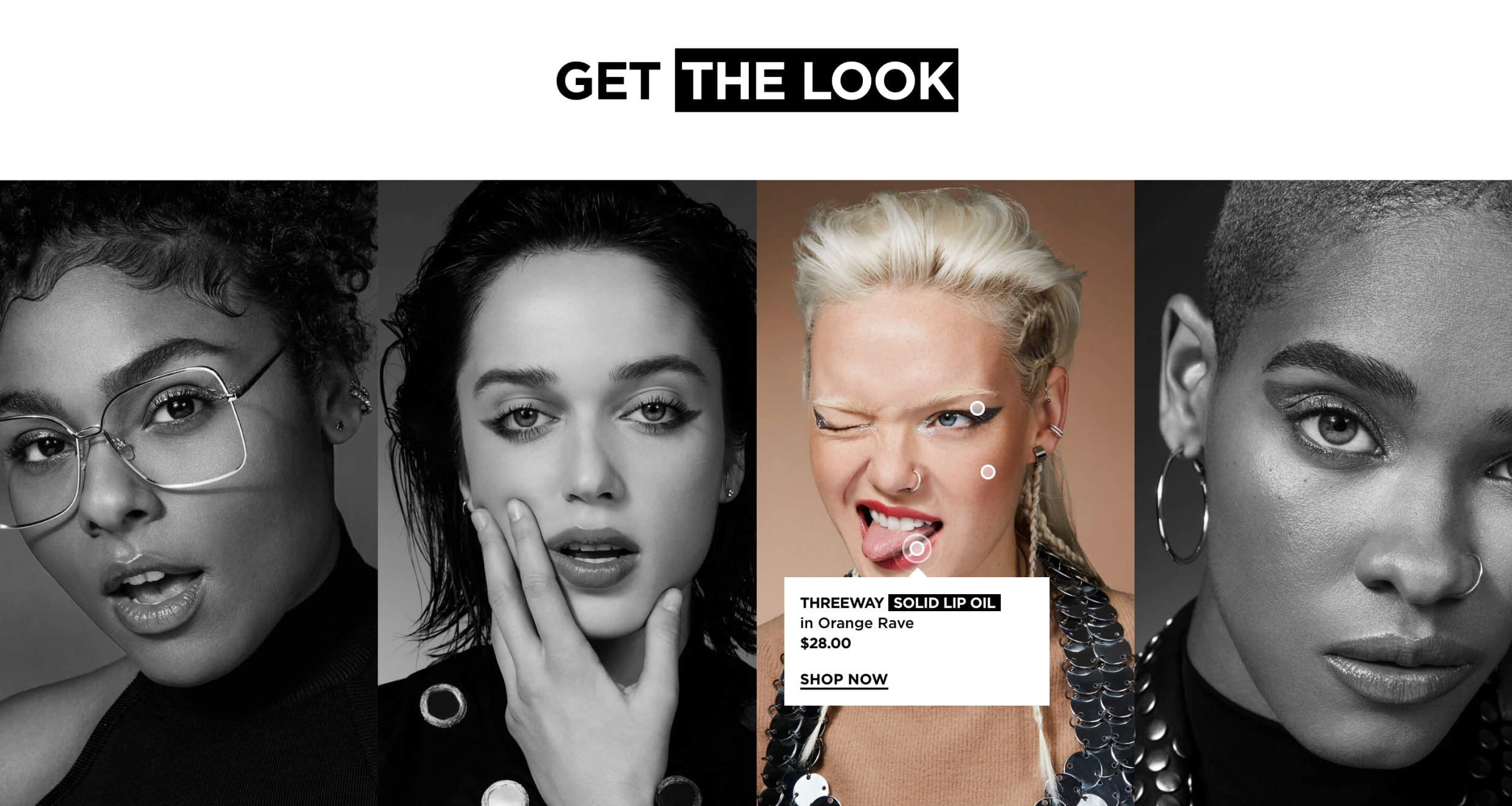
This block on the main page provides the possibility to see what was used to create these particular makeups, thus helping customers to make a purchase. On mouse hover, a photo becomes colorized and some points appear on the faces of the models, featuring a specific product. The points are clickable, and by clicking on them a small popup appears with the name of the product, its price, and the “Shop Now” button. Also, if the product is currently out of stock, the expected resupply date will be indicated.
This element, like the rest of the theme, is fully customizable from the corresponding theme setting. The store admin can change any element, from the background photos to the popup details. The points themselves can be attached to any product from the store, and moved anywhere on the photo by setting the coordinates on the X- and Y-axes.
This functionality is also accessible for people with disabilities both from the keyboard and with a screen reader.
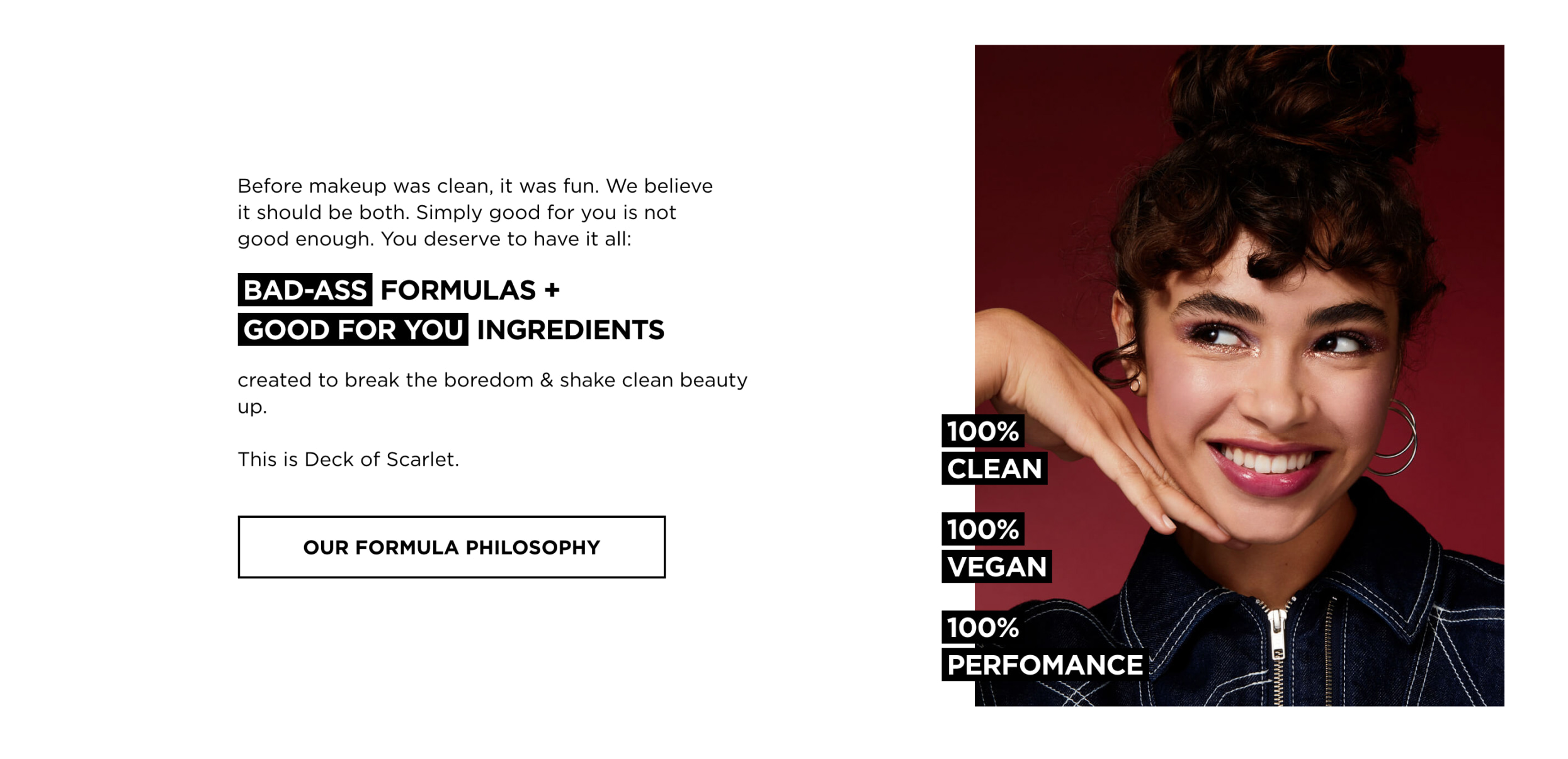
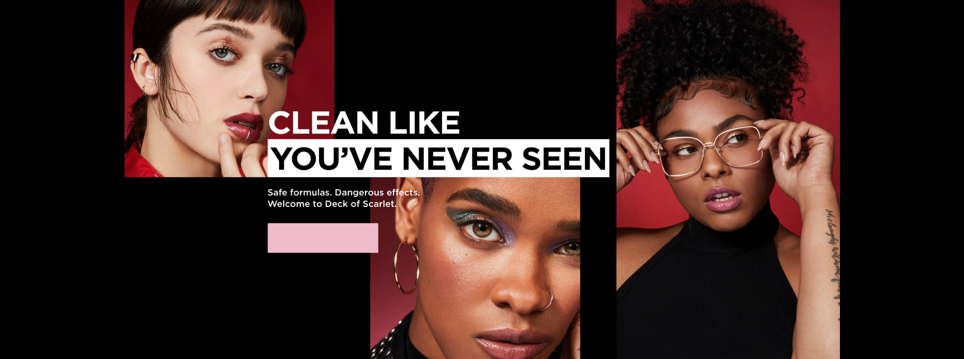
Throughout the whole website, there are places with highlighted text. This text is not hardcoded into the theme; it can be changed on any page of the website via the theme settings. It’s possible to highlight any text and choose any color for the background. The same is true for the main banners, where each element can be set up as well: all colors, fonts, text highlights, and backgrounds can be customized to fit any photo shoot or product.
In an ordinary theme, these banner images would be static, with the need to create new banners for even minor changes. With custom development, anything can be done through the theme settings with just several clicks.
How you can benefit
If a business needs both unique design and functionality, a custom solution makes everything possible. Go to our Custom theme development page to check out the benefits it can bring to your business.
This element is an example of a unique interface design and user experience that comes with a custom theme. In a typical store, the “Shop” menu tab takes customers to a page with all collections from a store in one place, which often looks messy. In the Deck of Scarlet theme, “Shop” leads to another submenu that is simple, elegant, and easy to navigate.

The background color of the menu changes depending on the page where the customer is at the given moment. If the page is white, the menu would be white as well, with the same for the black backgrounds. This is all configurable by the store admin through the theme settings, with the possibility to set any color scheme. The font color is changed accordingly, making the menu always stylish and easy to read.
In a typical store, the Instagram feed is the same throughout the whole website. In the Deck of Scarlet theme, it is different on every page: for the “Lips” collection, the posts with the focus on lipstick are shown, while photos with highlighter would be uploaded to a corresponding page. This functionality is implemented via tags that are added to each photo, and it allows customers to get the most out of every product page by seeing everything that can be done with the presented products.
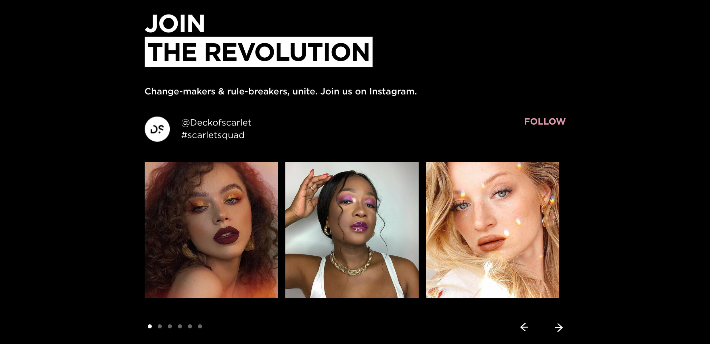
Another thing worth mentioning is how securely the feed is embedded into the theme. Usually a feed is added to a website with the help of special API services. As these services are free, it often happens that they stop working at times, making the feed on a website just white squares instead of posts. To prevent this, we connected the feed with two additional API services. If the first service is disabled, the second one does the job, and if it for some reason also stops working, there is the third service, and so on. This way it’s impossible for the feed to be disabled because there is always a backup plan.
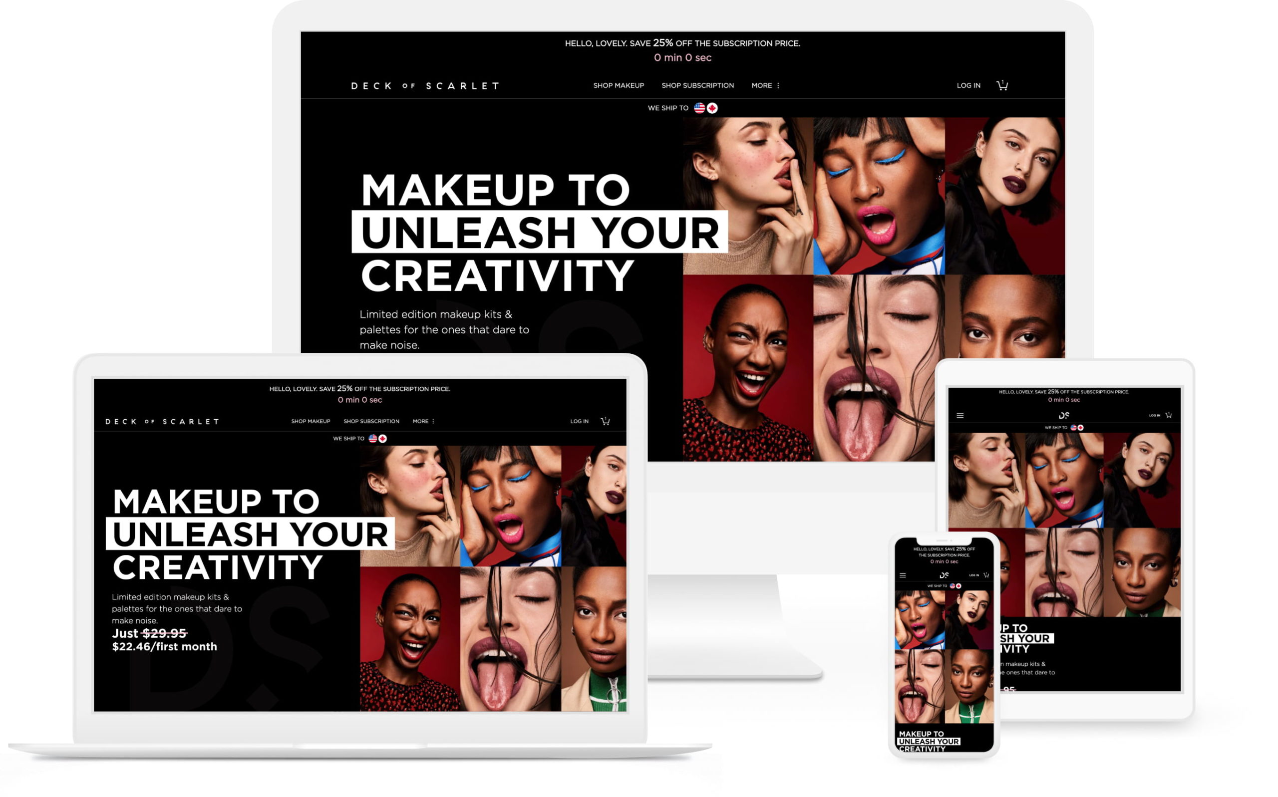
The website is compatible with popular browsers, and adjusts well to any screen size. To make this possible, we used a specific technology stack combined with manual checking. First, we created a responsive layout, then made an extensive list of browsers/screen resolutions, and tested this layout on each of them, fixing any issues that appeared.
It’s one of the biggest advantages of developing a custom theme – with full access to the source code, there is a possibility to control and test everything, so we can ensure that the final result not only meets but exceeds all client’s requirements. Ready-made themes, unfortunately, don’t provide such freedom, which can often result in compromising on some issues.
Due to this thorough testing, there are no distorted or blurred elements on the Deck of Scarlet website – it looks good on any device, from mobile to an ultra-high definition TV.
One of the most important requirements from the client’s side was the fast website load time.
When it comes to a ready-made theme, lots of factors have an influence on that; from the theme’s code itself to the apps which may be installed to implement the missing functionality. Only theme developers have full access to its source code, so sometimes changing certain key performance patterns is just impossible.
With a custom theme, on the contrary, developers build its architecture from the ground up, and can improve it until the required speed level is achieved. So if the speed requirements are strict, creating a custom theme is the only way to go.
As Deck of Scarlet contained a lot of visual content, we needed it to be fast and light without compromising on quality. To do this, we implemented an image optimization process that allowed us to have both speed and quality, and then manually conducted a variety of speed tests.
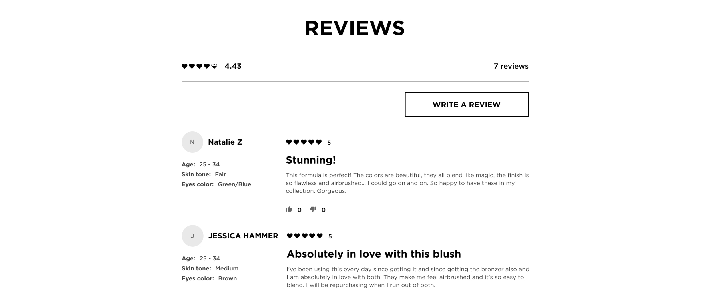
The review block on the Product page was integrated into the theme with an app. The app provided the functionality of displaying reviews and ratings, but its default style didn’t fit the website design. We changed the app’s visual style according to the client’s layout, and placed every element on the page in the way intended.
How you can benefit
Sometimes the app is a “great fit, but..”, and it’s always possible to change these “but” to meet the specific requirements of the business. To learn more about how to make any process easy, check out our Shopify app development page.
The code of the theme was written in one style according to certain guidelines, and includes comments to clarify which elements are responsible for what purposes. This makes the theme easy to work with for the in-house developers, so the costs of additional customizations in the future would be significantly reduced.
Being a US-based business, digital accessibility was another key requirement from the client’s side. Upon completing the work, the website was accessible both from the keyboard and with assistive technologies such as a screen reader. The work was carried out in bite-sized chunks, with the large tasks divided into smaller ones – this way our accessibility team ensured that each element met the accessibility requirements. The team also coordinated with the designer on the client side to provide recommendations on the accessibility of some elements. In creating the website menus, the structure for each page, headings, landmarks, forms, content carousel and other elements, we followed the W3C accessibility patterns and WCAG 2.1 Level AA guidelines to ensure the best accessibility practices.
How you can benefit
With digital accessibility becoming a must, it’s better to implement it into the website before facing a non-compliance lawsuit. But accessibility is also so much more than just a requirement – check out our Web accessibility page to learn how you can benefit society and grow your business at the same time.
In the end, our client got a unique, flexible and accessible website which looks great on any device. We’re happy to share the results of our work, and client reviews are always available on our Clutch profile.