Madam Glam: Theme customization
- Custom theme development
- Health, beauty, and cosmetics
Project details
-
Team
Senior Full Stack Developer, 2 Mid-Level Full Stack Developers,
Team Lead, Project Manager, Account Manager -
Technologies
Native JavaScript, Shopify REST
API, Shopify GraphQL API, HTML5,
SCSS, Shopify Liquid, Braintree
payments API, Avalara API,
Klaviyo API -
Time
2.5 months
-
The task
To implement the UX redesign of a Shopify store and make the theme work faster.
Results
-
+20%
conversion rate
-
+93%
usability
-
+85%
performance
About the business
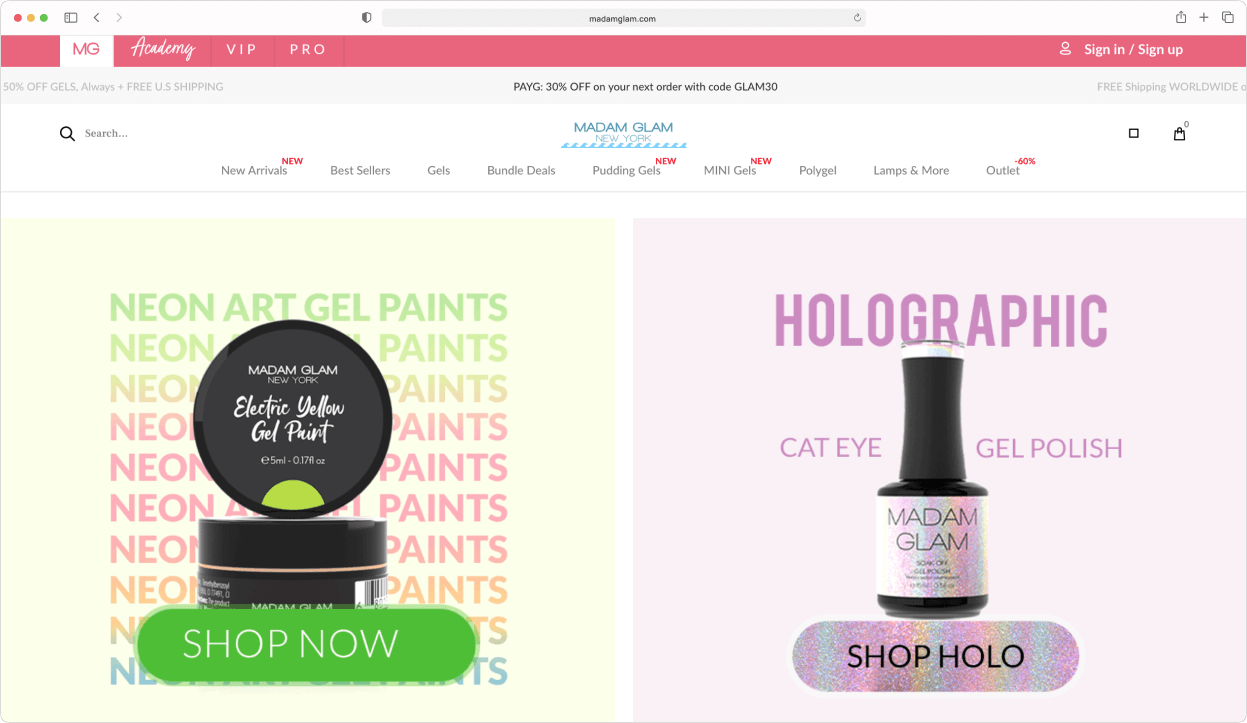
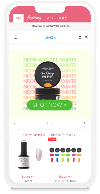
In the past, we helped Madam Glam to migrate from Magento to Shopify, implemented the required features, and customized the frontend part of the theme to support all of the backend functionality. Recently, the client contacted us to update the Madam Glam website to keep up with the modern requirements for the UX and the website’s loading speed.
Custom or ready-made theme — what to choose?
The old website was already outdated, so there were two options to begin with — either build a custom theme from scratch or customize a ready-made one. We laid out the benefits, drawbacks, and the cost of the both options for the Madam Glam case, and the client settled on the customization of a ready-made theme.
How you can benefit
There is no one-size-fits-all answer on what to choose. For some, building a theme from scratch may be the only option, but sometimes the required results can be achieved for a fraction of the cost with just some customizations of a ready-made Shopify theme.
To choose wisely and save both time and money in the long-term, we always recommend seeking professional help. Check out our Custom development page to learn more.
Choosing the theme
A future theme’s design should not be the decisive factor — its functionality and code quality are much more important. You need to have a clear understanding of the required functionality, and look first specifically for that. The more of these the chosen theme has by default, the less development work you will need (and the less time and money you’ll spend).
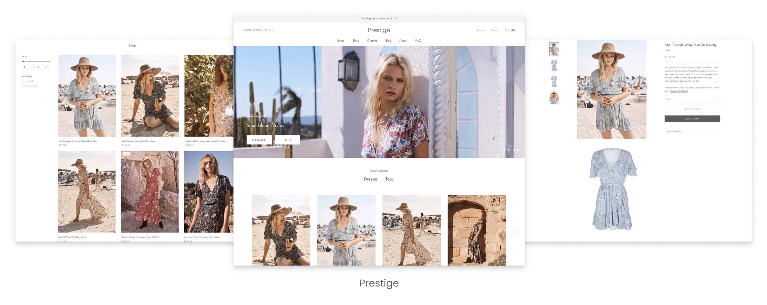
That’s why we first chose several themes which were optimal in terms of the required functionality and the specifics of the client’s business. After that, our developers inspected these ready-made themes and selected those with the best code quality — the cleaner the code is, the easier it is to work with it, and the faster all required changes will be implemented. Finally, we provided the client with the best remaining themes to choose from, and they settled on the one they visually liked the most.
This is how we helped Madam Glam to significantly lower the costs of development, future technical maintenance and customizations, even before the actual development work began.
Update of the existing design
When the theme was chosen, the layouts were created based on the previously conducted UX research. Compared to the old design, the positioning of the secondary elements was changed to increase conversions. During the redesign, the UX of the whole website was improved, but most changes affected the product page, the cart page and the user account page.
How you can benefit
Choosing the theme should always come before the design stage. Sometimes even the simplest-looking layouts take hours of development time to implement if the theme doesn’t have the required features out-of-the-box. Creating a layout based on the already chosen theme saves you a lot during the development stage.
So, if you’re thinking about a redesign, check out our Store design page — we’ll help you do it wisely and cost-effectively.
Main UX improvements
The product page
The traditional image gallery at the top of the product page was completely redesigned. Now, the main image of the product moves along with the user while they are scrolling the page. This way, when all other content moves out of view, the main product image remains in the view port until it reaches a certain place on the website page. There, the advantages of this product and the VIP benefits are displayed.
This feature helps customers to always see the product they are interested in, and significantly increases the number of products added to cart from the product page.

The cart page
On the cart page, all design changes were aimed to motivate customers to buy products as a VIP member (on the Madam Glam’s website there are several customer tiers, and being a VIP provides access to a wide variety of discounts, offers and sales for a monthly membership fee).
In the end, the UX improvements on the cart page included:
- Visually highlighting all the perks of a VIP membership, so the advantages of becoming a VIP member are clear at first sight
- Much easier process to buy a VIP membership
- More steps before conversion for regular pay-as-you-go customers
All the UX changes proved to be successful — the number of VIP members increased after the new design was implemented.

The user account page
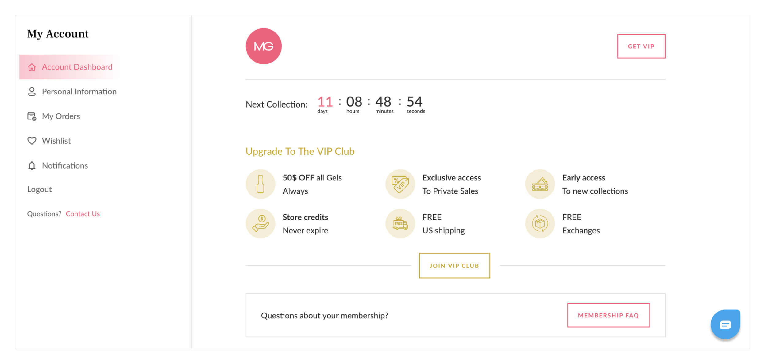
The user account was redesigned to make it more functional and easy to manage.
When the customer logs into their profile, they now see all the latest information, such as current member status, available discounts, the current balance of bonuses and credits, and even a countdown timer until the next major sale.
They also see all subscription options available to them within the store; now it’s easy to pause or renew a subscription, cancel it, or change the payment method.
Some of these features were missing in the previous version, so we either implemented or improved them, and made the difference between the pay-as-you-go customer and the VIP customers’ profiles as visually clear as possible.
Development challenges and solutions
The main project goal wasn’t simply to implement the new layouts and refresh the website’s look, but also to update the functionality under the hood.
For example, we used JavaScript instead of jQuery, because JavaScript is much faster and doesn’t require heavy coding that slows down the work of a website. We also implemented all relevant best practices from our overall theme development experience, to ensure that the code would work as quickly as possible and would speed up the page loading.
Delay in displaying a total on the cart
In the Madam Glam store, you can switch between different member statuses right in the cart and see the total price of the order being changed when the VIP discount is applied. To perform this recalculation, we used the backend scripts of the VIP membership app and Shopify Scripts, available for the Shopify Plus clients.
During development, we faced some serious challenges caused by incompatibility of these main elements — it turned out that the VIP membership app responsible for the customer-tier functionality, Shopify Scripts, and the new theme didn’t work well together. Particularly, the recalculation of the total price in the cart was quite slow.
We did some extensive research to find the problem and fix it. After that, our team carried out complex, in-depth, cross-browser and cross-device testing, so the price now is recalculated quickly and displayed correctly on all browsers and devices.
Summary
We not only updated the website’s functionality, but also provided the industry-based eCommerce insights that positively affected conversion. Due to our partnership, Madam Glam got a fast, functional and conversion-oriented website that is perfectly adapted to their business model.

We selected SpurIT because they were listed as preferred ‘Shopify Pro’ partners.
We had a few companies in competition and we decided to go with the most professional and competent one. Their aptitude to help scale a business and their empathy to answer all your needs, even the most complicated/complex ones, is most impressive.
For more details, the full review is available on our Clutch profile.


