Suokko: theme customization
- Custom theme development
- Fashion and apparel
Project details
-
Team
Tech Lead, 2 Full Stack Developers, QA, Project
Manager, Account Manager -
Technologies
Shopify Theme Liquid, HTML, CSS, SCSS, Native,
JavaScript (ES6+), Webpack, Ajax, API, Section
Rendering API, Storefront API, GraphQL,
Bitbucket -
Time
2 months
-
The task
- Theme customization
- Improve UX/UI functionality to increase purchasing volume
Results
-
+75%
conversion rate
-
+100%
usability
-
+92%
code quality
About the business
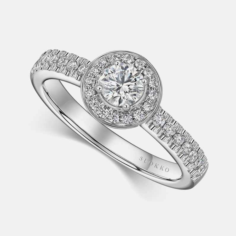
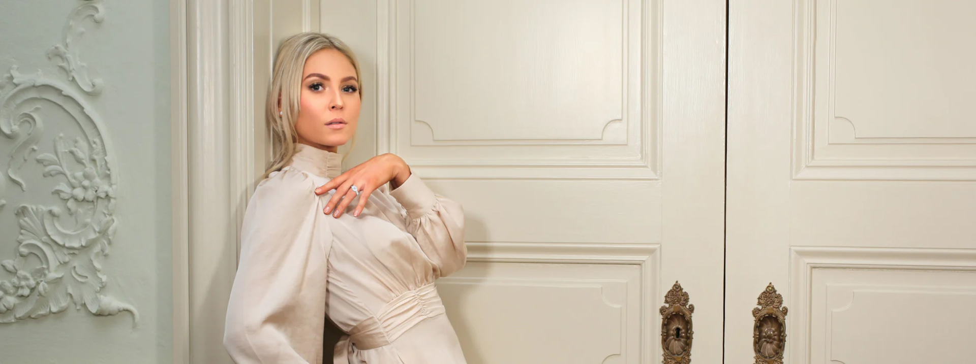
Suokko is a Finnish family-owned business offering novelty watches and jewelry from renowned brands – necklaces, earrings, and rings, including wedding rings.
Previously, we developed and launched an app for the ring configurator for the Suokko store. This time we picked up and customized the Shopify theme to keep up with the modern requirements for the UX and the website’s loading speed.
Challenges and solutions
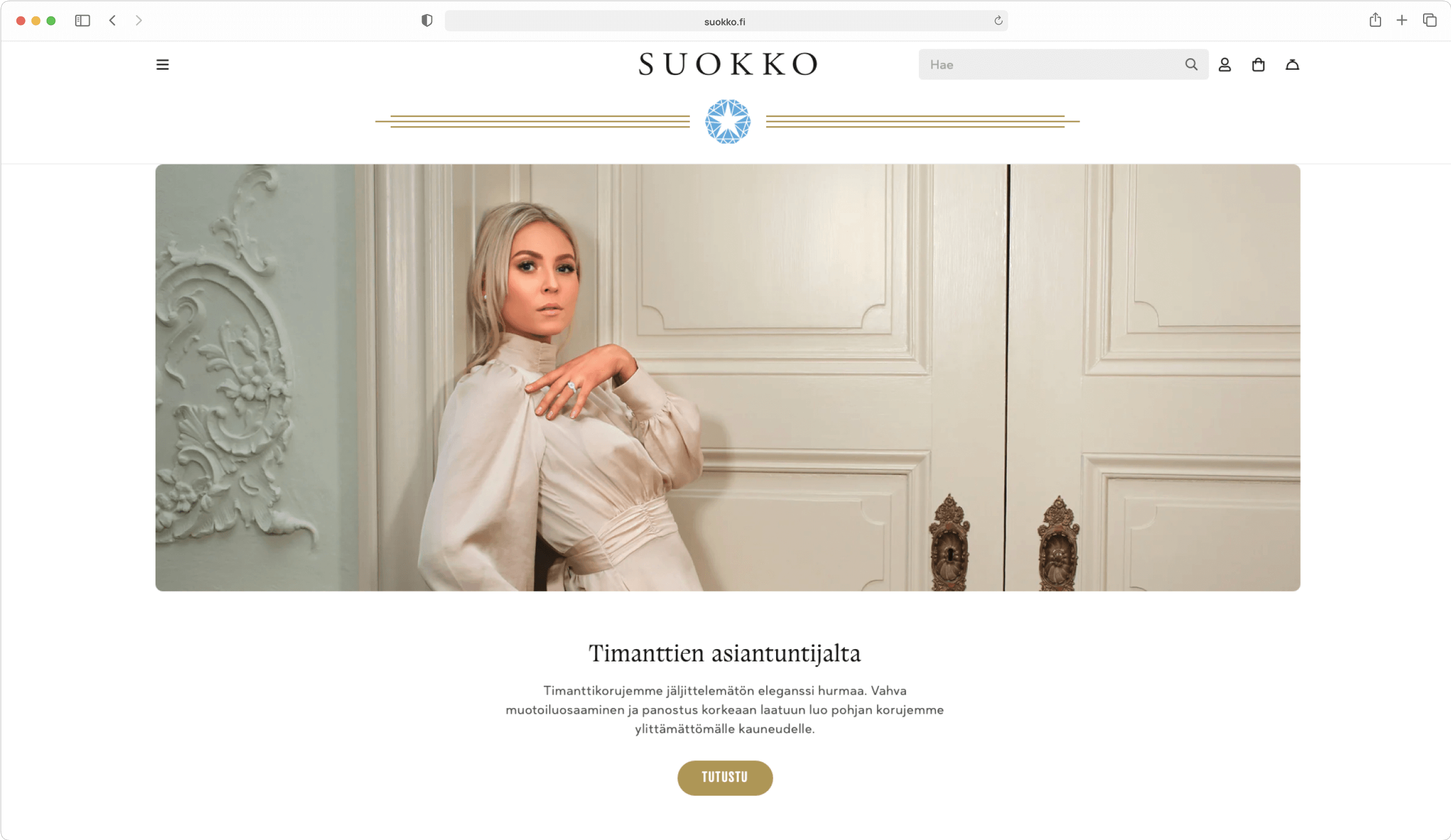
After the Shopify 2.0 Store features upgrade, the client opted to change the store theme and chose the Dawn 2.0, one of the free themes offering Online 2.0 store functionality. However, this theme required improvement to fully fit the business goals of the client. And that’s where we stepped in.
Creating and implementing the layouts
As the client had no layouts, we gathered all the requirements and wishes of the client for the necessary changes. Based on these requirements, we created layouts using best practices and offered the most effective solutions based on our expertise.
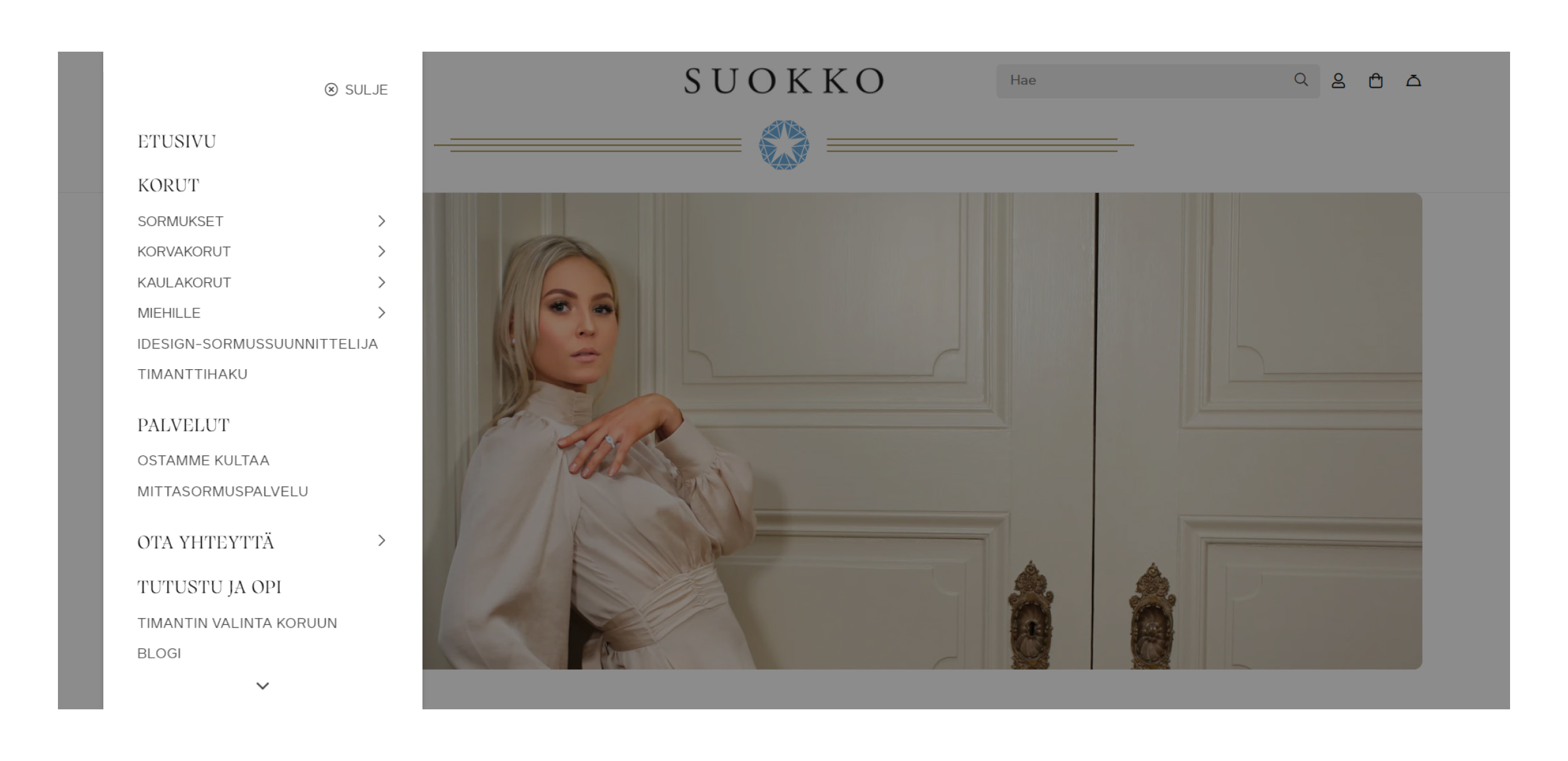
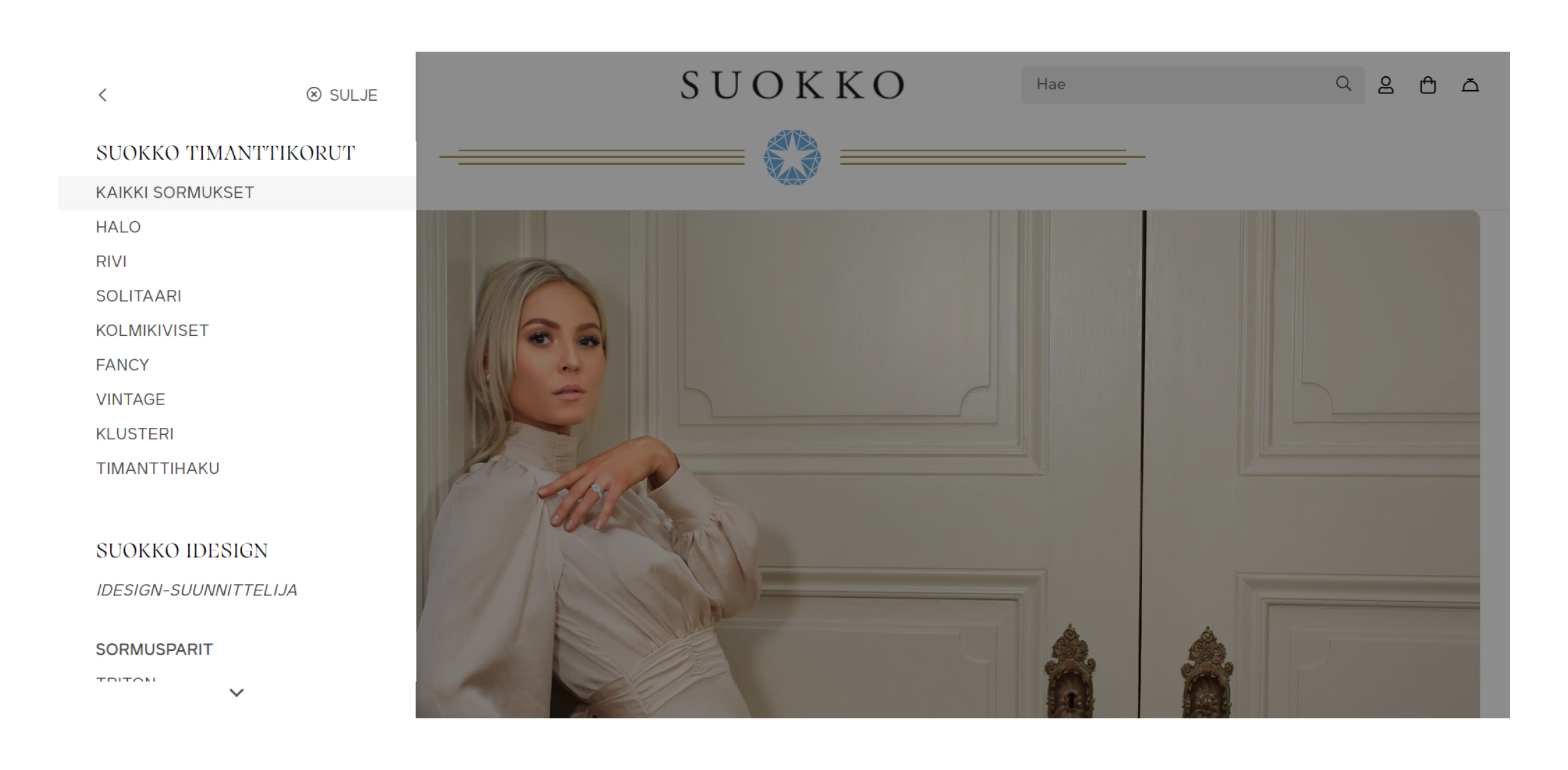
Navigation menu improvement
Our team completely redesigned the navigation menu. There are now advanced font settings so that font sizes or special outlines can be changed without any hassle. Also, it became possible to customize the look of buttons, icons, and much more at the section and theme level. Thus, the customer can make the navigation structure more efficient and intuitive.
Footer styling
We minimized the footer to make it look clearer and more lightweight.
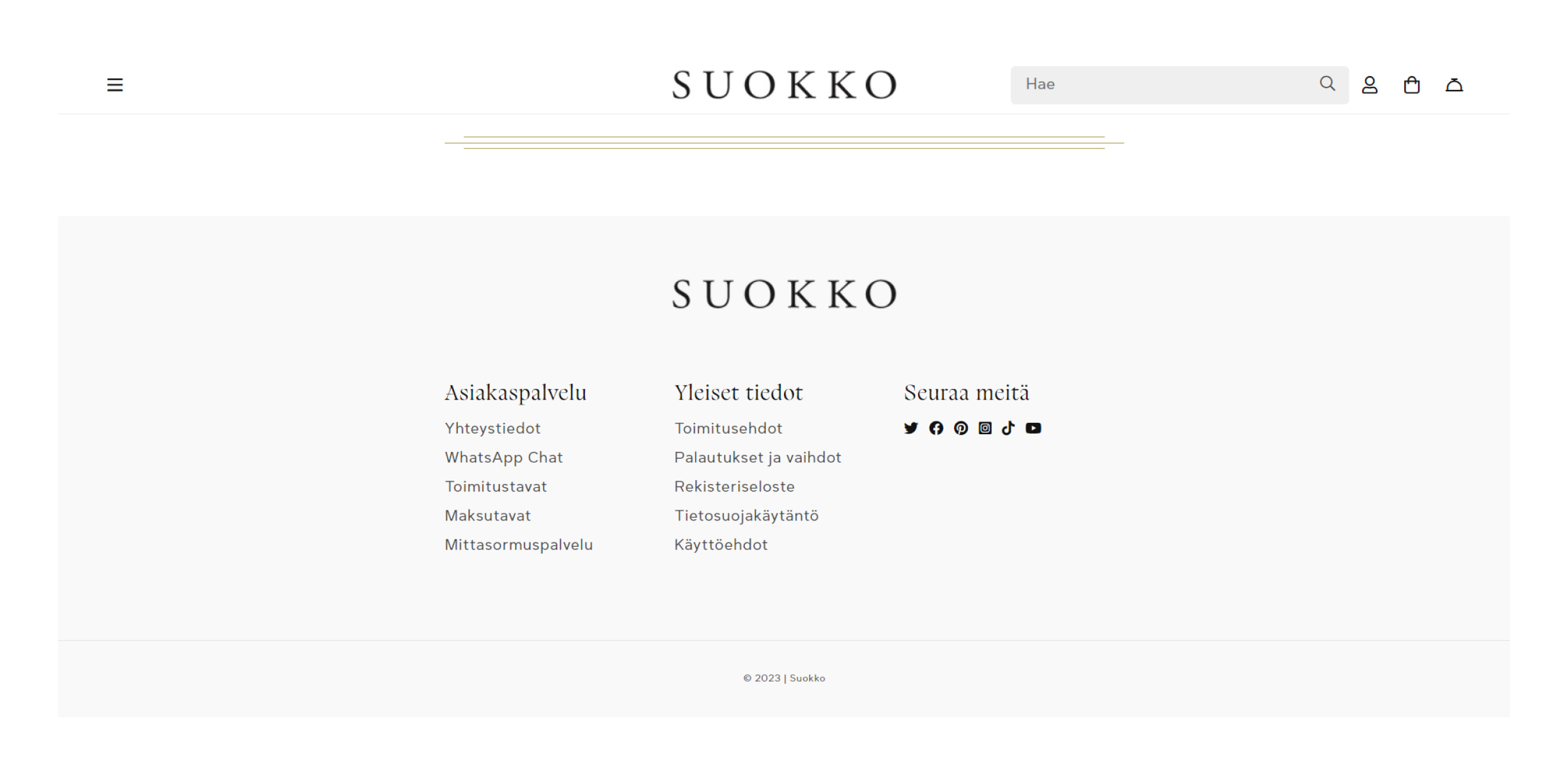
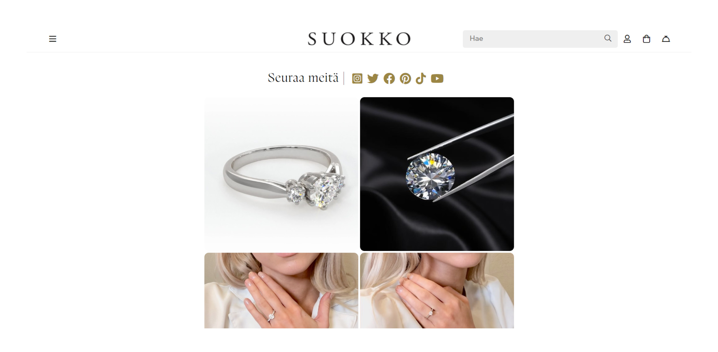
The subscription form is now positioned as a separate block on the homepage. We connected social networks to the website to display posts from them as a standalone block on the homepage.
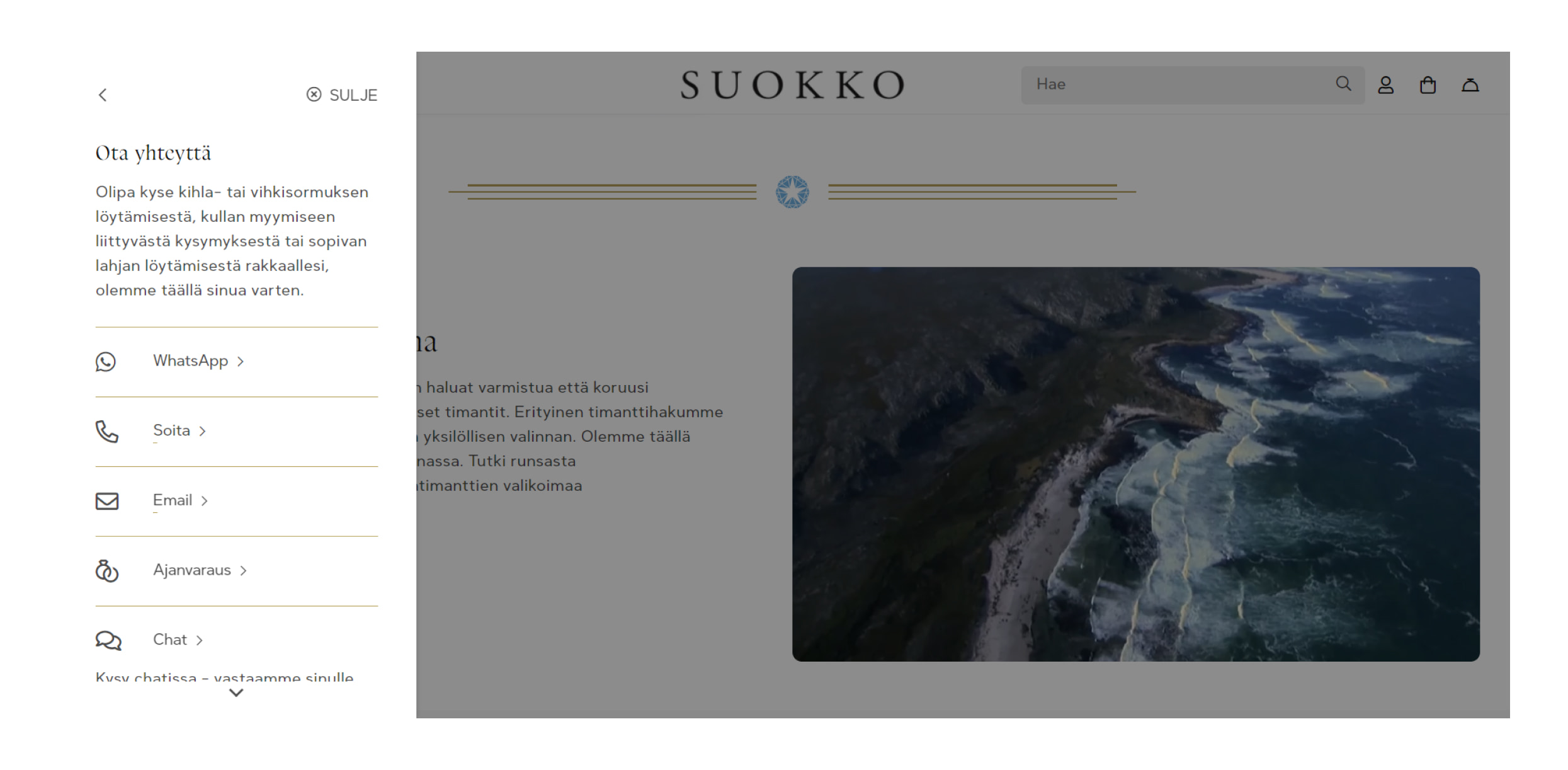
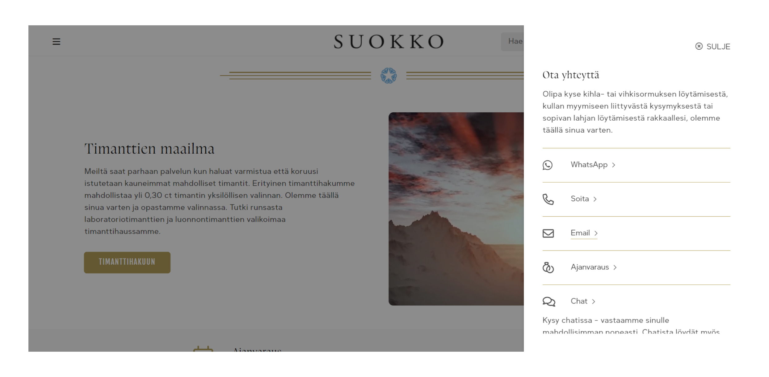
In addition, we removed non-essential settings and moved contact information to the navigation menu.
Product page
The most significant change was to the product page.
We have carried out a feature to display product variants in stock as a separate button. Once you press it, a popup appears and shows the currently available variants.
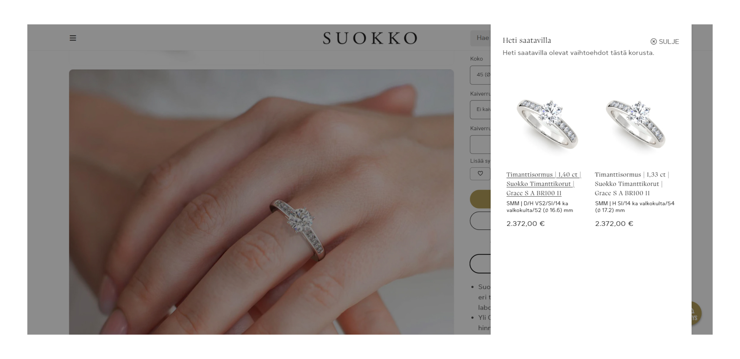
Also, added dropdowns for choosing one.
Our team implemented the display of the diamond video in a specific popup and ensured that the third-party service’s video is responsive.
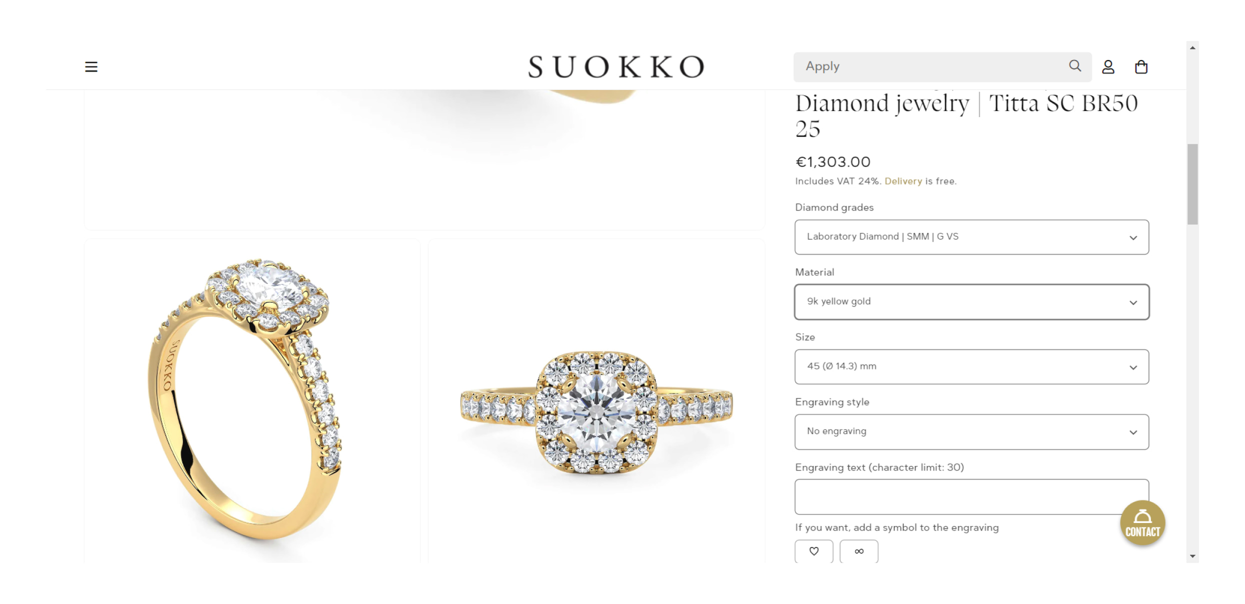
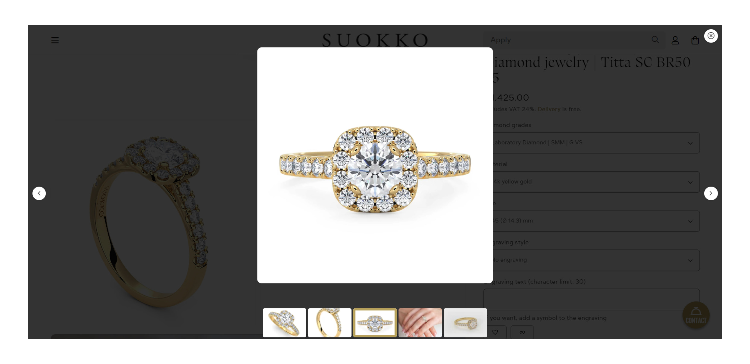
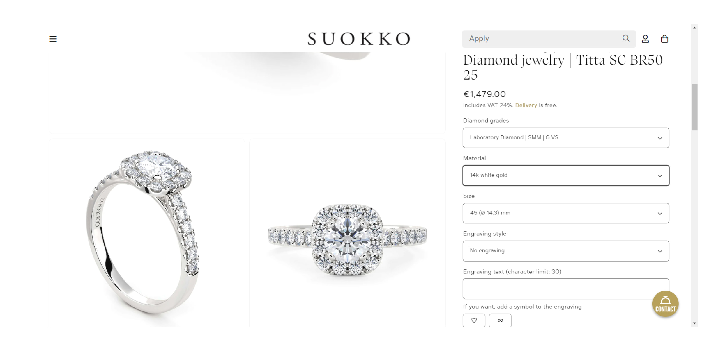
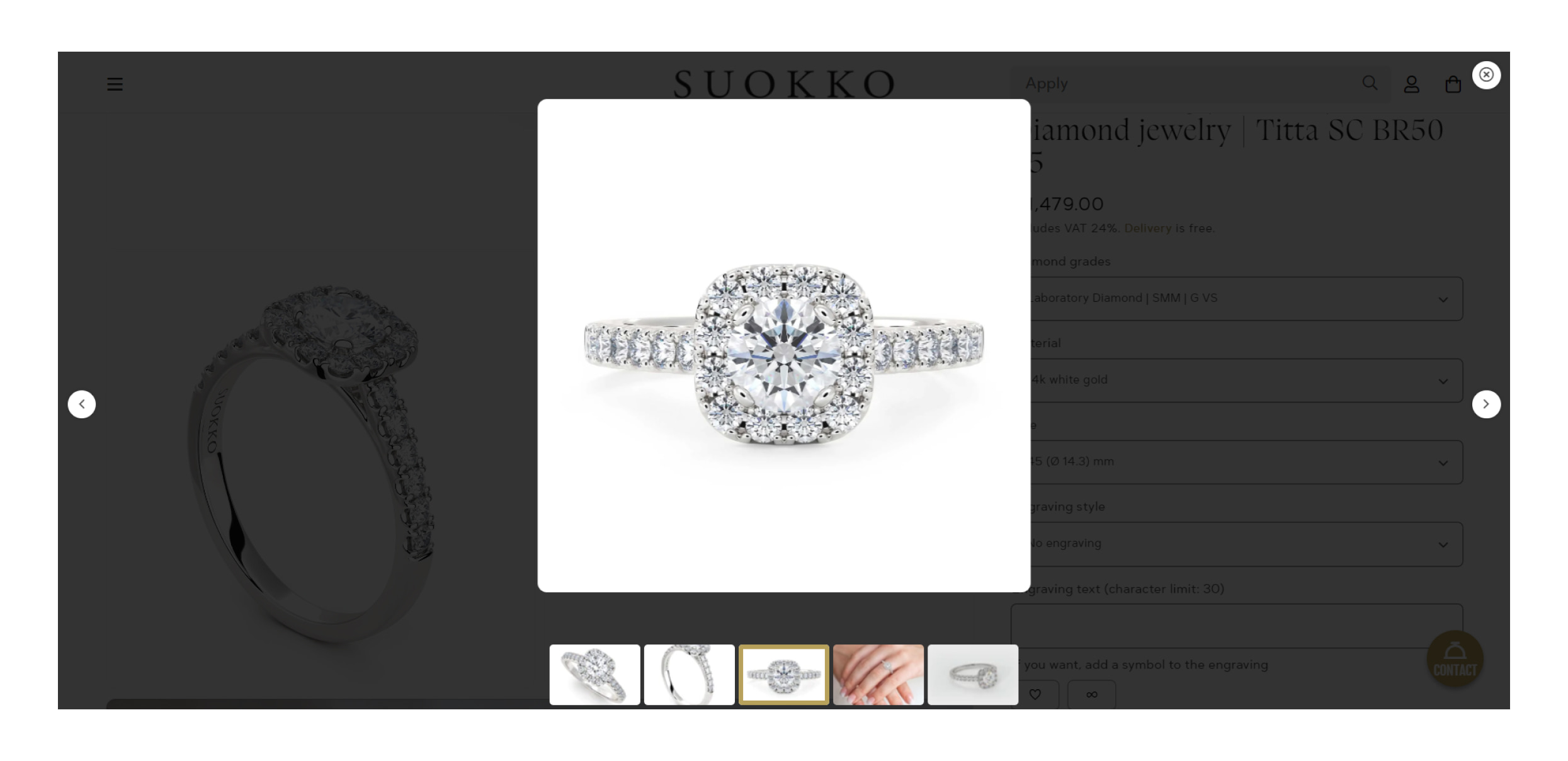
We’ve added sliders to the desktop – in a popup, and on a mobile device – a common slider. The images are displayed only for the selected product variant, in our case by color.
Collections page
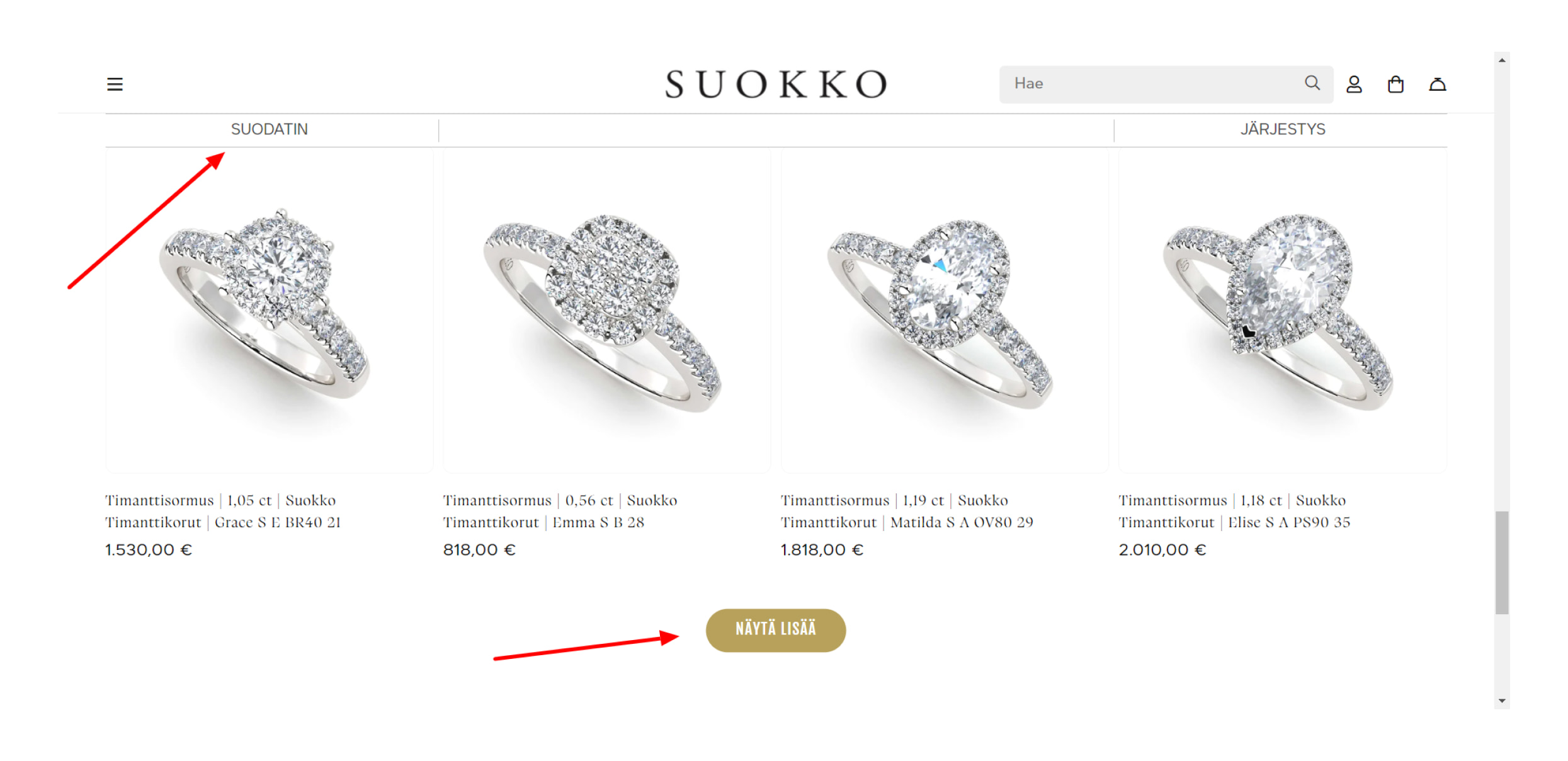
On the collections page, we added a download button instead of the default pagination. The filter buttons have also been redesigned.
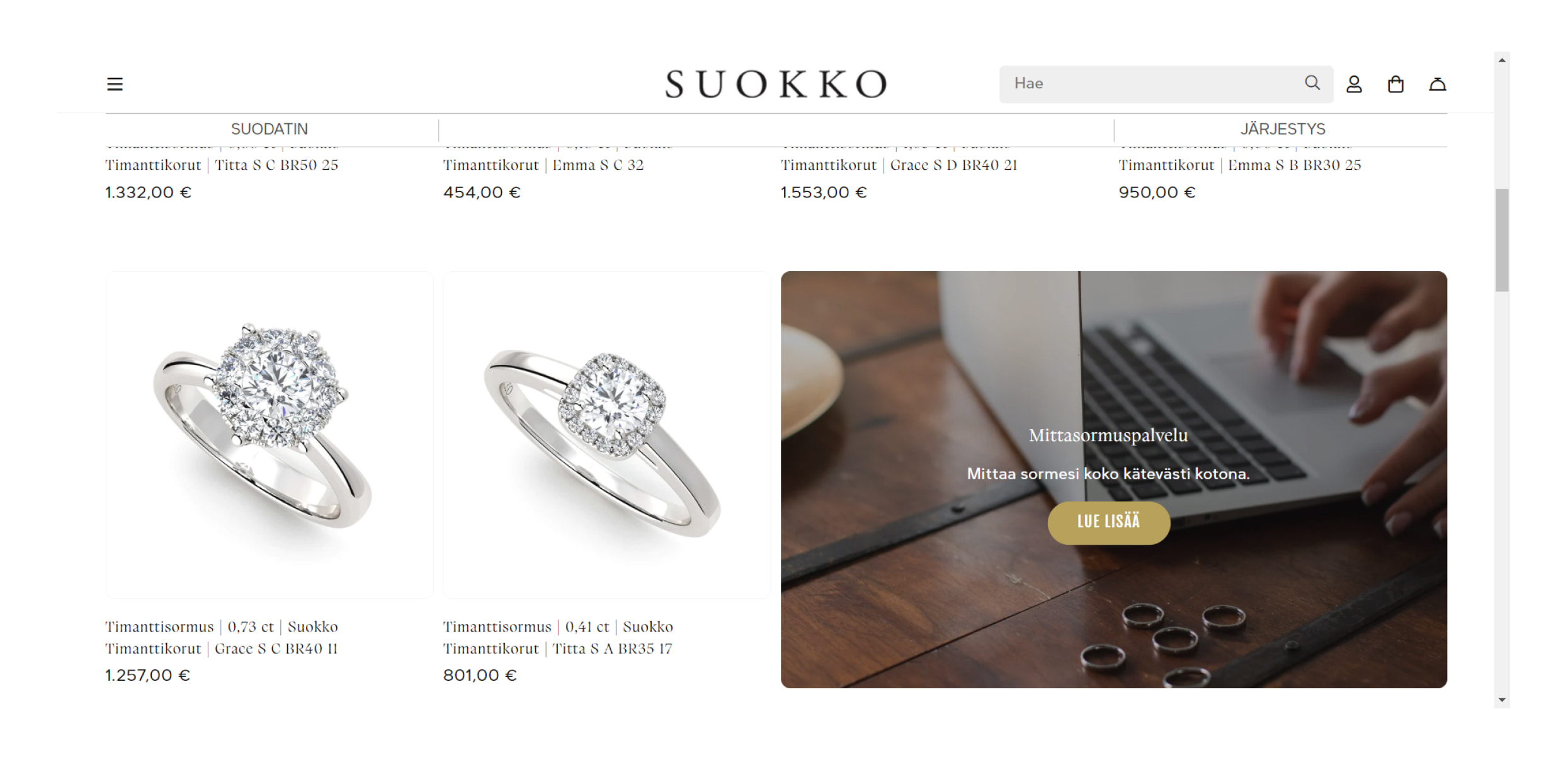
The product grid section now includes a promotion block for informational purposes. A block’s settings allow you to set its background – a picture or a video, which collection it will appear in, or how many columns it will take up. It’s possible to add a link with text, adjust its height and width, and add a button. In this block, you can also include a Shop image button, which displays a list of featured products when clicked.
Contacts
As we said above, contacts have been added to the navigation menu in a separate sidebar. When you click one of the communication methods, you will see the appropriate action – for example, a phone number, a form, or a chat will appear.
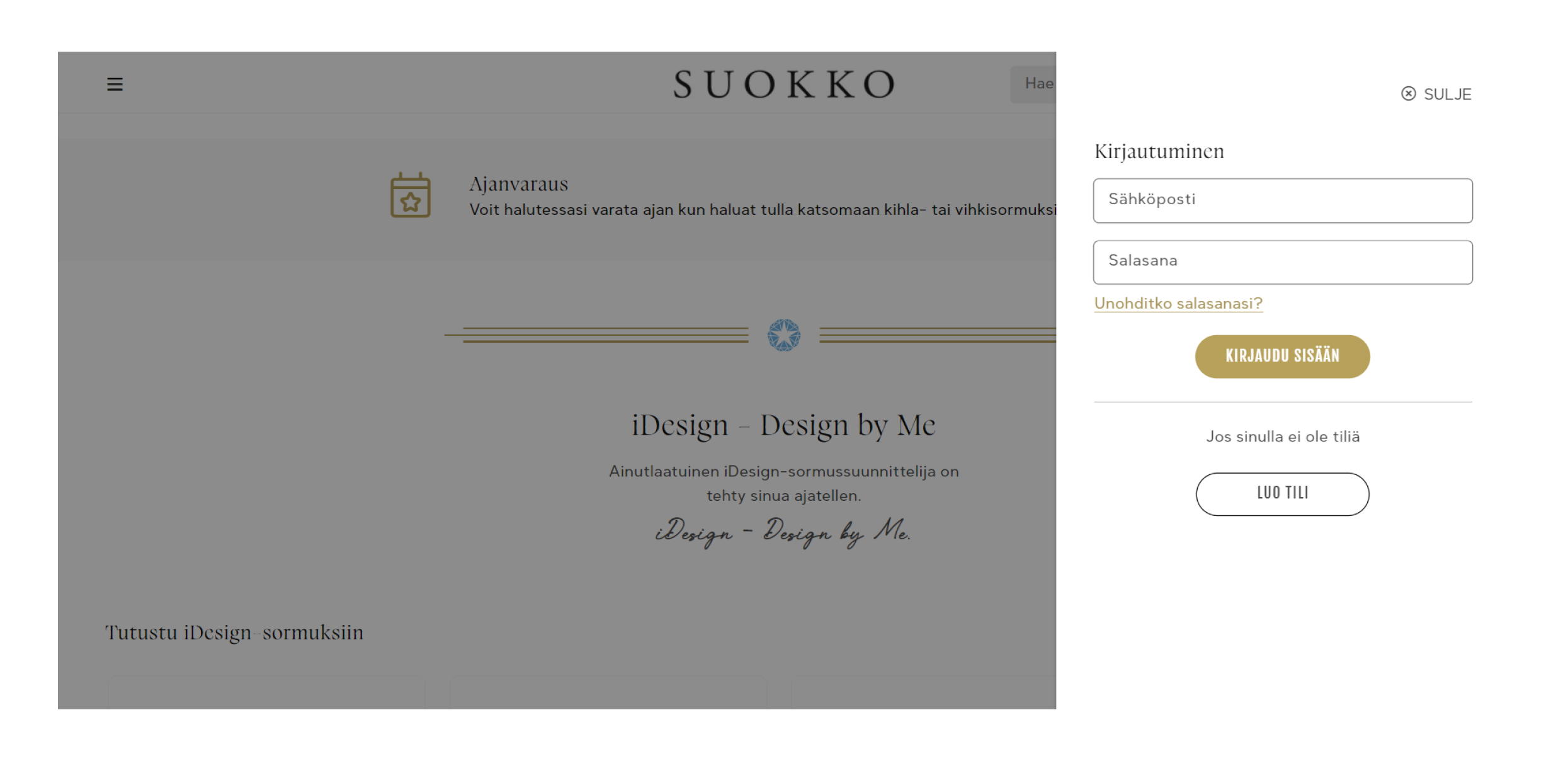
The registration and login forms now appear as separate sidebars without switching to another page.
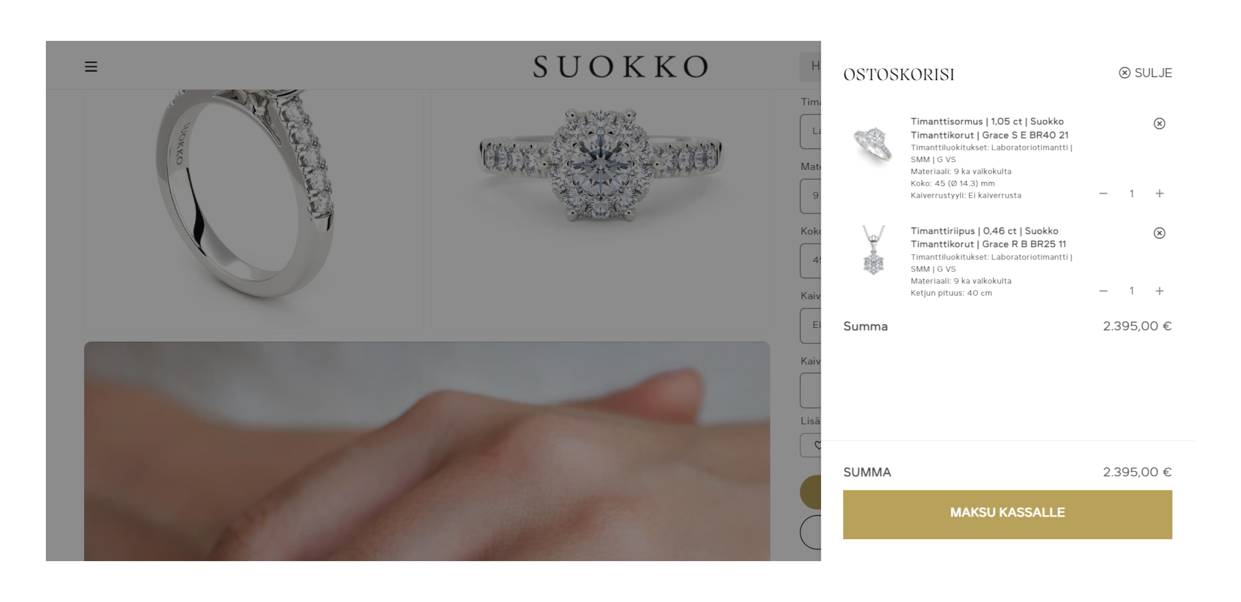
The Ajax shopping cart was also not included in the theme, so we developed it as well.
Summary
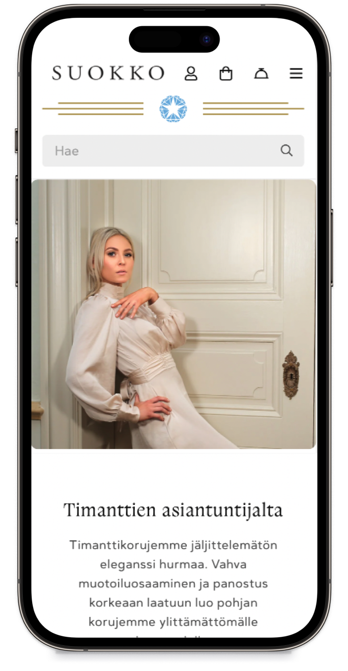
In the end, our client got a unique, and flexible website that looks great on any device. Here’s what our client says about working with us:

We felt we were in good hands with their professional work. They really found out what was the goal of this project and wanted to understand it completely before anything was done. Their level of executing all the features is top-class, and no compromises have been made in the quality of work. Communication was rapid and clear.
For more details, the full review is available on our Clutch profile.
