
VocalMist
- Store development
- Health, beauty, and cosmetics

Project details
-
Development team
Team Lead, Project Manager, Developers,
Account Manager -
Marketing team
Marketing and SEO Specialists, UX/UI
Designer -
Time
8 weeks
-
The task
Redesign the conversion journey and implement the custom functionality builds around the Shopify apps our client was using.
Results
-
+75%
conversion rate
-
+63%
revenue
-
+95%
usability
About the business
VocalMist is a nebulizer that helps singers and voice professionals to support their vocal health.
The nebulizer comes with a specially-designed VocalMist Hydration Formula, available in packs starting from 24 units and intended for regular use.
From the business point of view, it’s quite a unique case with a specific monetization strategy, where selling the flagship product is just the first step of interaction with the customer. The main source of income comes from refill packs with several subscription options available.
Also, SEO promotion wasn’t an option because the website is relatively small; and running Facebook or Google Ads was restricted because the nebulizer is a healthcare-related product unlikely to pass moderation. That’s why some of the challenges the business faced were quite specific and impossible to solve out-of-the-box.


Challenges and solutions
Unclear website navigation
According to the owner’s own words, the online store was designed “piecemeal from basic themes on Shopify and ended up quite convoluted and clunky”. Without a logical structure, it wasn’t clear to the customer which products were presented, how to buy them, and what was needed to efficiently use the nebulizer later.
Solution
In eCommerce, it all starts with a quality user experience. To make the online store perform its main function, we:
- Redesigned the customer journey from the homepage to the final check out, and made the website navigation clear, simple, and intuitive;
- Clearly presented the flagship product, its features, and how to use it – with special focus on the importance of the refill packs;
- Described all available subscription options to make it clear for customers on how to get the most out of the product;
- Redesigned the website to make it more visually appealing.
Results
After the implementation of the first stage, the client received a structured and effective online store with a clear customer journey focused on sales, essential for promoting the product via influencers and word-of-mouth advertising.
How you can benefit
It doesn’t matter how you sell online – having an intuitive, effective, and pleasant-looking online store is a must in any eCommerce business. To learn more about high-performance eCommerce, check out our Store design page.
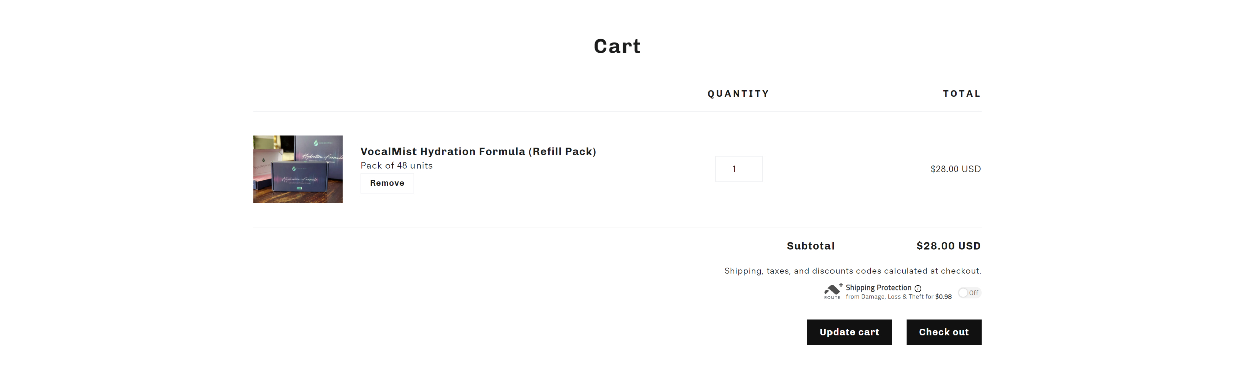
Missing out on subscriptions
Another challenge our client faced was that customers were mostly buying the flagship product(the nebulizer itself) and not the subscription packs, which was the main long-term business goal.

Customers benefit from both of these options, as in both cases they would have the required 24 units per month. The only difference between these two options is the delivery frequency; shipping and delivery with the second option would cost half as much for the business.
So the tasks for this stage were clear: to attract customers’ attention to the subscription plans, and motivate them to buy the two-month subscription option.
Solution
To accomplish this, we integrated a customized popup message which appeared when the customer adds the first subscription option (24 units per month) to their cart. The message offers a discount for the second subscription (48 units per 2 months) and motivates customers to choose it over the first one.
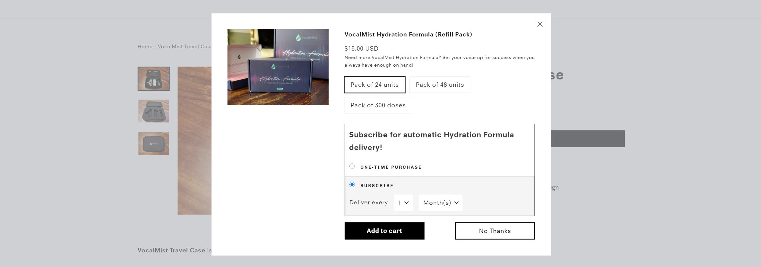
Although these kinds of popups are common in eCommerce and are available within the default settings of basically any theme, there was one challenge. In a standard popup, after the customer adds the promoted option to the cart, two products appeared together on the checkout page: the product which was chosen first (A) and the one added from the popup (B). In this case, customers needed to delete option A manually, and only after that complete the purchase. This way the number of steps before the checkout increased, which resulted in subsequent customer loss.
To prevent this, we developed the functionality which deletes product A if product B is added from the popup. It’s done automatically on the back end, so customers did not need to delete anything manually, and the checkout process remains as smooth as possible.
Also, the popup had to be integrated with a third-party subscription app to show all available delivery options in the popup.
Results
The popup development didn’t involve custom app solutions; everything was implemented on the theme level. All settings are available via theme customizer, so it’s possible to set up and change anything at any time from the Shopify admin panel, with no coding required.
How you can benefit
If done right, even a small tweak added in the right place can significantly increase your conversion rate. We have the necessary eCommerce experience to optimize any customer flow, so check our Custom theme development page to learn more.
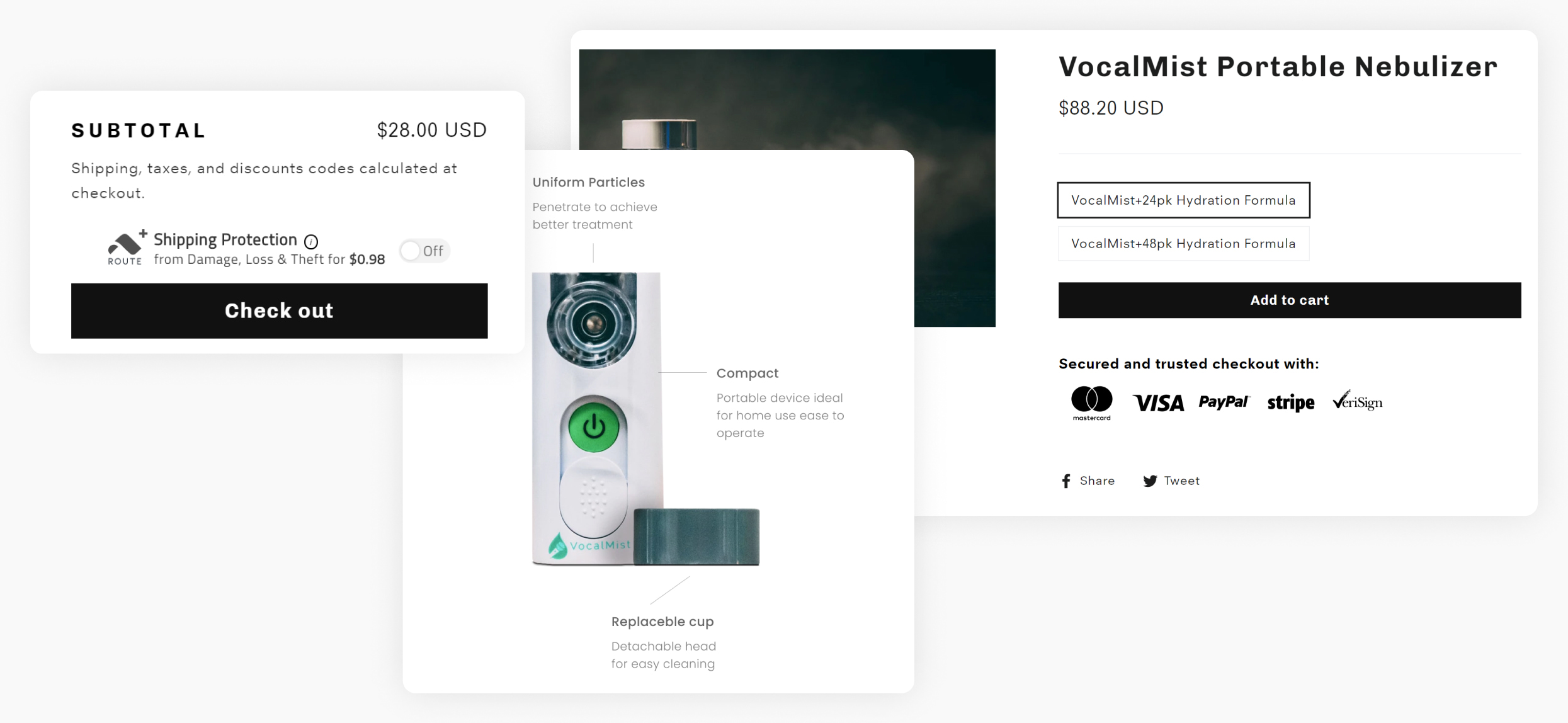
No required delivery settings
Regular delivery of the refill packs was available only within the U.S., but it wasn’t possible to restrict users from other countries from ordering subscriptions. So we needed to show the subscription options to customers from the U.S. and hide them from others, still providing them the possibility to buy the main product.
Solution
The only way to do this was to integrate custom functionality builds around the Shopify subscription app that our client was using. We added the script to check customers’ geolocation, and if the country of origin was the U.S., all subscription options were made available. For all other countries, these subscription options were hidden.

Also, in case our client would like to expand the delivery area, we made it a completely future-proof solution, because this functionality is controlled from the settings. The client just needs to choose from the dropdown menu the countries they would like to deliver to.
Results
The client got the flexible and easy-to-use settings that were impossible to integrate out of the box or find in other apps.
How you can benefit
Sometimes custom functionality is the only way to get the results you need, and a wise investment made once can bring you much more afterwards. Check out our Custom app development page and get a solution for your business challenges!
Unwanted elements on the website
Finally, there were some improvements, such as the removal of the “Buy Now” button from the product card, and other minor fixes. We easily implemented them too to polish off the project.
How you can benefit
To make some improvements here and there, there’s no need to waste time on unnecessary communication with development teams. You can simply go to our Small tasks page, choose the customization you need, order it in a few clicks, and have the job done!
Summary
To sum it all up, our client got a user-friendly online store with improved conversion journey, but nothing can describe the results of the work better than the feedback from the owner:

Our multiple-product purchase rate (with the SpurIT custom popup builds)
has gone up around 75% with the products we were attempting to push!
For more details, the full review is available on our Clutch profile.