AI, ChatCPT, and Midjourney have quickly become buzzwords in the world of website design. While many are creating stunning and imaginative visuals using these tools, the question remains: are they a worthwhile option for eCommerce store design? Our senior designer, Paul, has embarked on a journey to explore this question and shares his impressions. So, let’s dive in!
- The task at hand: creating web design with AI tools
- Choosing the right industry: beauty, fashion, or food?
- Website design journey: the synergy of AI and human ingenuity
- Breaking down the time investment
- Reflections on results: autonomy and assistance of AI
The task at hand: creating web design with AI tools
My goal was to create web layouts for eCommerce websites using AI-powered tools. I wanted to go beyond just designing the visual aspects and create the entire content for the website.
Analyzing and exploring AI tools
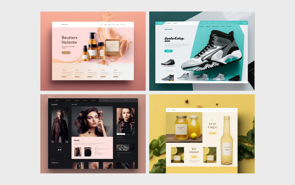
To start, I delved into numerous examples, extensively reviewed tutorials, and analyzed the available tools. After this phase, it became evident that AI could indeed aid in website creation. However, there was a catch. The generated designs appeared somewhat outdated, reminiscent of styles from five to six years ago. Furthermore, AI tools primarily focused on producing visuals for the hero section rather than the entire webpage, let alone multiple pages of a website. Drawing from my extensive experience in mock-up creation, I noticed that the generated layouts had design flaws that proved difficult to rectify on an individual basis.
Therefore, I concluded that Midjourney could serve as a valuable assistant rather than a complete replacement for a human designer.
Choosing the right industry: beauty, fashion, or food?
I faced several potential domains for exploration: beauty and cosmetics, clothing, and food products. Before settling on one, I conducted a small test to generate images for each domain.
Beauty and cosmetics: the challenges of generating cohesive imagery
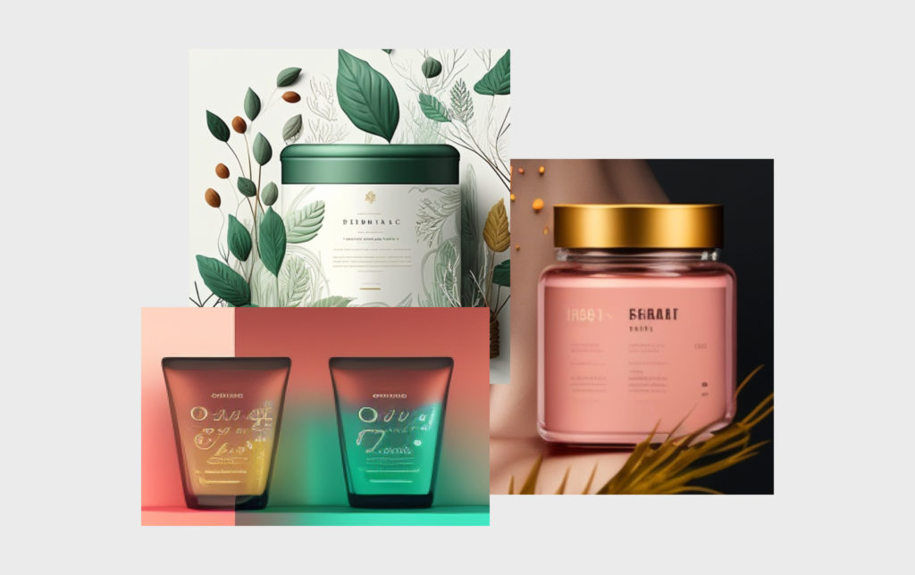
I initially ventured into the realm of beauty and cosmetics. However, upon attempting to generate images specific to this domain, I encountered a significant challenge. Consistently creating images for different products proved to be a complex task. For instance, after successfully generating an image of lipstick on a specific background, reproducing a similar image for another product became a daunting endeavor.
Accomplishing this required substantial time investment and experimentation with prompts. As I aimed to produce a high-quality concept swiftly, I realized that beauty and cosmetics might not be the most suitable domain for AI-driven design.
Furthermore, the generated images in the beauty and cosmetics domain exhibited an outdated design that failed to align with modern trends.
Fashion: excelling in clothing generation but struggling with models
Subsequently, I shifted my focus to the domain of clothing. While the AI tools performed admirably in generating individual clothing items, they fell short when it came to generating models showcasing the garments. The resulting images portrayed people with three fingers or distorted facial features. Recognizing the diminishing returns, I decided to redirect my efforts toward the domain of food.
Food and beverages: a promising choice for design creation
Within the realm of food products, I narrowed my focus to beverages. Leveraging my previous experience in fully designing for Harmless Harvest, this seemed like an ideal starting point.
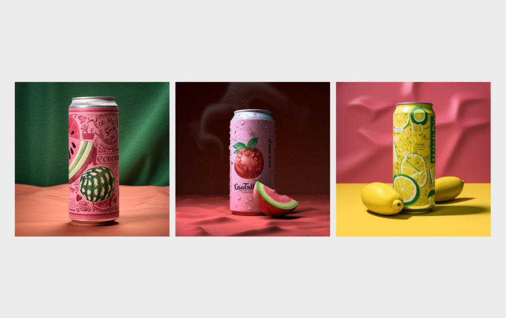
Initially, I attempted to generate images of individual beverages. Although the outcomes were promising, they lacked consistency in style. For example, some images depicted fruits, while others did not. Additionally, the cans exhibited inconsistencies in finish—some appeared matte and dry, while others had a glossy sheen with condensation droplets. Moreover, the sizes of the cans often did not align. While seemingly trivial, such details are critical when aiming to create a high-quality design.
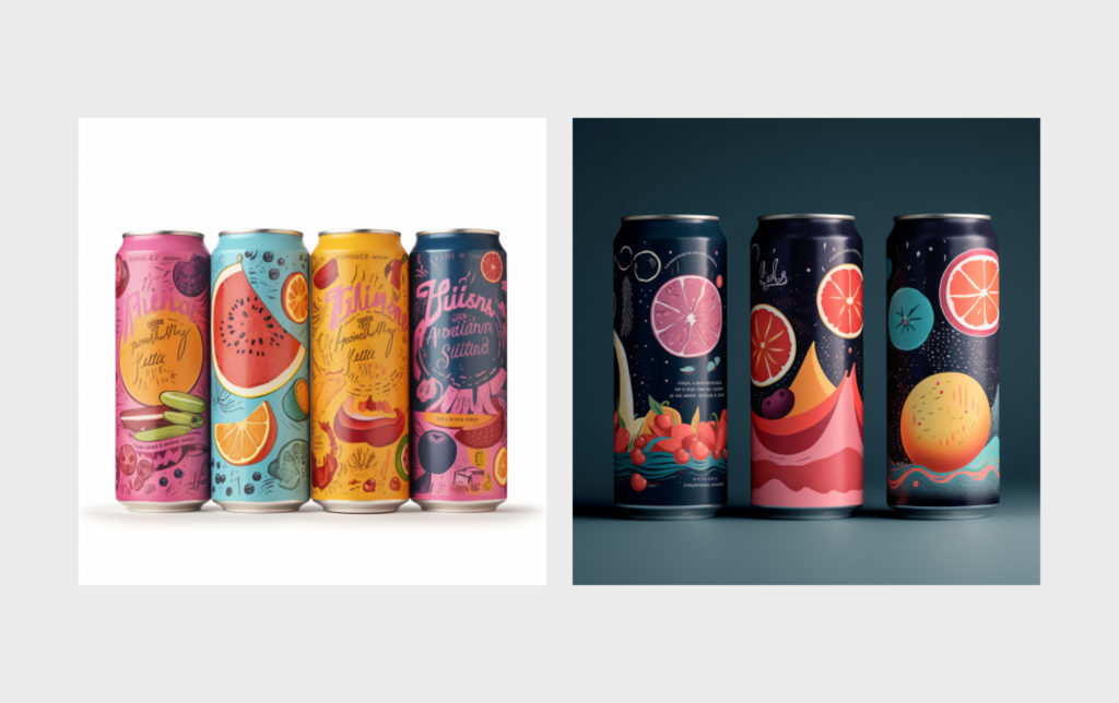
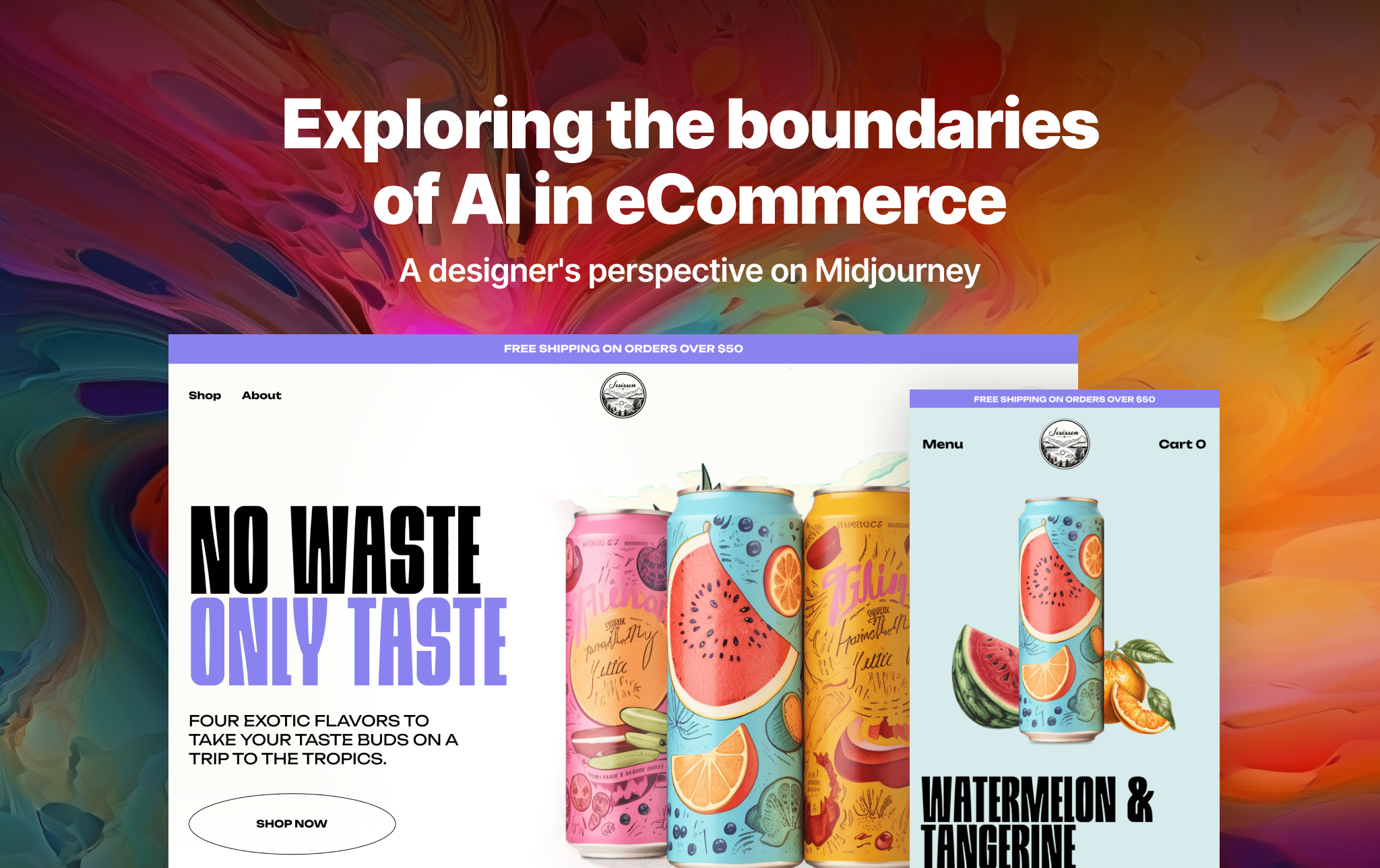
Consequently, I decided to generate images with four cans simultaneously and later extract and refine them as separate elements. To achieve this, I provided prompts for each can, specifying different flavors, a consistent style, and a logo.
After considering various variations, I ultimately selected the first option, despite the slightly imperfect text generated by Midjourney. The visually striking and high-quality images in the chosen style overshadowed this minor setback, prompting me to move forward without dwelling on this particular aspect.
Website design journey: the synergy of AI and human ingenuity
Let’s dive back into the core of the design process. I started by using Figma as my design tool, where I created the structure, pages, elements like buttons and menus, and the color palette myself.
Midjourney’s role: enhancing elements and concepts
Midjourney played a crucial role in assisting me during this stage. I began by generating a logo. Taking the text from the AI-generated product label, “Jesissen,” as a base, I specified the theme as “products” and defined the style. After obtaining several results, I decided to go with a monochromatic variation.
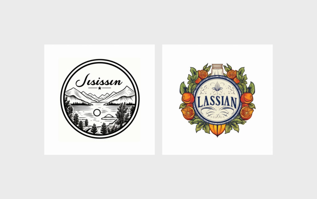
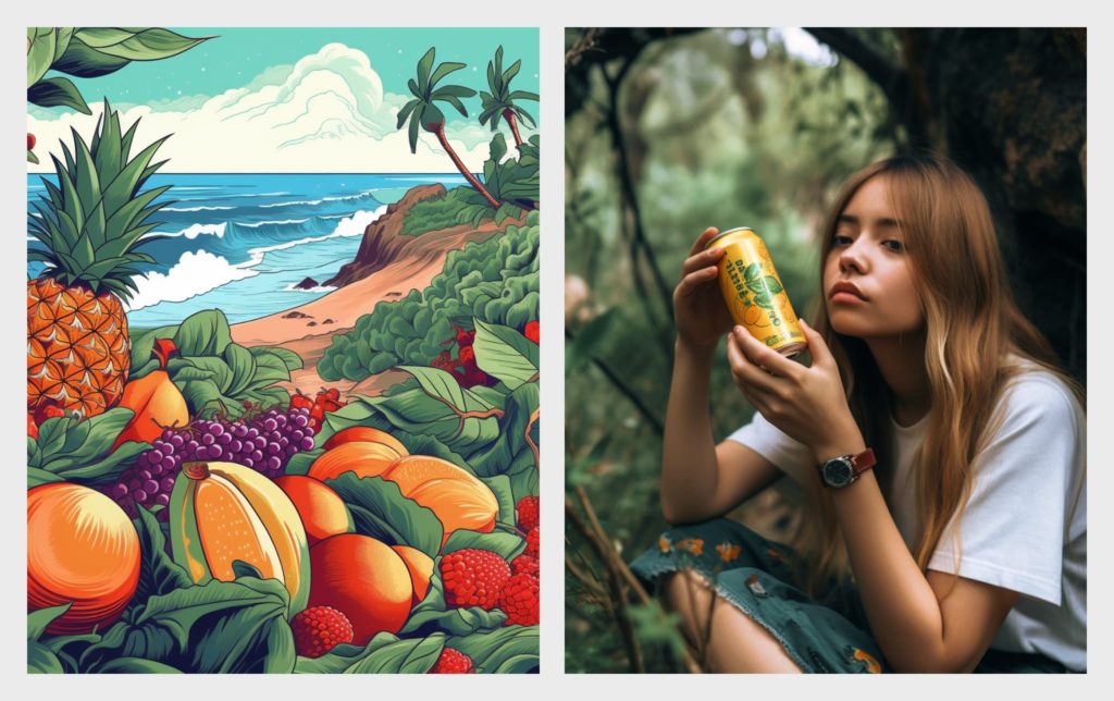
Additionally, I utilized Midjourney to generate a tropical background image and several supplementary images for the “About Us” section.
With the help of Midjourney, I also generated a photograph of a woman with a beverage. It’s worth noting that unlike the clothing scenario, the image with a person was generated perfectly on the first attempt. I selected one of the four suggested options and then chose the best resolution possible.
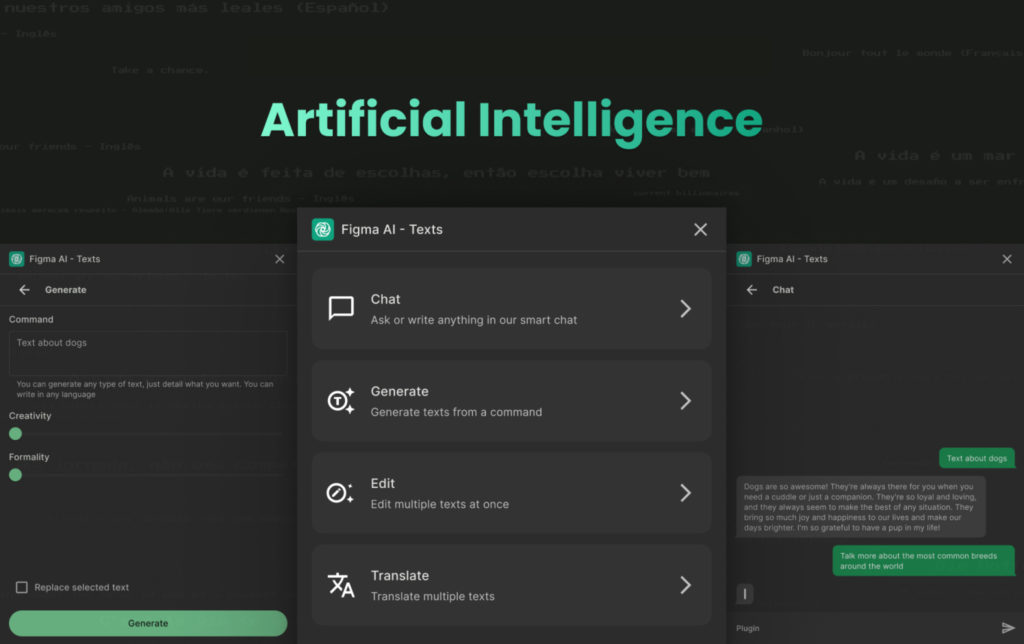
All the text on the design, including descriptions and headings, was completely generated using FigmaAI, the AI plugin for Figma.
Showcasing the products: a meticulous process
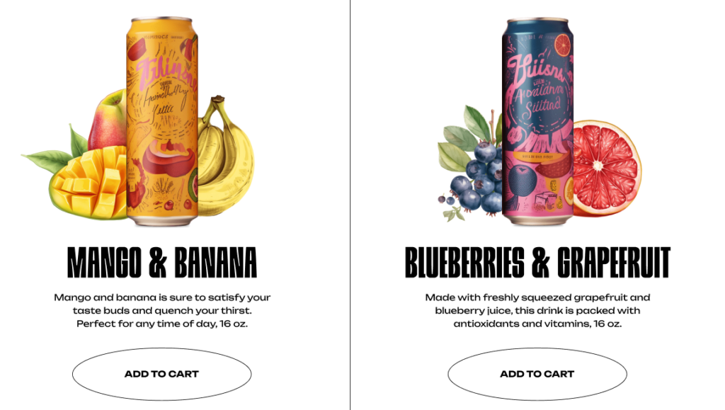
As mentioned earlier, I initially created an image featuring four cans in a consistent style. I then manually separated this image into various elements. Using AI, I generated fruit images for each can to match the product label. I manually combined the images and achieved the following result.
Initially, I had planned to provide prompts for generating background images for each product. However, in this case, the generated images exhibited significantly different designs, leading me to abandon this approach.
Breaking down the time investment
Considering my experience and a rough understanding of the desired structure, creating the homepage took approximately 10 hours. However, additional time was required for developing the remaining website pages and the mobile version. It’s important to note that individuals with little to no design experience may require significantly more time. If you’re ready to take on the challenge, go for it!
Reflections on results: autonomy and assistance of AI
In retrospect, I took charge of crafting the page structure and overarching design concept, drawing upon my expertise and guiding principles. Nevertheless, the invaluable assistance rendered by Midjourney in shaping distinctive elements and innovative ideas cannot be overlooked.
For an immersive experience of the complete website, kindly navigate to this link and delve into a world of boundless possibilities.
