Yogi Secret
- Store development
- Gifts & сollectibles
Project details
-
Team
Senior Developer, Team Lead, Project
Manager, Account Manager -
Technologies
Native JavaScript, Shopify GraphQL API,
HTML5, CSS, Shopify Theme Liquid -
Time
2 months
-
The task
- Redesign online store to drive sales, and improve user experience and user interface.
- Make the navigation through the website frictionless and clear, buying process fast and easy.
Results
-
+32%
conversion rate
-
+86%
usability
-
+78%
performance
About the business
Yogi Secret is a subscription-based business that curates a unique self-love box for mindful living. Committed to bringing customers cruelty-free and sustainable products from brands that support a healthy mind and body, YogiSecret boxes are designed to make every day enjoyable, purposeful, and stress-free.
Caring for their customers’ bodies, souls, and the environment, Yogi Secret includes products from conscious brands that use minimal packaging and are certified cruelty-free and toxic-chemical-free.
Challenges and solutions
Our client acquired a turnkey business with a pre-existing Shopify store and contacted us for a redesign. We provided them with a UX/UI designer who thoroughly analyzed the existing store and proposed the most suitable design solution, including design guidelines and mockups.
Once the client approved the design, we helped them implement it into the store using the existing Prestige theme.
Design
Home page
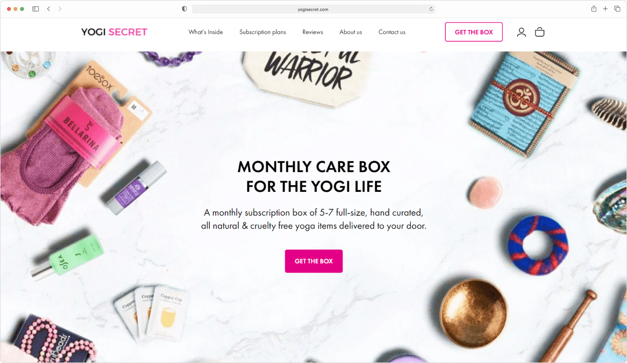
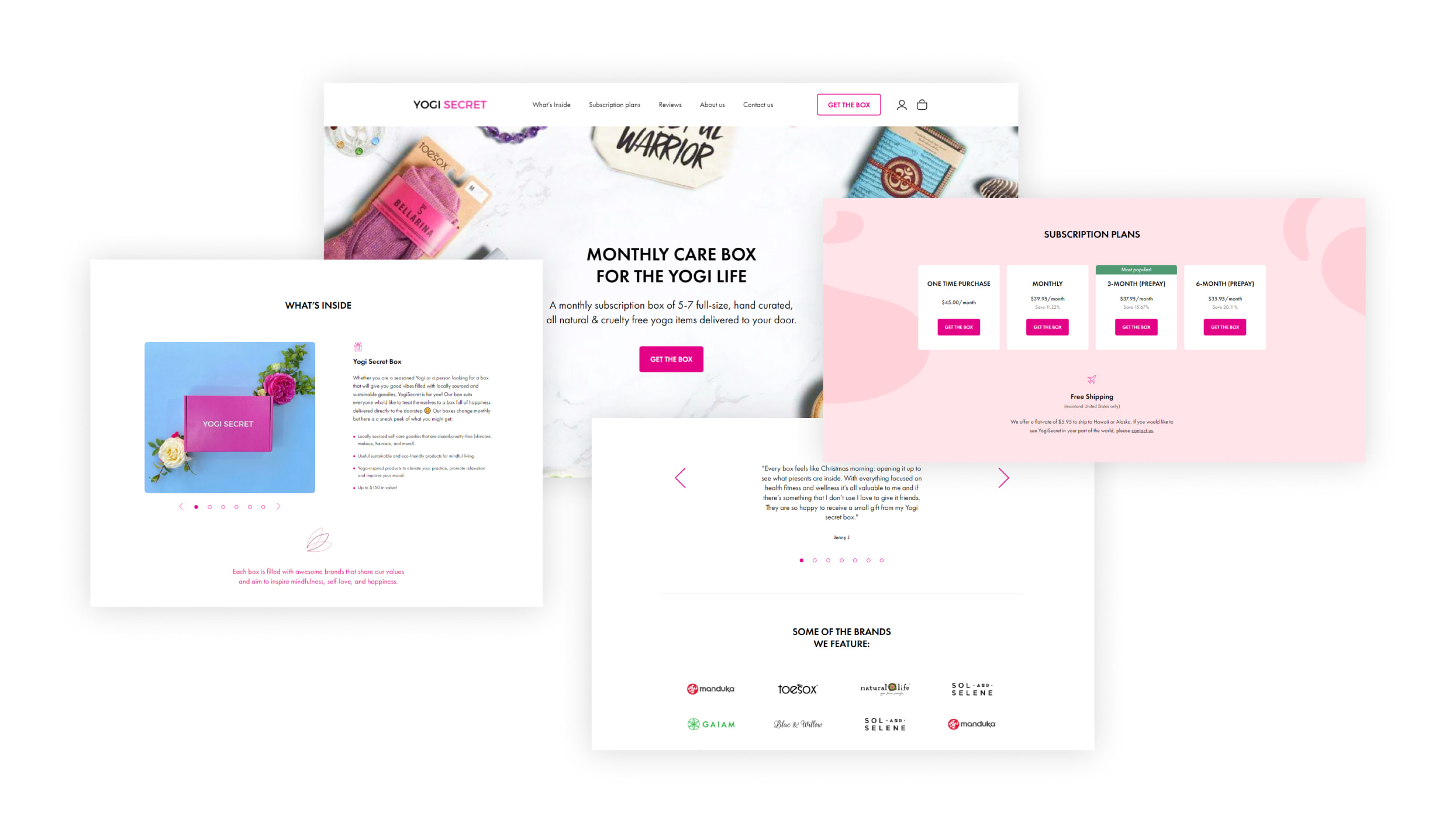
While working on the new design of the home page, we focused on highlighting the product idea, benefits, and key customer reviews to help build stronger brand loyalty. Understanding the positioning and target audience, we created a new brand color and abstract patterns that clearly translate our company’s values and message.
Product page
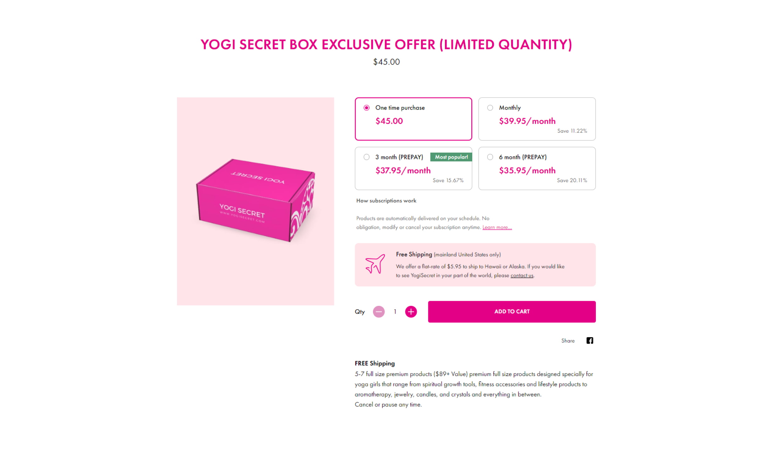
The product page required careful attention to redesign, as Yogi Secret’s subscription plans are its primary focus. We created four large buttons that highlight the features of each subscription plan. The most popular plan is labeled “Most Popular!”. Below the buttons, we provide subscription and shipping information. We also decided to add clarifying information on the categories of products typically included in the boxes, as Yogi Secret keeps their contents a secret.
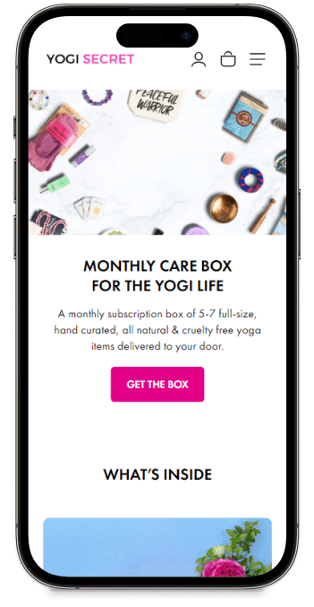
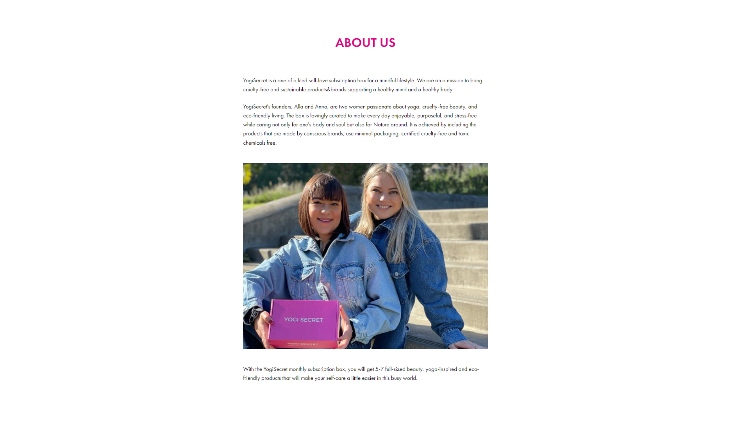
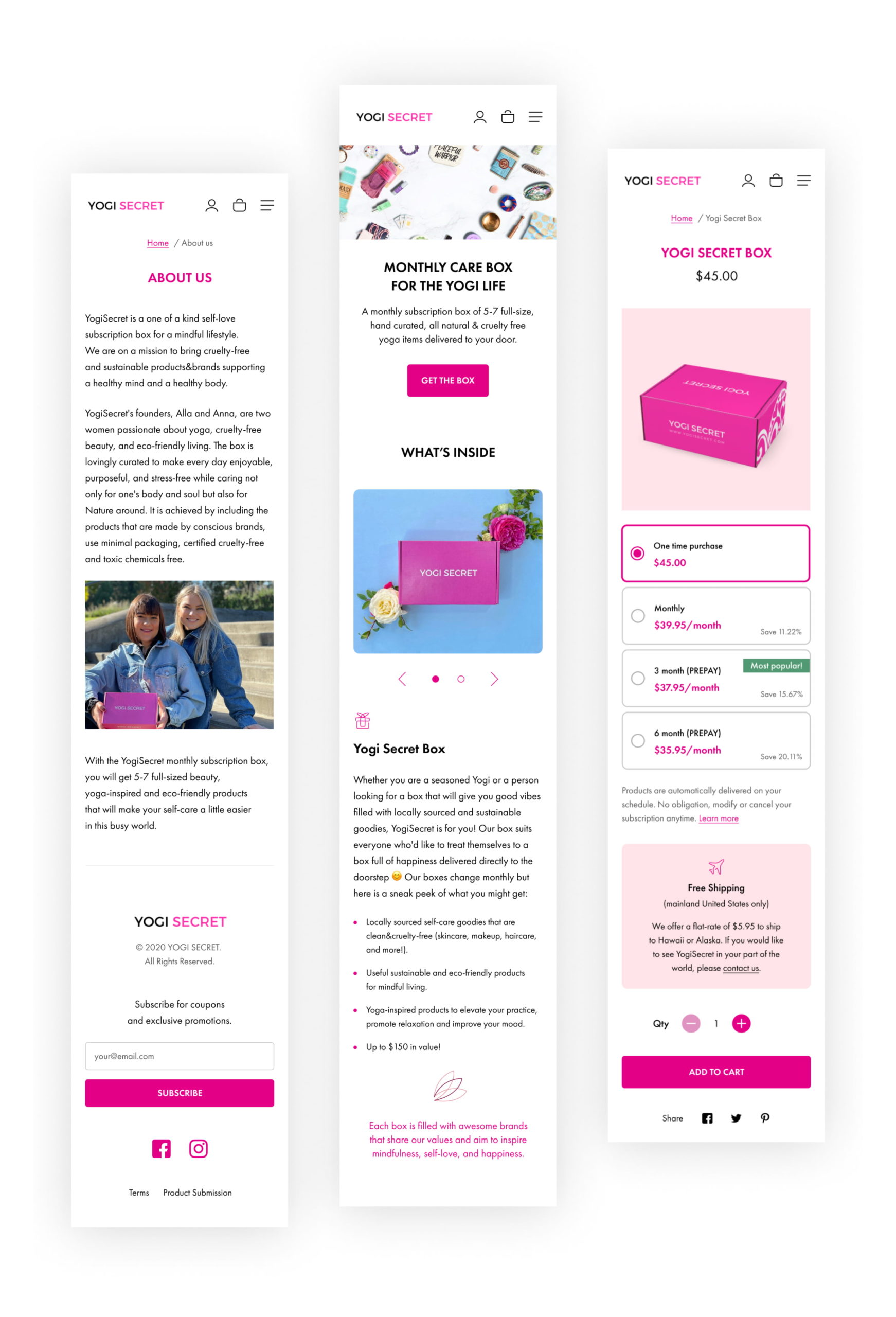
Additionally, we created an About Us page and implemented an adaptive design.
Key features
We worked on all standard website pages, assembling, and customizing them.
Among the key features implemented were:
- Product reviews from real buyers: We added a system for displaying product reviews from real customers.
- Instagram feed: We integrated an Instagram feed into the website to showcase products and brand content.
- Subscription model: We implemented a subscription model that allows customers to receive products regularly in exchange for discounts or other benefits.
App integration
Recharge app integration was the most important part of the project for us. We integrated the app with the store and customized its options and appearance to match the overall design.
Subscriptions
The standard Recharge subscription display shows a dropdown menu under the “Add to cart” button. Users can choose the frequency of their subscription, such as once a month or twice a month. The payment amount is based on the chosen plan.
The client’s model was different. They had four subscription plans:
- One-time purchase
- Monthly purchase
- 3-month prepayment
- 6-month prepayment
The longer the subscription period, the lower the monthly payment. For example, a 6-month prepayment costs less than six monthly payments.
To accommodate the client’s model, we had to customize the subscription options on the page and how we interact with the subscription app.
Summary
Ultimately, our client received the functionality that worked exactly as needed. We’re happy to share the results of our work, and client reviews are always available on our Clutch profile here.
